

Note
Go to the end to download the full example code.
NCL_panel_19.py#
- This script illustrates the following concepts:
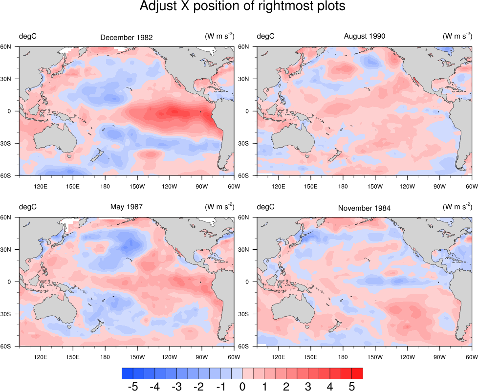
Paneling four subplots in a two by two grid using
gridspecAdjusting the positioning of the subplots using
hspaceandwspaceUsing a blue-red color map
- See following URLs to see the reproduced NCL plot & script:
Original NCL script: https://www.ncl.ucar.edu/Applications/Scripts/panel_19.ncl
Original NCL plot: https://www.ncl.ucar.edu/Applications/Images/panel_19_1_lg.png and https://www.ncl.ucar.edu/Applications/Images/panel_19_2_lg.png
Import packages:
import cartopy.crs as ccrs
import cartopy.feature as cfeature
from cartopy.mpl.gridliner import LongitudeFormatter, LatitudeFormatter
import matplotlib.pyplot as plt
import numpy as np
import xarray as xr
import cmaps

import geocat.datafiles as gdf
import geocat.viz as gv
Helper function to convert date from YYYYMM to the month name and the year
def convert_date(date):
    months = [
        'January',
        'February',
        'March',
        'April',
        'May',
        'June',
        'July',
        'August',
        'September',
        'October',
        'November',
        'December',
    ]
    year = str(date)[:4]
    month = months[int(str(date)[4:]) - 1]
    return month + " " + year
Helper function to create and format subplots
def add_axes(fig, grid_space, date):
    ax = fig.add_subplot(
        grid_space, projection=ccrs.PlateCarree(central_longitude=-160)
    )
    ax.set_extent([100, 300, -60, 60], crs=ccrs.PlateCarree())

    # Usa geocat.viz.util convenience function to set axes parameters
    gv.set_axes_limits_and_ticks(
        ax,
        ylim=(-60, 60),
        xticks=np.arange(-80, 120, 30),
        yticks=np.arange(-60, 61, 30),
    )

    # Use geocat.viz.util convenience function to make plots look like NCL
    # plots by using latitude, longitude tick labels
    gv.add_lat_lon_ticklabels(ax)
    # Remove the degree symbol from tick labels
    ax.yaxis.set_major_formatter(LatitudeFormatter(degree_symbol=''))
    ax.xaxis.set_major_formatter(LongitudeFormatter(degree_symbol=''))

    # Use geocat.viz.util convenience function to add minor and major tick lines
    gv.add_major_minor_ticks(ax, labelsize=8)

    # Make sure that tick marks are only on the left and bottom sides of subplot
    ax.tick_params('both', which='both', top=False, right=False)

    # Add land to the subplot
    ax.add_feature(
        cfeature.LAND,
        facecolor='lightgray',
        edgecolor='black',
        linewidths=0.5,
        zorder=2,
    )

    # Set subplot titles
    gv.set_titles_and_labels(
        ax,
        lefttitle='degC',
        lefttitlefontsize=10,
        righttitle='$(W m s^{-2})$',
        righttitlefontsize=10,
    )
    ax.set_title(convert_date(date), fontsize=10, y=1.04)

    return ax
Helper function to create figure with specific gridspec
def create_fig(grid, fig, title):
    # Add the axes
    ax1 = add_axes(fig, grid[0, 0], dates[0])
    ax2 = add_axes(fig, grid[0, 1], dates[1])
    ax3 = add_axes(fig, grid[1, 0], dates[2])
    ax4 = add_axes(fig, grid[1, 1], dates[3])

    # Create a dictionary with contour attributes
    contourf_kw = dict(
        transform=ccrs.PlateCarree(),
        levels=21,
        cmap=cmaps.BlueRed,
        add_colorbar=False,
        add_labels=False,
        vmin=-5,
        vmax=5,
        extend='both',
        zorder=1,
    )

    # Plot the filled contours
    contour1 = data1.plot.contourf(ax=ax1, **contourf_kw)
    contour2 = data2.plot.contourf(ax=ax2, **contourf_kw)
    contour3 = data3.plot.contourf(ax=ax3, **contourf_kw)
    contour4 = data4.plot.contourf(ax=ax4, **contourf_kw)

    # Add colorbar for all four plots
    fig.colorbar(
        contour4,
        ax=[ax1, ax2, ax3, ax4],
        ticks=np.linspace(-5, 5, 11),
        drawedges=True,
        orientation='horizontal',
        shrink=0.5,
        pad=0.075,
        extendfrac='auto',
        extendrect=True,
    )

    # Add figure title
    fig.suptitle(title, fontsize=18, y=0.9)

    plt.show()
Read in data:
# Open a netCDF data file using xarray default engine and load the data into xarrays
ds = xr.open_dataset(gdf.get("netcdf_files/sst8292a.nc"))

dates = [198212, 199008, 198705, 198411]

data1 = ds.sel(time=11).SSTA
data1 = gv.xr_add_cyclic_longitudes(data1, 'lon')

data2 = ds.sel(time=103).SSTA
data2 = gv.xr_add_cyclic_longitudes(data2, 'lon')

data3 = ds.sel(time=64).SSTA
data3 = gv.xr_add_cyclic_longitudes(data3, 'lon')

data4 = ds.sel(time=34).SSTA
data4 = gv.xr_add_cyclic_longitudes(data4, 'lon')
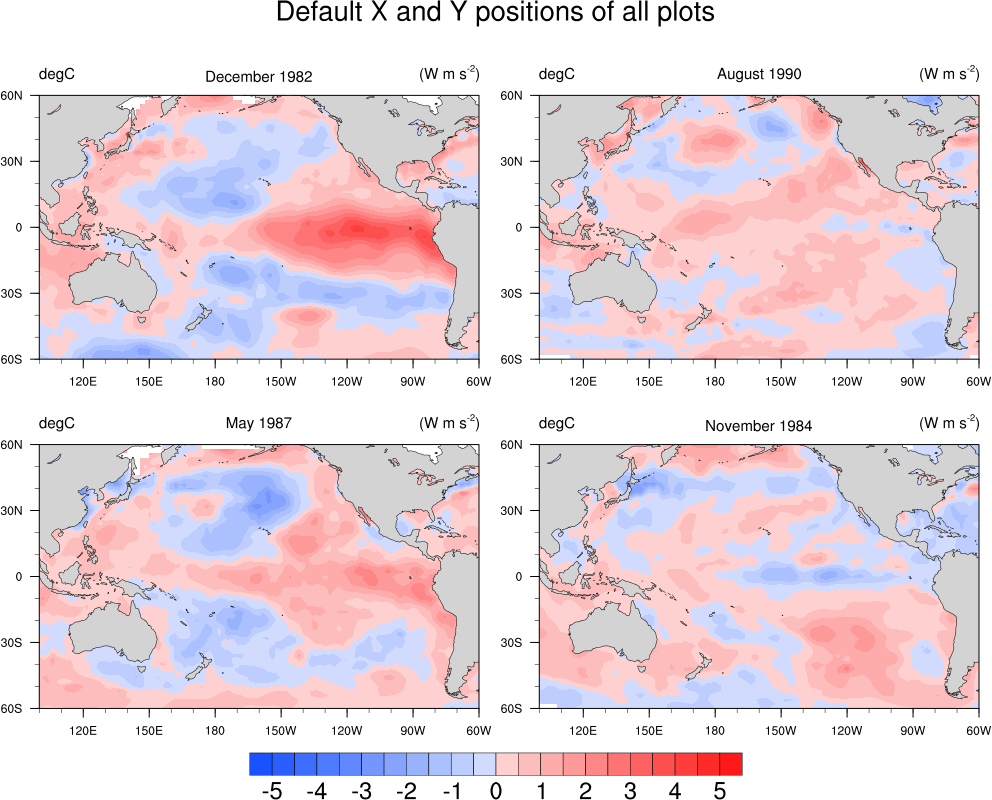
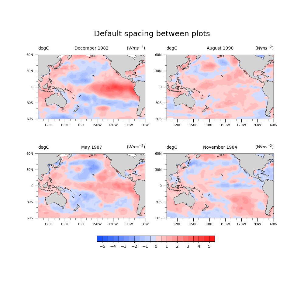
Plot with default spacing:
fig = plt.figure(figsize=(10, 10))

# Create gridspec to hold four subplots
grid = fig.add_gridspec(ncols=2, nrows=2)

title = "Default spacing between plots"

# Create the figure with the given title and gridspec
create_fig(grid, fig, title)
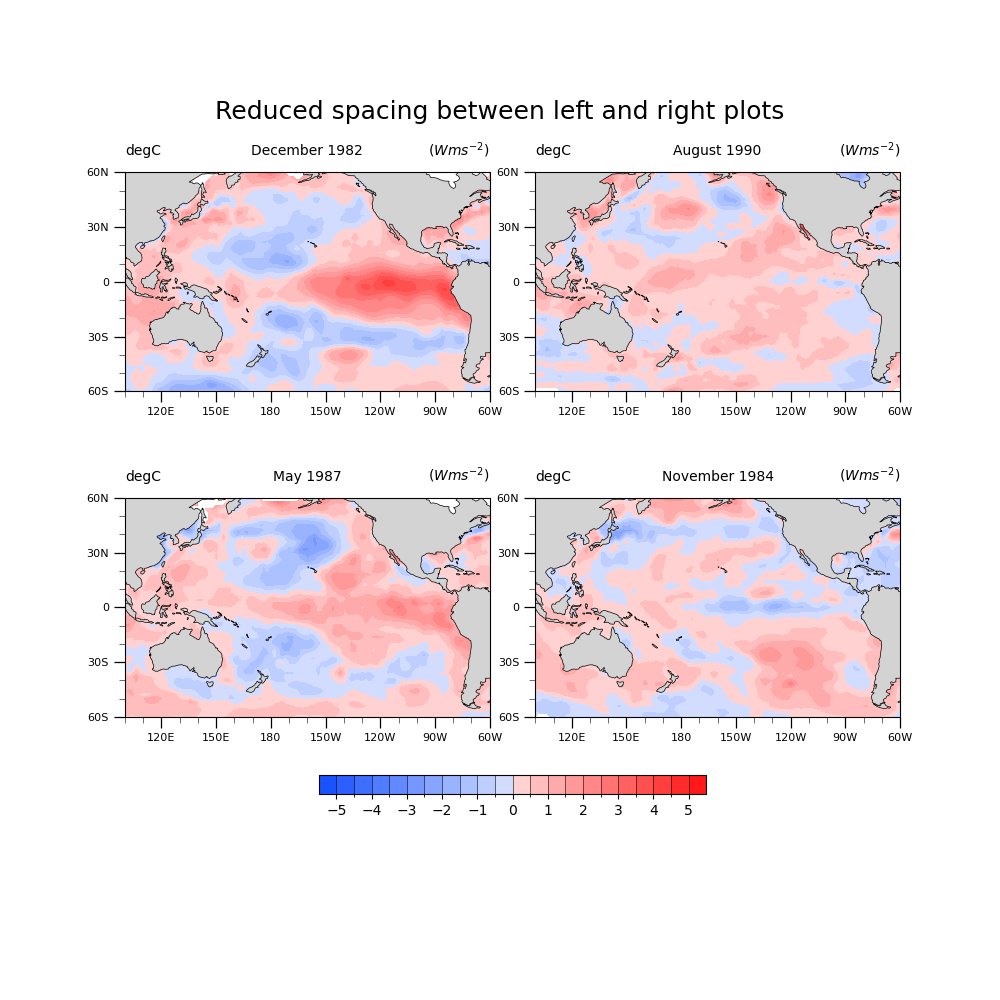
Plot with reduced spacing between the left and right subplots
fig = plt.figure(figsize=(10, 10))

# Create gridspec to hold four subplots, use `wspace` to specify the amount
# of spacing between columns of subplots
grid = fig.add_gridspec(ncols=2, nrows=2, wspace=0.125)

title = "Reduced spacing between left and right plots"

create_fig(grid, fig, title)
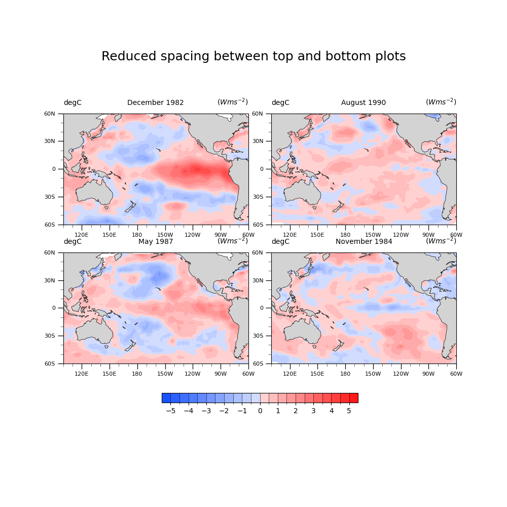
Plot with reduced spacing between the top and bottom subplots
fig = plt.figure(figsize=(10, 10))

# Create gridspec to hold four subplots, use `hspace` to specify the amount
# of spacing between rows of subplots
grid = fig.add_gridspec(ncols=2, nrows=2, wspace=0.125, hspace=-0.15)

title = "Reduced spacing between top and bottom plots"

create_fig(grid, fig, title)
Total running time of the script: (0 minutes 7.030 seconds)