

Note
Go to the end to download the full example code.
NCL_panel_10.py#
- This script illustrates the following concepts:
Drawing Hovmueller plots
Attaching plots along the Y axis
Using a blue-white-red color map
Drawing zonal average plots
Paneling attached plots
- See following URLs to see the reproduced NCL plot & script:
Original NCL script: https://www.ncl.ucar.edu/Applications/Scripts/panel_10.ncl and https://www.ncl.ucar.edu/Applications/Scripts/panel_attach_10.ncl
Original NCL plot: https://www.ncl.ucar.edu/Applications/Images/panel_10_lg.png and https://www.ncl.ucar.edu/Applications/Images/panel_attach_10_lg.png
Import packages:
import numpy as np
import xarray as xr
import matplotlib.pyplot as plt
from mpl_toolkits.axes_grid1.inset_locator import inset_axes
import matplotlib.gridspec as gridspec
from cartopy.mpl.gridliner import LongitudeFormatter
import warnings
import cmaps

import geocat.datafiles as gdf
import geocat.viz as gv
Read in data:
# Open a netCDF data file using xarray default engine
# and load the data into xarrays
filename = 'chi200_ud_smooth.nc'
ds = xr.open_dataset(gdf.get('netcdf_files/' + filename))

lon = ds.lon
times = ds.time
scale = 1000000
chi = ds.CHI
chi = chi / scale

# Calculate zonal mean
with warnings.catch_warnings():  # This is not needed but is suppressing a warning thrown by numpy checking for NaN values
    warnings.simplefilter("ignore")
    mean = chi.mean(dim='lon')
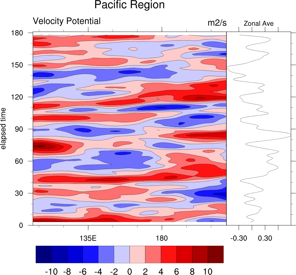
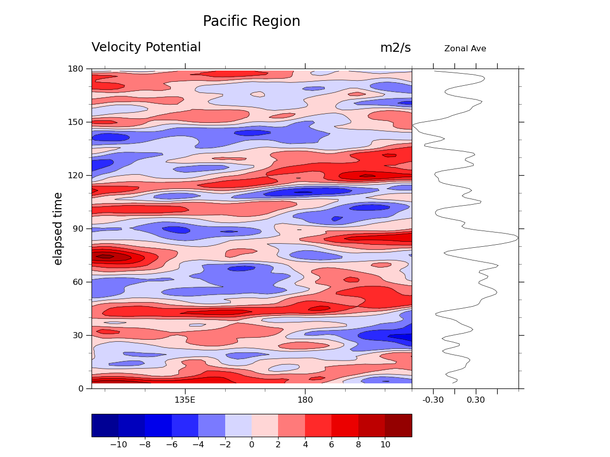
Create Single Plot:
fig, (ax1, ax2) = plt.subplots(
    nrows=1,
    ncols=2,
    sharey=True,
    figsize=(12, 9),
    gridspec_kw=dict(
        wspace=0,
        width_ratios=[0.75, 0.25],
        left=0.15,
        right=0.85,
        top=0.85,
        bottom=0.15,
    ),
)
# Create inset axes for color bar
cax1 = inset_axes(
    ax1,
    width='100%',
    height='7%',
    loc='lower left',
    bbox_to_anchor=(0, -0.15, 1, 1),
    bbox_transform=ax1.transAxes,
    borderpad=0,
)

# Draw contour lines
ax1.contour(
    lon,
    times,
    chi,
    levels=np.arange(-12, 13, 2),
    colors='black',
    linestyles='solid',
    linewidths=0.5,
)

# Draw filled contours
cf = ax1.contourf(lon, times, chi, levels=np.arange(-12, 13, 2), cmap=cmaps.BlWhRe)

# Draw colorbar with larger tick labels
cbar = plt.colorbar(cf, cax=cax1, orientation='horizontal', ticks=np.arange(-10, 11, 2))
cbar.ax.tick_params(labelsize=12)

# Use geocat.viz.util convenience function to set axes limits & tick values
gv.set_axes_limits_and_ticks(
    ax1,
    xlim=[100, 220],
    ylim=[0, 1.55 * 1e16],
    xticks=[135, 180],
    yticks=np.linspace(0, 1.55 * 1e16, 7),
    xticklabels=['135E', '180'],
    yticklabels=np.arange(0, 181, 30),
)

# Use geocat.viz.util convenience function to add minor and major tick lines
gv.add_major_minor_ticks(ax1, x_minor_per_major=3, y_minor_per_major=3, labelsize=12)

# Remove tick marks on right side of ax1
ax1.tick_params('y', which='both', right=False)

# Use geocat.viz.util convenience function to add titles
gv.set_titles_and_labels(
    ax1,
    maintitle="Pacific Region",
    lefttitle="Velocity Potential",
    righttitle="m2/s",
    ylabel="elapsed time",
)

# Format axes for zonal average plot
# Use geocat.viz.util convenience function to set axes limits & tick values
gv.set_axes_limits_and_ticks(
    ax2,
    xlim=[-0.6, 0.9],
    ylim=[0, 1.55 * 1e16],
    xticks=np.arange(-0.3, 0.7, 0.3),
    yticks=np.linspace(0, 1.55 * 1e16, 7),
    xticklabels=['-0.30', '', '0.30', ''],
    yticklabels=np.arange(0, 181, 30),
)

# Use geocat.viz.util convenience function to add minor and major tick lines
gv.add_major_minor_ticks(ax2, x_minor_per_major=1, y_minor_per_major=3, labelsize=12)

# Remove tick marks on left side of ax2
ax2.tick_params('y', which='both', left=False)

# Use geocat.viz.util convenience function to add titles
gv.set_titles_and_labels(ax2, maintitle="Zonal Ave", maintitlefontsize=12)

# Plot zonal average
ax2.plot(mean, times, linewidth=0.5, color='black')

plt.show()
Define helper function to create the four subplots
def make_subplot(fig, gridspec, xlim):
    # Create axes for the contour plot and the zonal average plot
    ax1 = fig.add_subplot(gridspec[0])
    ax2 = fig.add_subplot(gridspec[1])

    # Draw contour lines
    ax1.contour(
        lon,
        times,
        chi,
        levels=np.arange(-12, 13, 2),
        colors='black',
        linestyles='solid',
        linewidths=0.5,
    )

    # Draw filled contours, save the mappable to create colorbar later
    color_mappable = ax1.contourf(
        lon, times, chi, levels=np.arange(-12, 13, 2), cmap=cmaps.BlWhRe
    )

    # Use geocat.viz.util convenience function to add longitude tick labels
    gv.add_lat_lon_ticklabels(ax1)

    # Remove degree symbol from tick labels
    ax1.xaxis.set_major_formatter(LongitudeFormatter(degree_symbol=''))

    # Use geocat.viz.util convenience function to set axes limits & tick values
    gv.set_axes_limits_and_ticks(
        ax1,
        xlim=xlim,
        ylim=[0, 1.55 * 1e16],
        xticks=np.arange(xlim[0], xlim[1], 30),
        yticks=np.linspace(0, 1.55 * 1e16, 7),
        yticklabels=[],
    )

    # Use geocat.viz.util convenience function to add minor and major tick lines
    gv.add_major_minor_ticks(
        ax1, x_minor_per_major=2, y_minor_per_major=3, labelsize=10
    )

    # Remove tick marks on right side of ax1
    ax1.tick_params('y', which='both', right=False)

    # Use geocat.viz.util convenience function to add titles
    gv.set_titles_and_labels(
        ax1,
        lefttitle="Velocity Potential",
        righttitle="m2/s",
        lefttitlefontsize=10,
        righttitlefontsize=10,
    )

    # Format axes for zonal average plot
    # Use geocat.viz.util convenience function to set axes limits & tick values
    gv.set_axes_limits_and_ticks(
        ax2,
        xlim=[-0.6, 0.9],
        ylim=[0, 1.55 * 1e16],
        xticks=np.arange(-0.3, 0.7, 0.3),
        yticks=np.linspace(0, 1.55 * 1e16, 7),
        xticklabels=['-0.30', '', '0.30', ''],
        yticklabels=[],
    )

    # Use geocat.viz.util convenience function to add minor and major tick lines
    gv.add_major_minor_ticks(ax2, x_minor_per_major=1, y_minor_per_major=3, labelsize=8)

    # Remove tick marks on left side of ax2
    ax2.tick_params('y', which='both', left=False)

    # Use geocat.viz.util convenience function to add titles
    gv.set_titles_and_labels(ax2, maintitle="Zonal Ave", maintitlefontsize=8)

    # Plot zonal average
    ax2.plot(mean, times, linewidth=0.5, color='black')
    return color_mappable
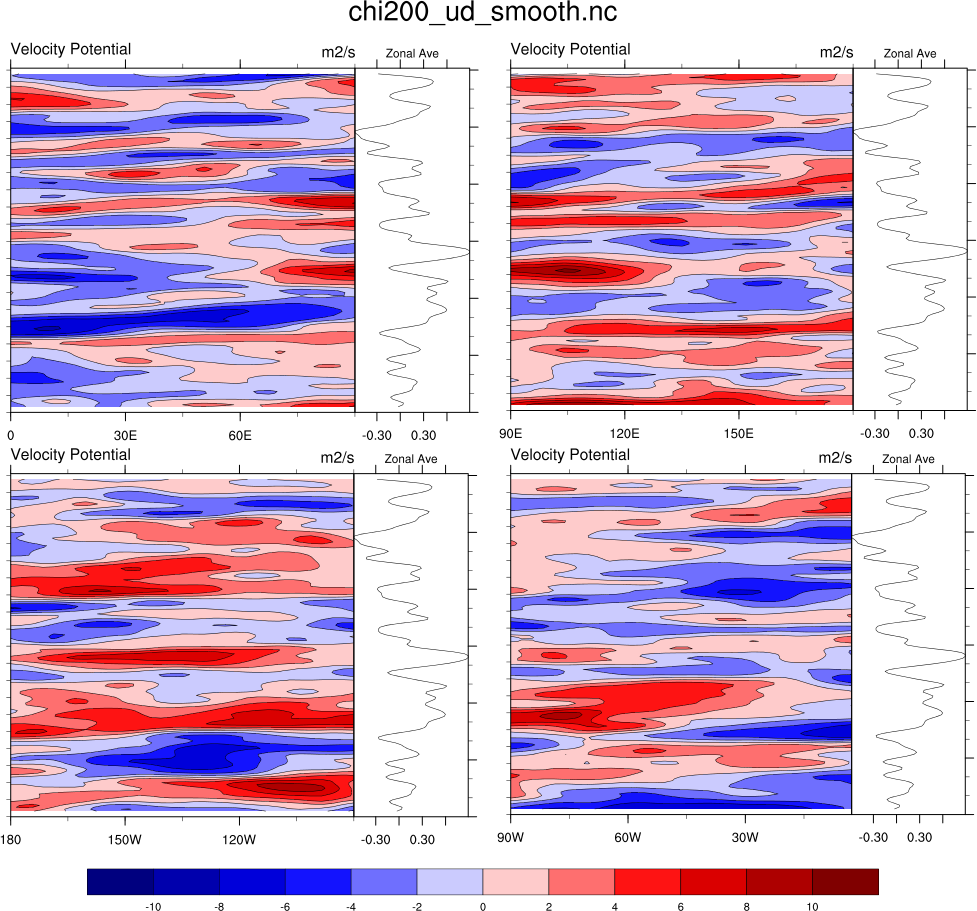
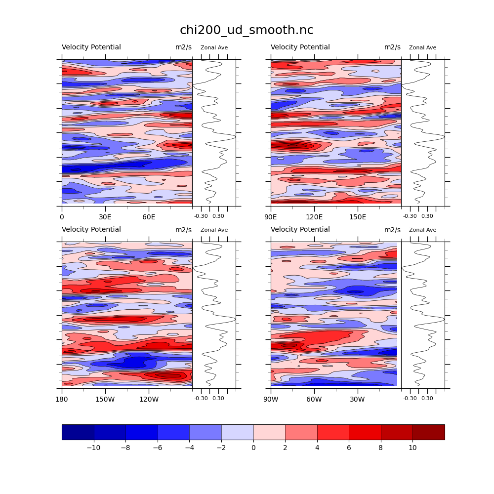
Create the four panel plot
fig = plt.figure(figsize=(10, 10))

# Create a three by two grid to hold the four plots and the colorbar
outer_grid = gridspec.GridSpec(
    3, 2, figure=fig, hspace=0.35, height_ratios=[0.475, 0.475, 0.05]
)

# Create an array to hold the internal gridspecs
inner_grids = np.empty(4, dtype=gridspec.GridSpec)

# Create the gridspecs for each of the four plots
for i in range(0, 4):
    inner_grids[i] = gridspec.GridSpecFromSubplotSpec(
        1, 2, subplot_spec=outer_grid[i], wspace=0, width_ratios=[0.75, 0.25]
    )
make_subplot(fig, inner_grids[0], [0, 90])
make_subplot(fig, inner_grids[1], [90, 180])
make_subplot(fig, inner_grids[2], [180, 270])
color_mappable = make_subplot(fig, inner_grids[3], [270, 360])

# Create axes for colorbar and then draw colorbar
cax = fig.add_subplot(outer_grid[2, :])
plt.colorbar(
    color_mappable,
    cax=cax,
    ticks=np.arange(-10, 12, 2),
    orientation='horizontal',
    drawedges=True,
)

# Add figure title
fig.suptitle(filename, fontsize=18, y=0.95)
plt.show()
Total running time of the script: (0 minutes 0.506 seconds)