

Note
Go to the end to download the full example code.
NCL_lb_2.py#
- This script illustrates the following concepts:
Making a vertical colorbar
Changing the colorbar labels
Setting color maps using the new standard
- See following URLs to see the reproduced NCL plot & script:
Original NCL script: https://www.ncl.ucar.edu/Applications/Scripts/lb_2.ncl
Original NCL plot: https://www.ncl.ucar.edu/Applications/Images/lb_2_lg.png
Import packages:
import numpy as np
import xarray as xr
import cartopy.crs as ccrs
import matplotlib.pyplot as plt
import cmaps

import geocat.datafiles as gdf
import geocat.viz as gv
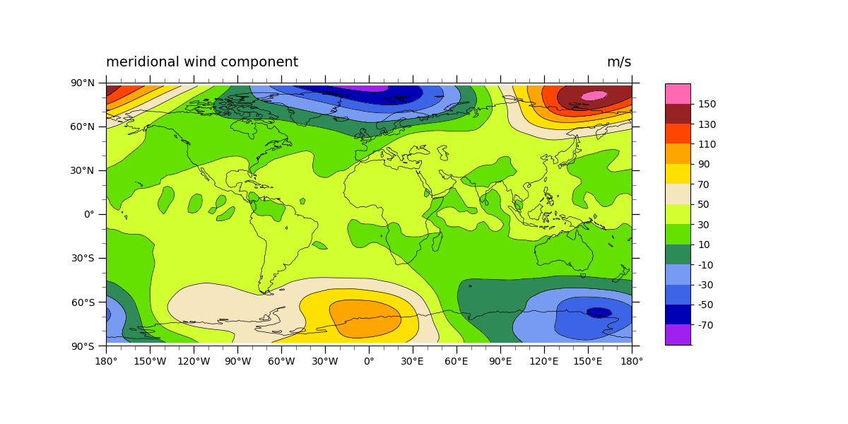
Read in data:
# Open a netCDF data file using xarray default engine and load the data into xarrays
ds = xr.open_dataset(gdf.get("netcdf_files/atmos.nc"), decode_times=False)
# Extract variable
v = ds.V.isel(time=0, lev=3)

# Fix the artifact of not-shown-data around 0 and 360-degree longitudes
wrap_v = gv.xr_add_cyclic_longitudes(v, "lon")
Plot:
# Generate figure (set its size (width, height) in inches)
fig = plt.figure(figsize=(12, 6))

# Generate axes using Cartopy and draw coastlines
ax = plt.axes(projection=ccrs.PlateCarree())
ax.coastlines(linewidths=0.5)

# Import an NCL colormap
newcmp = cmaps.wgne15

# Contourf-plot data (for filled contours)
a = wrap_v.plot.contourf(
    levels=np.arange(-24, 25, 4), cmap=newcmp, add_colorbar=False, add_labels=False
)
# Contour-plot data (for borderlines)
wrap_v.plot.contour(
    levels=np.arange(-24, 25, 4), linewidths=0.5, cmap='black', add_labels=False
)

# Add vertical colorbar
cbar = plt.colorbar(
    a,
    ticks=np.arange(-20, 25, 4),
    shrink=0.8,
    aspect=10,
    extendrect=True,
    extendfrac='auto',
)

# Change the colorbar tick labels
clabels = np.arange(-70, 151, 20)
cbar.ax.set_yticklabels(clabels)

# Use geocat.viz.util convenience function to set axes limits & tick values without calling several matplotlib functions
gv.set_axes_limits_and_ticks(
    ax,
    ylim=(-90, 90),
    xticks=np.linspace(-180, 180, 13),
    yticks=np.linspace(-90, 90, 7),
)

# Use geocat.viz.util convenience function to add minor and major tick lines
gv.add_major_minor_ticks(ax, labelsize=10)

# Use geocat.viz.util convenience function to make plots look like NCL plots by using latitude, longitude tick labels
gv.add_lat_lon_ticklabels(ax)

# Use geocat.viz.util convenience function to add titles to left and right of the plot axis.
gv.set_titles_and_labels(
    ax,
    lefttitle="meridional wind component",
    lefttitlefontsize=14,
    righttitle="m/s",
    righttitlefontsize=14,
    xlabel="",
    ylabel="",
)

# Show the plot
plt.show()
Total running time of the script: (0 minutes 0.338 seconds)