

Note
Go to the end to download the full example code.
NCL_panel_6.py#
- This script illustrates the following concepts:
Paneling four plots on a page
Adding white space around paneled plots
- See following URLs to see the reproduced NCL plot & script:
Original NCL script: https://www.ncl.ucar.edu/Applications/Scripts/panel_6.ncl
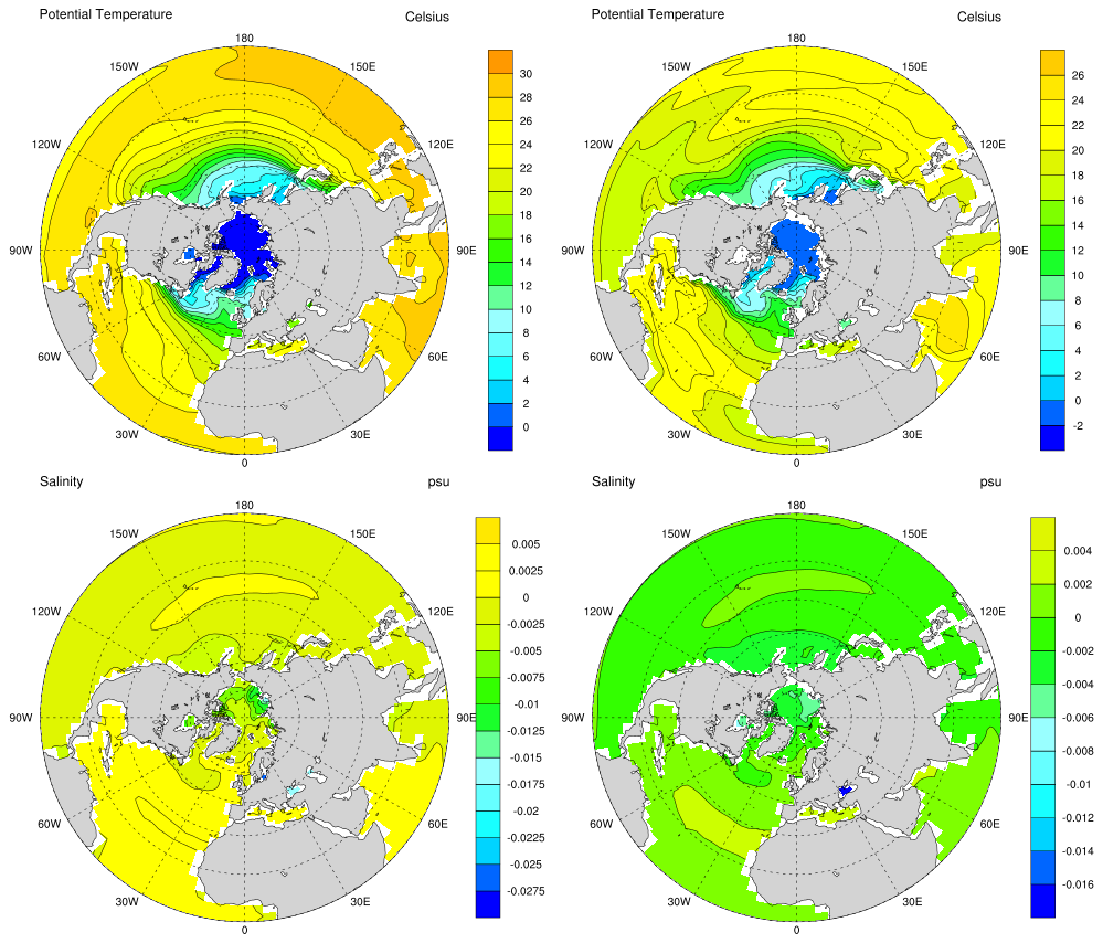
Original NCL plot: https://www.ncl.ucar.edu/Applications/Images/panel_6_1_lg.png and https://www.ncl.ucar.edu/Applications/Images/panel_6_2_lg.png
- Note:
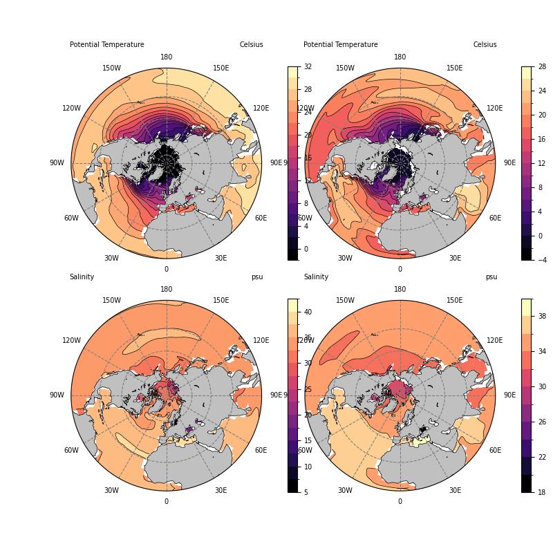
A different colormap was used in this example than in the NCL example because rainbow colormaps do not translate well to black and white formats, are not accessible for individuals affected by color blindness, and vary widely in how they are perceived by different people. See this example for more information on choosing colormaps.
Import packages:
import cartopy.crs as ccrs
import cartopy.feature as cfeature
import matplotlib.pyplot as plt
import matplotlib.ticker as mticker
import matplotlib.contour as mcontour
from mpl_toolkits.axes_grid1.inset_locator import inset_axes
import numpy as np
import xarray as xr

import geocat.datafiles as gdf
import geocat.viz as gv
Read in data:
# Open a netCDF data file using xarray default engine and load the data into xarrays
ds = xr.open_dataset(gdf.get("netcdf_files/h_avg_Y0191_D000.00.nc"), decode_times=False)

data0 = ds.T.isel(time=0, drop=True).isel(z_t=0, drop=True)
data1 = ds.T.isel(time=0, drop=True).isel(z_t=5, drop=True)
data2 = ds.S.isel(time=0, drop=True).isel(z_t=0, drop=True)
data3 = ds.S.isel(time=0, drop=True).isel(z_t=3, drop=True)

data0 = gv.xr_add_cyclic_longitudes(data0, "lon_t")
data1 = gv.xr_add_cyclic_longitudes(data1, "lon_t")
data2 = gv.xr_add_cyclic_longitudes(data2, "lon_t")
data3 = gv.xr_add_cyclic_longitudes(data3, "lon_t")

data = [[data0, data1], [data2, data3]]
Plot without extra whitespace:
projection = ccrs.NorthPolarStereo()
fig, axs = plt.subplots(2, 2, figsize=(8, 8), subplot_kw=dict(projection=projection))

# Format axes and inset axes for color bars
cax = np.empty((2, 2), dtype=plt.Axes)
for row in range(0, 2):
    for col in range(0, 2):
        # Add map features
        axs[row][col].add_feature(cfeature.LAND, facecolor='silver', zorder=2)
        axs[row][col].add_feature(cfeature.COASTLINE, linewidth=0.5, zorder=3)
        axs[row][col].add_feature(
            cfeature.LAKES, linewidth=0.5, edgecolor='black', facecolor='None', zorder=4
        )

        # Add gridlines
        gl = axs[row][col].gridlines(
            ccrs.PlateCarree(),
            draw_labels=False,
            color='gray',
            linestyle="--",
            zorder=5,
        )
        gl.xlocator = mticker.FixedLocator(np.linspace(-180, 150, 12))

        # Add latitude and longitude labels
        x = np.arange(0, 360, 30)
        # Array specifying 8S, this makes an offset from the circle boundary
        # which lies at the equator
        y = np.full_like(x, -8)
        labels = [
            '0',
            '30E',
            '60E',
            '90E',
            '120E',
            '150E',
            '180',
            '150W',
            '120W',
            '90W',
            '60W',
            '30W',
        ]
        for x, y, label in zip(x, y, labels):
            if label == '180':
                axs[row][col].text(
                    x,
                    y,
                    label,
                    fontsize=7,
                    horizontalalignment='center',
                    verticalalignment='top',
                    transform=ccrs.Geodetic(),
                )
            elif label == '0':
                axs[row][col].text(
                    x,
                    y,
                    label,
                    fontsize=7,
                    horizontalalignment='center',
                    verticalalignment='bottom',
                    transform=ccrs.Geodetic(),
                )
            else:
                axs[row][col].text(
                    x,
                    y,
                    label,
                    fontsize=7,
                    horizontalalignment='center',
                    verticalalignment='center',
                    transform=ccrs.Geodetic(),
                )

        # Set boundary of plot to be circular
        gv.set_map_boundary(axs[row][col], (-180, 180), (0, 90), south_pad=1)
        # Create inset axes for color bars
        cax[row][col] = inset_axes(
            axs[row][col],
            width='5%',
            height='100%',
            loc='lower right',
            bbox_to_anchor=(0.175, 0, 1, 1),
            bbox_transform=axs[row][col].transAxes,
            borderpad=0,
        )
# Import color map
cmap = "magma"

# Plot filled contours
contour = np.empty((2, 2), dtype=mcontour.ContourSet)
contour[0][0] = data[0][0].plot.contourf(
    ax=axs[0][0],
    cmap=cmap,
    levels=np.arange(-2, 34, 2),
    transform=ccrs.PlateCarree(),
    add_colorbar=False,
    zorder=0,
)
contour[0][1] = data[0][1].plot.contourf(
    ax=axs[0][1],
    cmap=cmap,
    levels=np.arange(-4, 30, 2),
    transform=ccrs.PlateCarree(),
    add_colorbar=False,
    zorder=0,
)
contour[1][0] = data[1][0].plot.contourf(
    ax=axs[1][0],
    cmap=cmap,
    levels=15,
    transform=ccrs.PlateCarree(),
    add_colorbar=False,
    zorder=0,
)
contour[1][1] = data[1][1].plot.contourf(
    ax=axs[1][1],
    cmap=cmap,
    levels=12,
    transform=ccrs.PlateCarree(),
    add_colorbar=False,
    zorder=0,
)

# Plot contour lines
data[0][0].plot.contour(
    ax=axs[0][0],
    colors='black',
    linestyles='solid',
    linewidths=0.5,
    levels=np.arange(-2, 34, 2),
    transform=ccrs.PlateCarree(),
    zorder=1,
)
data[0][1].plot.contour(
    ax=axs[0][1],
    colors='black',
    linestyles='solid',
    linewidths=0.5,
    levels=np.arange(-4, 30, 2),
    transform=ccrs.PlateCarree(),
    zorder=1,
)
data[1][0].plot.contour(
    ax=axs[1][0],
    colors='black',
    linestyles='solid',
    linewidths=0.5,
    levels=15,
    transform=ccrs.PlateCarree(),
    zorder=1,
)
data[1][1].plot.contour(
    ax=axs[1][1],
    colors='black',
    linestyles='solid',
    linewidths=0.5,
    levels=12,
    transform=ccrs.PlateCarree(),
    zorder=1,
)

# Create colorbars and reduce the font size
for row in range(0, 2):
    for col in range(0, 2):
        cbar = plt.colorbar(contour[row][col], cax=cax[row][col])
        cbar.ax.tick_params(labelsize=7)

# Format titles for each subplot
for row in range(0, 2):
    for col in range(0, 2):
        axs[row][col].set_title(
            data[row][col].long_name, loc='left', fontsize=7, pad=20
        )
        axs[row][col].set_title(data[row][col].units, loc='right', fontsize=7, pad=20)

plt.show()
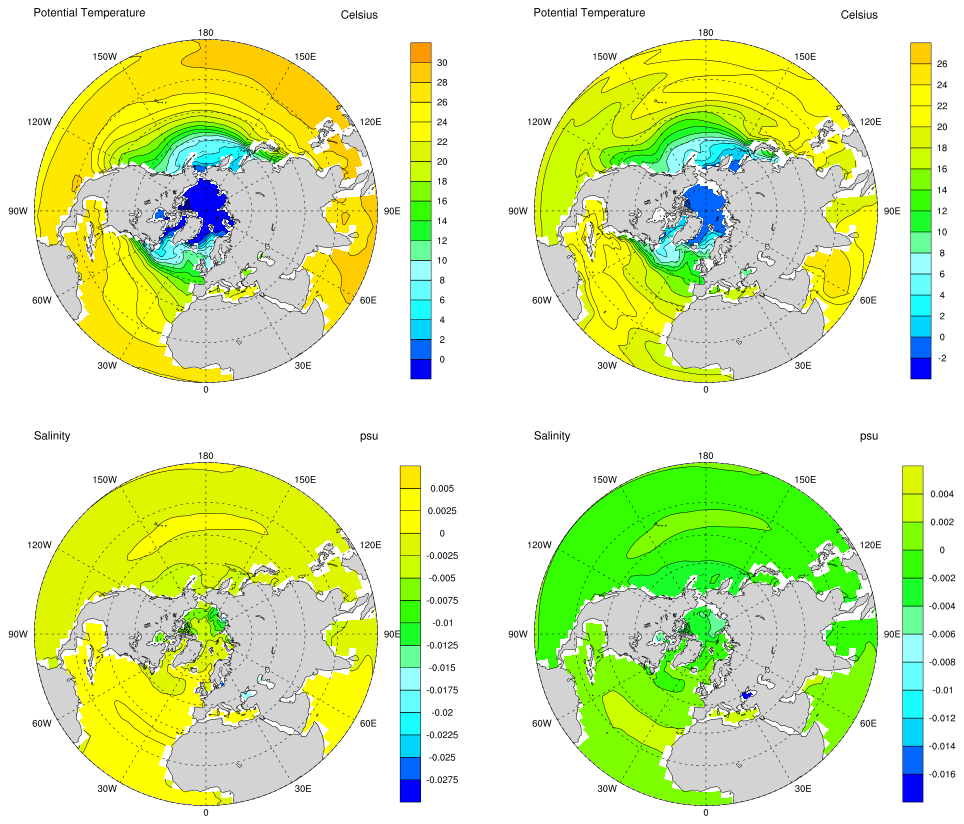
Plot with extra whitespace:
The keyword argument gridspec_kw accepts a dictionary with keywords passed
to the GridSpec constructor used to create the grid the subplots are placed
on. See the documentation for GridSpec
for more information on how to manipulate the gridlayout.
projection = ccrs.NorthPolarStereo()
fig, axs = plt.subplots(
    2,
    2,
    figsize=(8, 8),
    gridspec_kw=(dict(wspace=0.5)),
    subplot_kw=dict(projection=projection),
)
#
# Everything beyond this is the same code for the example without extra white space
#

# Format axes and inset axes for color bars
cax = np.empty((2, 2), dtype=plt.Axes)
for row in range(0, 2):
    for col in range(0, 2):
        # Add map features
        axs[row][col].add_feature(cfeature.LAND, facecolor='silver', zorder=2)
        axs[row][col].add_feature(cfeature.COASTLINE, linewidth=0.5, zorder=3)
        axs[row][col].add_feature(
            cfeature.LAKES, linewidth=0.5, edgecolor='black', facecolor='None', zorder=4
        )

        # Add gridlines
        gl = axs[row][col].gridlines(
            ccrs.PlateCarree(),
            draw_labels=False,
            color='gray',
            linestyle="--",
            zorder=5,
        )
        gl.xlocator = mticker.FixedLocator(np.linspace(-180, 150, 12))

        # Add latitude and longitude labels
        x = np.arange(0, 360, 30)
        # Array specifying 8S, this makes an offset from the circle boundary
        # which lies at the equator
        y = np.full_like(x, -8)
        labels = [
            '0',
            '30E',
            '60E',
            '90E',
            '120E',
            '150E',
            '180',
            '150W',
            '120W',
            '90W',
            '60W',
            '30W',
        ]
        for x, y, label in zip(x, y, labels):
            if label == '180':
                axs[row][col].text(
                    x,
                    y,
                    label,
                    fontsize=7,
                    horizontalalignment='center',
                    verticalalignment='top',
                    transform=ccrs.Geodetic(),
                )
            elif label == '0':
                axs[row][col].text(
                    x,
                    y,
                    label,
                    fontsize=7,
                    horizontalalignment='center',
                    verticalalignment='bottom',
                    transform=ccrs.Geodetic(),
                )
            else:
                axs[row][col].text(
                    x,
                    y,
                    label,
                    fontsize=7,
                    horizontalalignment='center',
                    verticalalignment='center',
                    transform=ccrs.Geodetic(),
                )

        # Set boundary of plot to be circular
        gv.set_map_boundary(axs[row][col], (-180, 180), (0, 90), south_pad=1)
        # Create inset axes for color bars
        cax[row][col] = inset_axes(
            axs[row][col],
            width='5%',
            height='100%',
            loc='lower right',
            bbox_to_anchor=(0.175, 0, 1, 1),
            bbox_transform=axs[row][col].transAxes,
            borderpad=0,
        )
# Import color map
cmap = "magma"

# Plot filled contours
contour = np.empty((2, 2), dtype=mcontour.ContourSet)
contour[0][0] = data[0][0].plot.contourf(
    ax=axs[0][0],
    cmap=cmap,
    levels=np.arange(-2, 34, 2),
    transform=ccrs.PlateCarree(),
    add_colorbar=False,
    zorder=0,
)
contour[0][1] = data[0][1].plot.contourf(
    ax=axs[0][1],
    cmap=cmap,
    levels=np.arange(-4, 30, 2),
    transform=ccrs.PlateCarree(),
    add_colorbar=False,
    zorder=0,
)
contour[1][0] = data[1][0].plot.contourf(
    ax=axs[1][0],
    cmap=cmap,
    levels=15,
    transform=ccrs.PlateCarree(),
    add_colorbar=False,
    zorder=0,
)
contour[1][1] = data[1][1].plot.contourf(
    ax=axs[1][1],
    cmap=cmap,
    levels=12,
    transform=ccrs.PlateCarree(),
    add_colorbar=False,
    zorder=0,
)

# Plot contour lines
data[0][0].plot.contour(
    ax=axs[0][0],
    colors='black',
    linestyles='solid',
    linewidths=0.5,
    levels=np.arange(-2, 34, 2),
    transform=ccrs.PlateCarree(),
    zorder=1,
)
data[0][1].plot.contour(
    ax=axs[0][1],
    colors='black',
    linestyles='solid',
    linewidths=0.5,
    levels=np.arange(-4, 30, 2),
    transform=ccrs.PlateCarree(),
    zorder=1,
)
data[1][0].plot.contour(
    ax=axs[1][0],
    colors='black',
    linestyles='solid',
    linewidths=0.5,
    levels=15,
    transform=ccrs.PlateCarree(),
    zorder=1,
)
data[1][1].plot.contour(
    ax=axs[1][1],
    colors='black',
    linestyles='solid',
    linewidths=0.5,
    levels=12,
    transform=ccrs.PlateCarree(),
    zorder=1,
)

# Create colorbars and reduce the font size
for row in range(0, 2):
    for col in range(0, 2):
        cbar = plt.colorbar(contour[row][col], cax=cax[row][col])
        cbar.ax.tick_params(labelsize=7)

# Format titles for each subplot
for row in range(0, 2):
    for col in range(0, 2):
        axs[row][col].set_title(
            data[row][col].long_name, loc='left', fontsize=7, pad=20
        )
        axs[row][col].set_title(data[row][col].units, loc='right', fontsize=7, pad=20)

plt.show()
Total running time of the script: (0 minutes 4.266 seconds)