

Note
Go to the end to download the full example code.
NCL_panel_41.py#
- This script illustrates the following concepts:
Paneling six plots on a page
Adding a common title to paneled plots using a custom method
Adding left, center, and right subtitles to a panel plot
Using a different color scheme to follow best practices for visualizations
- See following URLs to see the reproduced NCL plot & script:
Original NCL script: https://www.ncl.ucar.edu/Applications/Scripts/panel_41.ncl
Original NCL plot: https://www.ncl.ucar.edu/Applications/Images/panel_41_lg.png
Import packages:
import cartopy.crs as ccrs
import cartopy.feature as cfeature
from cartopy.mpl.gridliner import LongitudeFormatter, LatitudeFormatter
import matplotlib.pyplot as plt
import matplotlib.cm as cm
import matplotlib.colors as mcolors
import numpy as np
import xarray as xr

import geocat.datafiles as gdf
import geocat.viz as gv
Helper function to convert date into 03-Oct 2000 (00H) format
def convert_date(date):
    months = [
        'Jan',
        'Feb',
        'Mar',
        'Apr',
        'May',
        'Jun',
        'Jul',
        'Aug',
        'Sept',
        'Oct',
        'Nov',
        'Dec',
    ]
    year = date[:4]
    month = months[int(date[5:7]) - 1]
    day = date[8:10]
    hour = date[11:13]
    return day + "-" + month + " " + year + " (" + hour + "H)"
Helper function to create and format subplots
def add_axes(fig, grid_space):
    ax = fig.add_subplot(grid_space, projection=ccrs.PlateCarree())

    # Add land to the subplot
    ax.add_feature(
        cfeature.LAND, facecolor="none", edgecolor='black', linewidths=0.5, zorder=2
    )

    # Usa geocat.viz.util convenience function to set axes parameters
    gv.set_axes_limits_and_ticks(
        ax,
        ylim=(-90, 90),
        xlim=(-180, 180),
        xticks=np.arange(-180, 181, 30),
        yticks=np.arange(-90, 91, 30),
    )

    # Use geocat.viz.util convenience function to add minor and major tick lines
    gv.add_major_minor_ticks(ax, labelsize=8)

    # Use geocat.viz.util convenience function to make plots look like NCL
    # plots by using latitude, longitude tick labels
    gv.add_lat_lon_ticklabels(ax)

    # Remove the degree symbol from tick labels
    ax.yaxis.set_major_formatter(LatitudeFormatter(degree_symbol=''))
    ax.xaxis.set_major_formatter(LongitudeFormatter(degree_symbol=''))

    return ax
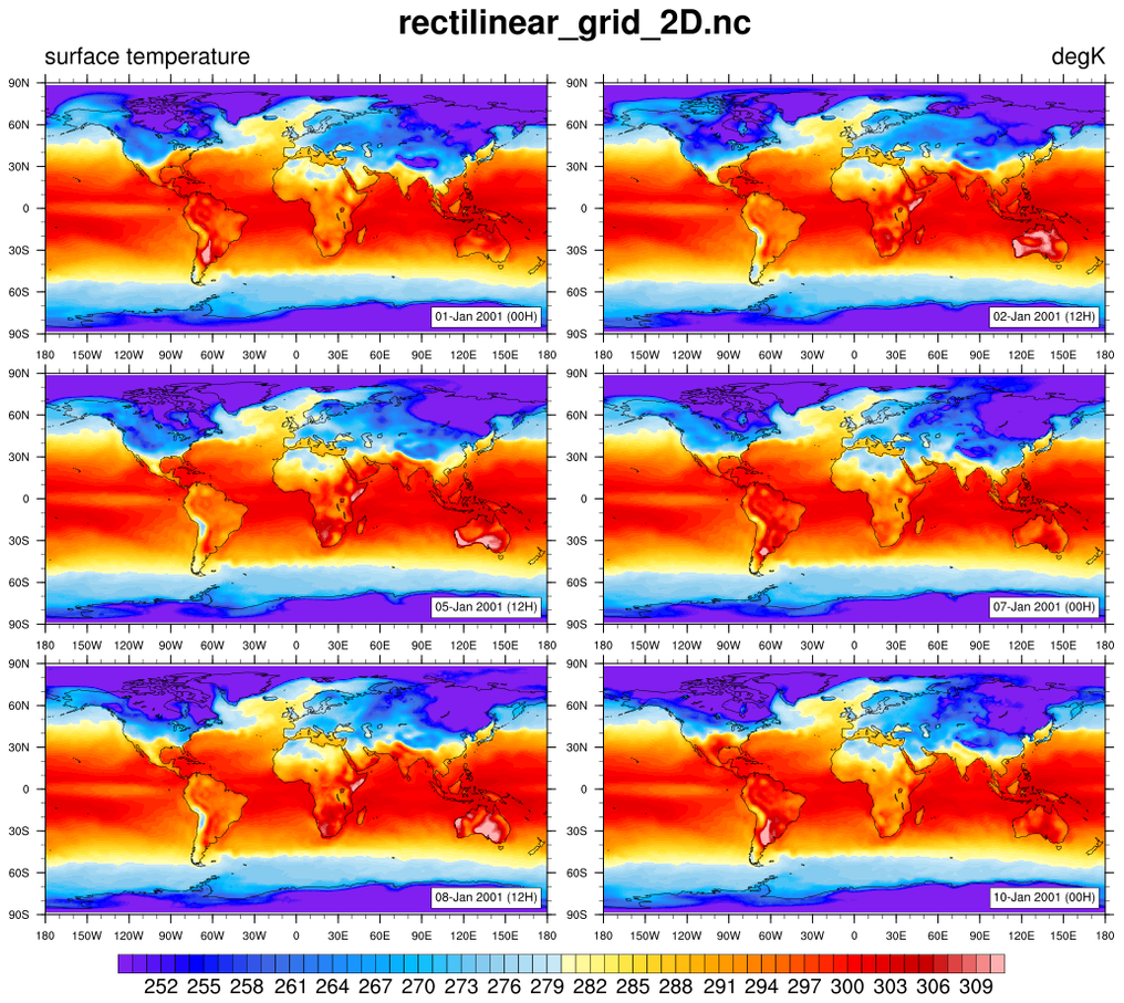
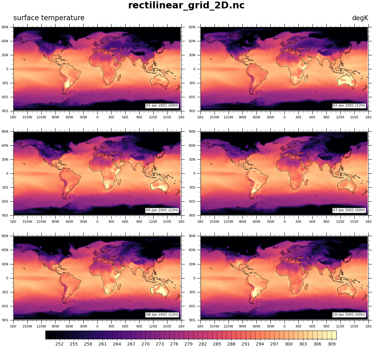
Read in data:
# Open a netCDF data file using xarray default engine and load the data into xarrays
ds = xr.open_dataset(gdf.get("netcdf_files/rectilinear_grid_2D.nc"))

# Read variables
tsurf = ds.tsurf  # surface temperature in K
date = tsurf.time
Plot
# Generate figure (set its size (width, height) in inches)
fig = plt.figure(figsize=(12, 11.2), constrained_layout=True)

# Create gridspec to hold six subplots
grid = fig.add_gridspec(ncols=2, nrows=3)

# Add the axes
ax1 = add_axes(fig, grid[0, 0])
ax2 = add_axes(fig, grid[0, 1])
ax3 = add_axes(fig, grid[1, 0])
ax4 = add_axes(fig, grid[1, 1])
ax5 = add_axes(fig, grid[2, 0])
ax6 = add_axes(fig, grid[2, 1])

# Set plot index list
plot_idxs = [0, 6, 18, 24, 30, 36]
# Set contour levels
levels = np.arange(220, 316, 1)
# Set colormap
cmap = plt.get_cmap('magma')

for i, axes in enumerate([ax1, ax2, ax3, ax4, ax5, ax6]):
    dataset = tsurf[plot_idxs[i], :, :]
    # Contourf plot data
    contour = axes.contourf(
        dataset.lon,
        dataset.lat,
        dataset.data,
        vmin=250,
        vmax=310,
        cmap=cmap,
        levels=levels,
    )
    # Add lower text box
    axes.text(
        0.98,
        0.05,
        convert_date(str(dataset.time.data)),
        horizontalalignment='right',
        transform=axes.transAxes,
        fontsize=8,
        bbox=dict(boxstyle='square, pad=0.25', facecolor='white', edgecolor='gray'),
        zorder=5,
    )

# Set colorbounds of norm
colorbounds = np.arange(249, 311, 1)
# Use cmap to create a norm and mappable for colorbar to be correctly plotted
norm = mcolors.BoundaryNorm(colorbounds, cmap.N)
mappable = cm.ScalarMappable(norm=norm, cmap=cmap)

# Add colorbar for all six plots
fig.colorbar(
    mappable,
    ax=[ax1, ax2, ax3, ax4, ax5, ax6],
    ticks=colorbounds[3:-1:3],
    drawedges=True,
    orientation='horizontal',
    shrink=0.82,
    pad=0.01,
    aspect=35,
    extendfrac='auto',
    extendrect=True,
)

# Add figure titles
fig.suptitle("rectilinear_grid_2D.nc", fontsize=22, fontweight='bold')
ax1.set_title("surface temperature", loc="left", fontsize=16, y=1.05)
ax2.set_title("degK", loc="right", fontsize=15, y=1.05)

# Show plot
plt.show()
Total running time of the script: (0 minutes 2.491 seconds)