

Note
Go to the end to download the full example code.
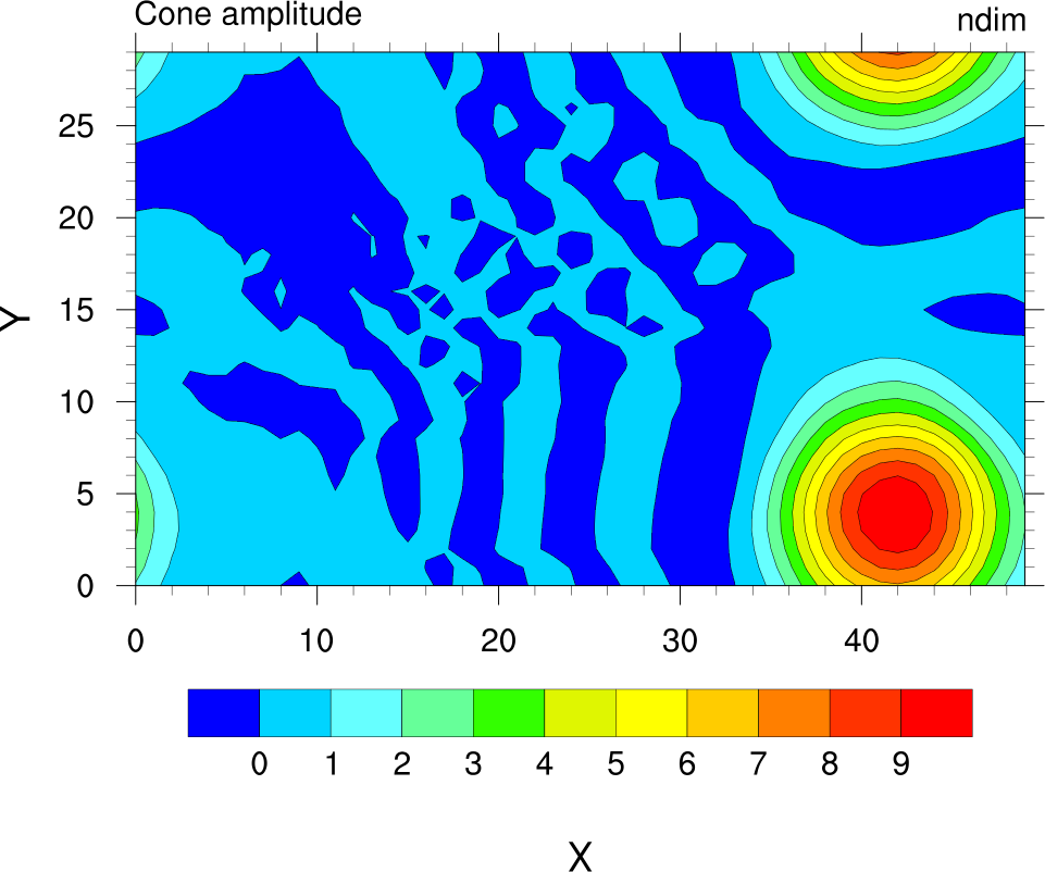
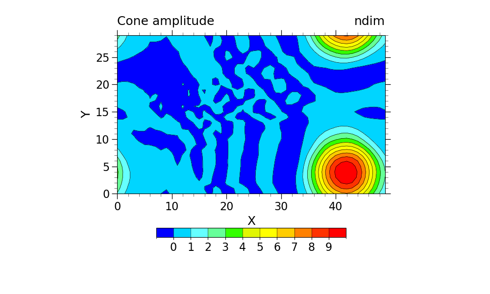
NCL_conwomap_2.py#
- This script illustrates the following concepts:
Drawing a simple filled contour plot
Selecting a different color map
Changing the size/shape of a contour plot
- See following URLs to see the reproduced NCL plot & script:
Original NCL script: https://www.ncl.ucar.edu/Applications/Scripts/conwomap_2.ncl
Original NCL plot: https://www.ncl.ucar.edu/Applications/Images/conwomap_2_lg.png
Import packages:
import numpy as np
import xarray as xr
import cartopy.crs as ccrs
import matplotlib.pyplot as plt
import cmaps

import geocat.datafiles as gdf
import geocat.viz as gv
Read in data:
# Open a netCDF data file using xarray default engine and load the data into xarrays
ds = xr.open_dataset(gdf.get("netcdf_files/cone.nc"))
u = ds.u.isel(time=4)
Plot:
# Generate figure (set its size (width, height) in inches)
plt.figure(figsize=(10, 6))

# Generate axes, using Cartopy
projection = ccrs.PlateCarree()
ax = plt.axes(projection=projection)

# Import an NCL colormap
newcmp = cmaps.gui_default

# Contourf-plot data (for filled contours)
p = u.plot.contourf(
    ax=ax,
    vmin=-1,
    vmax=10,
    levels=12,
    cmap=newcmp,
    add_colorbar=False,
    transform=projection,
    extend='neither',
    add_labels=False,
)
# Contour-plot data (for borderlines)
u.plot.contour(
    ax=ax,
    vmin=-1,
    vmax=10,
    levels=12,
    linewidths=0.5,
    colors='black',
    add_colorbar=False,
    transform=projection,
    extend='neither',
    add_labels=False,
)

# Add horizontal colorbar
cbar = plt.colorbar(p, orientation='horizontal', shrink=0.5, drawedges=True)
cbar.ax.tick_params(labelsize=16)
cbar.set_ticks(np.linspace(0, 9, 10))

# Use geocat.viz.util convenience function to set axes limits & tick values without calling several matplotlib functions
gv.set_axes_limits_and_ticks(
    ax,
    xlim=(0, 49),
    ylim=(0, 29),
    xticks=np.linspace(0, 40, 5),
    yticks=np.linspace(0, 25, 6),
)

# Use geocat.viz.util convenience function to add minor and major tick lines
gv.add_major_minor_ticks(ax, x_minor_per_major=5, y_minor_per_major=5, labelsize=16)

# Use geocat.viz.util convenience function to add titles to left and right of the plot axis.
gv.set_titles_and_labels(
    ax,
    lefttitle="Cone amplitude",
    lefttitlefontsize=18,
    righttitle="ndim",
    righttitlefontsize=18,
    xlabel="X",
    ylabel="Y",
    labelfontsize=18,
)

# Show the plot
plt.show()
Total running time of the script: (0 minutes 0.124 seconds)