

Note
Go to the end to download the full example code.
NCL_shapefiles_1.py#
- This script illustrates the following concepts:
Reading shapefiles
Plotting data from shapefiles
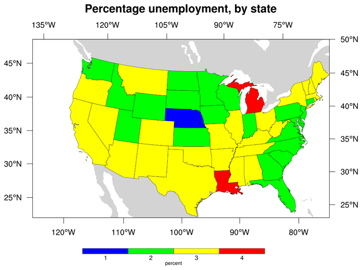
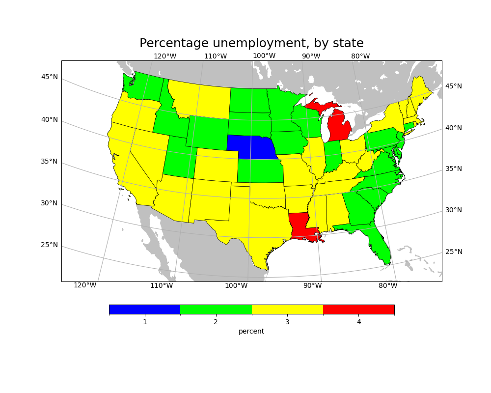
Using shapefile data to plot unemployment percentages in the U.S.
Drawing a custom colorbar on a map
Drawing filled polygons over a Lambert Conformal plot
Drawing the US with a Lambert Conformal projection
Zooming in on a particular area on a Lambert Conformal map
Centering the labels under the colorbar boxes
- See following URLs to see the reproduced NCL plot & script:
Original NCL script: https://www.ncl.ucar.edu/Applications/Scripts/shapefiles_1.ncl
Original NCL plot: https://www.ncl.ucar.edu/Applications/Images/shapefiles_1_lg.png
- Note:
At the time of making this example, there isn’t a good way to draw tick marks along with the latitude and longitude labels. We have chosen to draw gridlines to show exactly where the labels are pointing. The gridlines can be removed by calling
gl.xlines = Falseandgl.ylines = Falseafter drawing the labels.
Import packages:
import matplotlib.pyplot as plt
import matplotlib.patches as mpatches
import matplotlib.colors as colors
import matplotlib.cm as cm
import matplotlib.ticker as mticker
import shapefile as shp
import numpy as np
import cartopy.crs as ccrs
import cartopy.feature as cfeature

import geocat.datafiles as gdf
import geocat.viz as gv
Read in data:
# Open all shapefiles and associated .dbf, .shp, and .prj files
open(gdf.get("shape_files/states.dbf"), 'r')
open(gdf.get("shape_files/states.shp"), 'r')
open(gdf.get("shape_files/states.shx"), 'r')
open(gdf.get("shape_files/states.prj"), 'r')

# Open shapefiles
shapefile = shp.Reader(gdf.get("shape_files/states.dbf"))
Set color map colors and bounds
colormap = colors.ListedColormap(['blue', 'lime', 'yellow', 'red'])

colorbounds = [0.5, 1.5, 2.5, 3.5, 4.5]

norm = colors.BoundaryNorm(colorbounds, colormap.N)
Helper function to determine state color:
def color_assignment(record):
    population = record.PERSONS
    unempolyment = record.UNEMPLOY
    percent = unempolyment / population
    if 0.01 <= percent and percent < 0.02:
        return colormap.colors[0]
    elif 0.02 <= percent and percent < 0.03:
        return colormap.colors[1]
    elif 0.03 <= percent and percent < 0.04:
        return colormap.colors[2]
    elif 0.04 <= percent:
        return colormap.colors[3]
Plot:
plt.figure(figsize=(10, 8))
ax = plt.axes(
    projection=ccrs.LambertConformal(standard_parallels=(33, 45), central_longitude=-98)
)
ax.set_extent([-125, -74, 22, 50])

ax.add_feature(cfeature.LAND, color='silver', zorder=0)
ax.add_feature(cfeature.LAKES, color='white', zorder=1)

for i in range(0, len(shapefile.shapes())):
    shape = shapefile.shape(i)
    record = shapefile.record(i)
    color = color_assignment(record)
    # if a shape has multiple parts make each one a separate patch
    if len(shape.parts) > 1:
        for j in range(0, len(shape.parts)):
            start_index = shape.parts[j]
            # the last part uses the remaining points and doesn't require and end_index
            if j is (len(shape.parts) - 1):
                patch = mpatches.Polygon(
                    shape.points[start_index:],
                    facecolor=color,
                    edgecolor='black',
                    linewidth=0.5,
                    transform=ccrs.PlateCarree(),
                    zorder=2,
                )
            else:
                end_index = shape.parts[j + 1]
                patch = mpatches.Polygon(
                    shape.points[start_index:end_index],
                    facecolor=color,
                    edgecolor='black',
                    linewidth=0.5,
                    transform=ccrs.PlateCarree(),
                    zorder=2,
                )
            ax.add_patch(patch)
    else:
        patch = mpatches.Polygon(
            shape.points,
            facecolor=color,
            edgecolor='black',
            linewidth=0.5,
            transform=ccrs.PlateCarree(),
            zorder=2,
        )
        ax.add_patch(patch)

# Create colorbar
plt.colorbar(
    cm.ScalarMappable(cmap=colormap, norm=norm),
    ax=ax,
    boundaries=colorbounds,
    orientation='horizontal',
    shrink=0.75,
    ticks=[1, 2, 3, 4],
    label='percent',
    aspect=30,
    pad=0.075,
)

# Add latitude and longitude labels
gl = ax.gridlines(draw_labels=True, x_inline=False, y_inline=False)
gl.xlocator = mticker.FixedLocator(np.linspace(-120, -80, 5))
gl.ylocator = mticker.FixedLocator(np.linspace(25, 45, 5))
gl.xlabel_style = {'rotation': 0}
gl.ylabel_style = {'rotation': 0}

# Use geocat.viz.util convenience function to set titles and labels
gv.set_titles_and_labels(ax, maintitle='Percentage unemployment, by state')

plt.show()
Total running time of the script: (0 minutes 2.831 seconds)