

Note
Go to the end to download the full example code.
NCL_panel_18.py#
- This script illustrates the following concepts:
Combining two sets of paneled plots on one page
Assign color palettes to contours
Selecting a different colormap to abide by best practices. See the color examples for more information.
- See following URLs to see the reproduced NCL plot & script:
Original NCL script: http://www.ncl.ucar.edu/Applications/Scripts/panel_18.ncl
Original NCL plot: http://www.ncl.ucar.edu/Applications/Images/panel_18_lg.png
Import packages:
import cartopy.crs as ccrs
from cartopy.mpl.gridliner import LongitudeFormatter, LatitudeFormatter
import matplotlib.pyplot as plt
import matplotlib.gridspec as gridspec
import numpy as np
import xarray as xr
import cmaps

import geocat.datafiles as gdf
import geocat.viz as gv
Read in data:
# Open a netCDF data file using xarray default engine and load the data into
# xarrays
ds = xr.open_dataset(
    gdf.get("netcdf_files/TS.cam3.toga_ENS.1950-2000.nc"), decode_times=False
)

# Fix the artifact of not-shown-data around 0 and 360-degree longitudes
TS = gv.xr_add_cyclic_longitudes(ds.TS, "lon")

# Extract variables from data
yr0 = TS[12, :, :]
yr1 = TS[600, :, :]
yr0 = yr0 - 273.15  # convert to degree C
yr1 = yr1 - 273.15  # convert to degree C

# Calculate the difference
diff = yr1 - yr0
Print out a formatted message; note the starting ‘f’ for the string.
print(f" min= {diff.min().data} max={diff.min().data}")
min= -7.3148040771484375 max=-7.3148040771484375
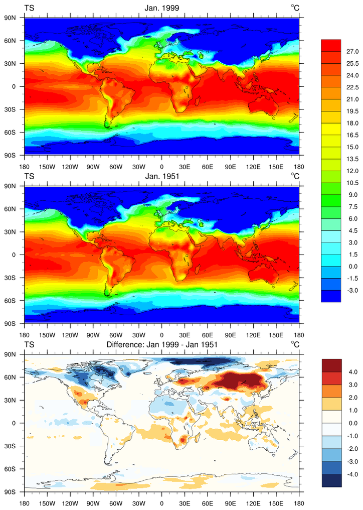
Plot:
fig = plt.figure(figsize=(8, 12))

grid = gridspec.GridSpec(nrows=3, ncols=1, figure=fig)

# Choose the map projection
proj = ccrs.PlateCarree()

# Add the subplots
ax1 = fig.add_subplot(grid[0], projection=proj)  # upper cell of grid
ax2 = fig.add_subplot(grid[1], projection=proj)  # middle cell of grid
ax3 = fig.add_subplot(grid[2], projection=proj)  # lower cell of grid

# Customize plots to match NCL standard format
for ax, title in [
    (ax1, 'Jan. 1999'),
    (ax2, 'Jan. 1951'),
    (ax3, 'Difference: Jan 1999 - Jan 1951'),
]:
    # Use geocat.viz.util convenience function to set axes tick values
    gv.set_axes_limits_and_ticks(
        ax=ax,
        xlim=(-180, 180),
        ylim=(-90, 90),
        xticks=np.linspace(-180, 180, 13),
        yticks=np.linspace(-90, 90, 7),
    )

    # Use geocat.viz.util convenience function to make plots look like NCL
    # plots by using latitude, longitude tick labels
    gv.add_lat_lon_ticklabels(ax)

    # Remove the degree symbol from tick labels
    ax.yaxis.set_major_formatter(LatitudeFormatter(degree_symbol=''))
    ax.xaxis.set_major_formatter(LongitudeFormatter(degree_symbol=''))

    # Use geocat.viz.util convenience function to add minor and major ticks
    gv.add_major_minor_ticks(ax)

    # Draw coastlines
    ax.coastlines(linewidth=0.5)

    # Use geocat.viz.util convenience function to set titles
    gv.set_titles_and_labels(
        ax, lefttitle='TS', righttitle='°C', lefttitlefontsize=10, righttitlefontsize=10
    )
    # Add center title
    ax.set_title(title, loc='center', y=1.04, fontsize=10)

# Import colormaps
newcmp = 'magma'
newcmp2 = cmaps.BlueWhiteOrangeRed

# Plot data
C = ax1.contourf(
    yr1['lon'],
    yr1['lat'],
    yr1.data,
    levels=np.arange(-3, 28, 1.5),
    cmap=newcmp,
    extend='both',
)
ax2.contourf(
    yr0['lon'],
    yr0['lat'],
    yr0.data,
    levels=np.arange(-3, 28, 1.5),
    cmap=newcmp,
    extend='both',
)
C_2 = ax3.contourf(
    diff['lon'],
    diff['lat'],
    diff.data,
    levels=np.arange(-4.0, 5, 1.0),
    cmap=newcmp2,
    extend='both',
)

# Add colorbars
# By specifying two axes for `ax` the colorbar will span both of them
cab1 = plt.colorbar(
    C,
    ax=[ax1, ax2],
    ticks=np.arange(-3, 28, 1.5),
    extendrect=True,
    extendfrac='auto',
    shrink=0.85,
    aspect=13,
    drawedges=True,
)
cab2 = plt.colorbar(
    C_2,
    ax=ax3,
    ticks=range(-4, 5, 1),
    extendrect=True,
    extendfrac='auto',
    shrink=0.85,
    aspect=5.5,
    drawedges=True,
    format='%.1f',
)

# Remove colorbar tick marks and adjust label spacing
for cab in [cab1, cab2]:
    cab.ax.yaxis.set_tick_params(pad=10, length=0)

# Generate plot
plt.show()
Total running time of the script: (0 minutes 5.103 seconds)