

Note
Go to the end to download the full example code.
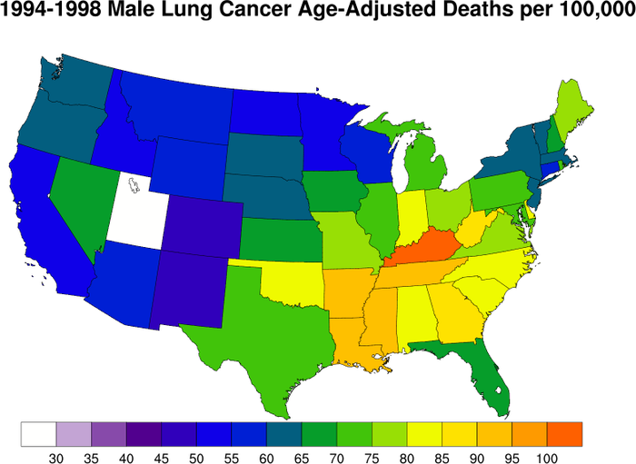
NCL_maponly_6.py#
- This script illustrates the following concepts:
Drawing the US with a Lambert Conformal projection
Filling each US state based on a data value
Drawing a custom labelbar
Turning off the map lat/lon grid lines
Excluding certain lakes from plotting depending on name
- See following URLs to see the reproduced NCL plot & script:
Original NCL script: https://www.ncl.ucar.edu/Applications/Scripts/maponly_6.ncl
Original NCL plot: https://www.ncl.ucar.edu/Applications/Images/maponly_6_lg.png
- Note:
A different colormap was used in this example than in the NCL example because rainbow colormaps do not translate well to black and white formats, are not accessible for individuals affected by color blindness, and vary widely in how they are perceived by different people. See this example for more information on choosing colormaps.
Import packages
import numpy as np
import cartopy.crs as ccrs
import cartopy.io.shapereader as shapereader
import matplotlib.pyplot as plt
import matplotlib.colors as colors
import matplotlib.cm as cm

import geocat.viz as gv
Read in data:
# Define data from original NCL script
data = [
    84.7,
    59.2,
    94.6,
    54.7,
    48.2,
    58.0,
    81.0,
    69.4,
    85.2,
    51.2,
    71.7,
    80.2,
    66.2,
    66.1,
    100.7,
    90.5,
    77.0,
    73.6,
    64.6,
    70.6,
    54.0,
    90.5,
    79.8,
    56.1,
    62.6,
    69.0,
    68.6,
    64.5,
    46.4,
    61.1,
    84.9,
    54.8,
    76.9,
    82.7,
    63.8,
    70.1,
    74.7,
    81.7,
    61.3,
    93.5,
    73.0,
    29.8,
    64.6,
    77.4,
    61.1,
    87.0,
    57.3,
    55.1,
]
states = [
    "Alabama",
    "Arizona",
    "Arkansas",
    "California",
    "Colorado",
    "Connecticut",
    "Delaware",
    "Florida",
    "Georgia",
    "Idaho",
    "Illinois",
    "Indiana",
    "Iowa",
    "Kansas",
    "Kentucky",
    "Louisiana",
    "Maine",
    "Maryland",
    "Massachusetts",
    "Michigan",
    "Minnesota",
    "Mississippi",
    "Missouri",
    "Montana",
    "Nebraska",
    "Nevada",
    "New Hampshire",
    "New Jersey",
    "New Mexico",
    "New York",
    "North Carolina",
    "North Dakota",
    "Ohio",
    "Oklahoma",
    "Oregon",
    "Pennsylvania",
    "Rhode Island",
    "South Carolina",
    "South Dakota",
    "Tennessee",
    "Texas",
    "Utah",
    "Vermont",
    "Virginia",
    "Washington",
    "West Virginia",
    "Wisconsin",
    "Wyoming",
]

# Combine data into a dictionary to make it easier to call
state_dict = {states[i]: data[i] for i in range(len(states))}
Plot:
# Set figure size (width, height) in inches
fig = plt.figure(figsize=(7, 5.5))

# Set axes [left, bottom, width, height] to ensure map takes up entire figure
ax = plt.axes(
    [0.02, -0.05, 0.98, 0.98], projection=ccrs.LambertConformal(), frameon=False
)

# Limit map to just show United States
ax.set_extent([-118, -75, 20, 50], ccrs.PlateCarree())

# Add inset axes (axes within pre-existing axes) to hold colorbar
axins1 = ax.inset_axes([0.0, 0.12, 0.975, 0.05])

# Download the Natural Earth shapefile for state boundaries at 10m resolution and lakes at 110m
state_shapefile = shapereader.natural_earth(
    category='cultural', resolution='10m', name='admin_1_states_provinces_lakes'
)
lake_shapefile = shapereader.natural_earth(
    category="physical", resolution="110m", name="lakes"
)

# List of lakes to exclude that would otherwise be visible within plot boundaries
exclude_list = [
    "Great Slave Lake",
    "Great Bear Lake",
    "Lake Winnipeg",
    "Lake Huron",
    "Lake Ontario",
    "Lake Michigan",
    "Lake Erie",
    "Lake Superior",
]

# Set colormap and its bounds
colormap = plt.get_cmap('magma')
colorbounds = np.linspace(25, 105, 17)

# Use colormap to create a norm and mappable for colorbar to be correctly plotted
norm = colors.BoundaryNorm(colorbounds, colormap.N)
mappable = cm.ScalarMappable(norm=norm, cmap=colormap)

# Loop through states in states file and only plot those who are a key in state_dict
for state in shapereader.Reader(state_shapefile).records():
    if state.attributes["name"] in state_dict.keys():
        # Set facecolor based on set colormap, divided by 105 to make data range from 0 to 1
        facecolor = colormap((state_dict[state.attributes["name"]] / 105))
        edgecolor = "black"

        # Plot state with correct color
        ax.add_geometries(
            [state.geometry],
            ccrs.PlateCarree(),
            facecolor=facecolor,
            edgecolor=edgecolor,
            linewidth=0.7,
        )

# Loop through lakes in lakes file and plot all except those in exclude_list
for lake in shapereader.Reader(lake_shapefile).records():
    if lake.attributes["name"] not in exclude_list:
        ax.add_geometries(
            [lake.geometry],
            crs=ccrs.PlateCarree(),
            facecolor="white",
            edgecolor="black",
            linewidth=0.7,
        )

# Create colorbar based on mapped colormap norm
fig.colorbar(
    mappable=mappable,
    cax=axins1,
    boundaries=colorbounds,
    ticks=colorbounds[1:-1],
    spacing='uniform',
    orientation='horizontal',
    drawedges=True,
    anchor=(0.1, 0.5),
)

# Use geocat.viz.util convenience function to add titles to left and right of the plot axis.
gv.set_titles_and_labels(
    ax,
    maintitle="1994-1998 Male Lung Cancer Age-Adjusted Deaths per 100,000",
    maintitlefontsize=15,
)

plt.show()

/home/docs/checkouts/readthedocs.org/user_builds/geocat-examples/conda/latest/lib/python3.14/site-packages/cartopy/io/__init__.py:242: DownloadWarning: Downloading: https://naturalearth.s3.amazonaws.com/10m_cultural/ne_10m_admin_1_states_provinces_lakes.zip
  warnings.warn(f'Downloading: {url}', DownloadWarning)
Total running time of the script: (0 minutes 3.049 seconds)