

Note
Go to the end to download the full example code.
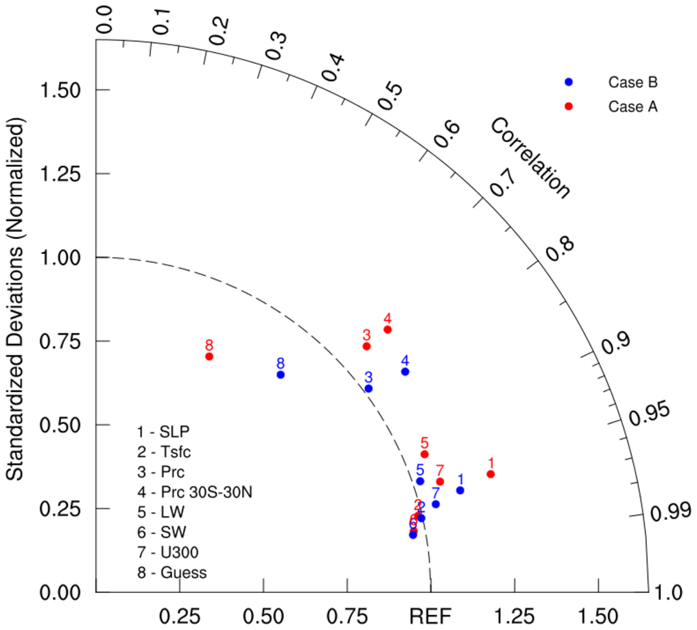
NCL_taylor_3.py#
- This script illustrates the following concepts:
Creating a basic Taylor diagram using geocat-viz Taylor diagram function.
Adding labels to a Taylor diagram
- See following URLs to see the reproduced NCL plot & script:
Original NCL script: https://www.ncl.ucar.edu/Applications/Scripts/taylor_3.ncl
Original NCL plot: https://www.ncl.ucar.edu/Applications/Images/taylor_3_lg.png
- Note: Due to limitations of matplotlib’s axisartist toolkit, we cannot include minor tick marks
between 0.9 and 0.99, as seen in the original NCL plot.
Import packages:
import matplotlib.pyplot as plt

import geocat.viz as gv
Create dummy data:
# Case A
CA_ratio = [
    1.230,
    0.988,
    1.092,
    1.172,
    1.064,
    0.966,
    1.079,
    0.781,
]  # standard deviation
CA_cc = [
    0.958,
    0.973,
    0.740,
    0.743,
    0.922,
    0.982,
    0.952,
    0.433,
]  # correlation coefficient

# Case B
CB_ratio = [
    1.129,
    0.996,
    1.016,
    1.134,
    1.023,
    0.962,
    1.048,
    0.852,
]  # standard deviation
CB_cc = [
    0.963,
    0.975,
    0.801,
    0.814,
    0.946,
    0.984,
    0.968,
    0.647,
]  # correlation coefficient
Plot:
# Create figure and TaylorDiagram instance
fig = plt.figure(figsize=(10, 10))
dia = gv.TaylorDiagram(fig=fig, label='REF')

# Add models to Taylor diagram
dia.add_model_set(CA_ratio, CA_cc, color='red', marker='o', label='Case A', fontsize=16)

dia.add_model_set(
    CB_ratio, CB_cc, color='blue', marker='o', label='Case B', fontsize=16
)

# Create model name list
namearr = ['SLP', 'Tsfc', 'Prc', 'Prc 30S-30N', 'LW', 'SW', 'U300', 'Guess']

# Add model name
dia.add_model_name(namearr, fontsize=16)

# Add figure legend
dia.add_legend(fontsize=16)

# Show the plot
plt.show()
Total running time of the script: (0 minutes 0.121 seconds)