

Note
Go to the end to download the full example code.
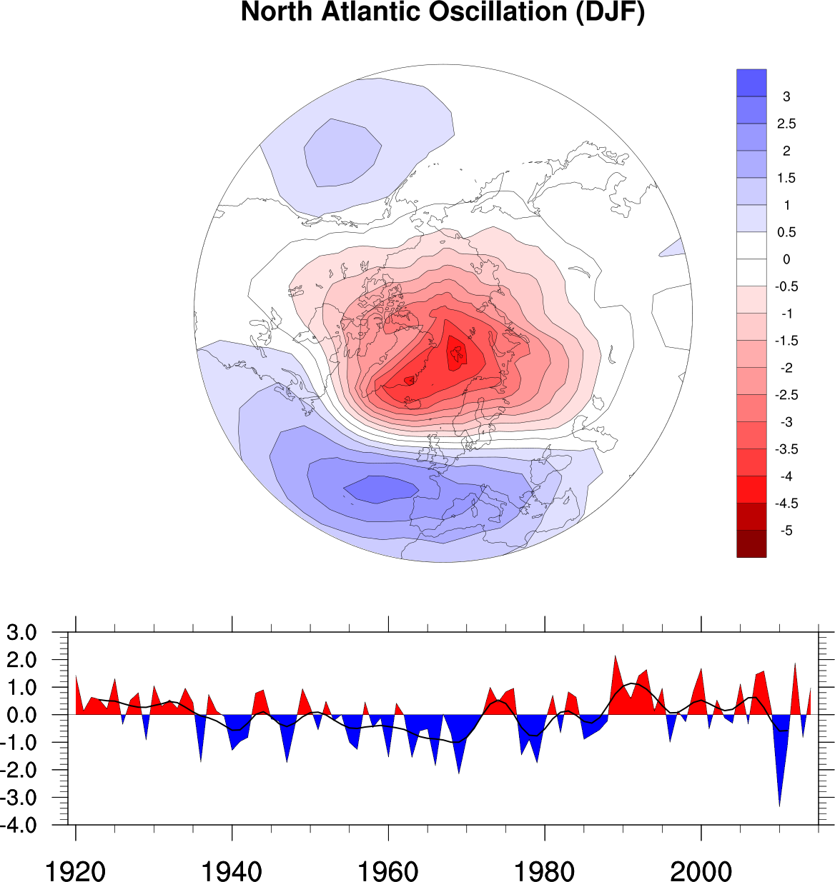
NCL_panel_9.py#
- This script illustrates the following concepts:
Paneling an XY and polar plot on the same figure
Using a blue-white-red color map
Using indexed color to set contour fill colors
Filling the areas of an XY curve above and below a reference line
Drawing a Y reference line in an XY plot
Calculating a weighted rolling average
- See following URLs to see the reproduced NCL plot & script:
Original NCL script: https://www.ncl.ucar.edu/Applications/Scripts/panel_9.ncl
Original NCL plot: https://www.ncl.ucar.edu/Applications/Images/panel_9_lg.png
Import packages:
import cartopy.crs as ccrs
import matplotlib.pyplot as plt
import matplotlib.gridspec as gridspec
import numpy as np
import xarray as xr
import cmaps

import geocat.datafiles as gdf
import geocat.viz as gv
Read in data:
# Open a netCDF data file using xarray default engine and load the data into xarrays
ds = xr.open_dataset(gdf.get("netcdf_files/nao.obs.nc"), decode_times=False)
deppat = ds.nao_djf
xyarr = ds.nao_pc_djf

# Fix the artifact of not-shown-data around -0 and 360 degree longitudes
deppat = gv.xr_add_cyclic_longitudes(deppat, 'lon')
Plot
# Format axes
fig = plt.figure(figsize=(10, 12))

# Create grid with two rows and one column
# Use `height_ratios` to adjust the relative height of the rows
grid = gridspec.GridSpec(nrows=2, ncols=1, height_ratios=[0.75, 0.25], figure=fig)

# Specify the projection
proj = ccrs.NorthPolarStereo()

# Add polar plot to figure
ax1 = plt.subplot(grid[0], projection=proj)
ax1.coastlines(linewidths=0.25)

# Use a geocat.viz.util function to make the plot boundary follow the 30N
# latitude line
gv.set_map_boundary(ax1, [-180, 180], [30, 90], south_pad=1)

# Add XY plot to figure
ax2 = plt.subplot(grid[1])

# Use geocat.viz.util convenience function to set axes tick values
gv.set_axes_limits_and_ticks(
    ax=ax2,
    xlim=(ds.time[0], ds.time[-1]),
    ylim=(-4, 3),
    yticks=np.arange(-4, 4, 1),
    yticklabels=np.arange(-4.0, 4.0, 1.0),
)

# Use geocat.viz.util convenience function to add minor and major ticks
gv.add_major_minor_ticks(ax=ax2, x_minor_per_major=4, y_minor_per_major=5, labelsize=12)

# Create list of colors based on Blue-White-Red colormap
cmap = cmaps.BlWhRe  # select colormap

# Extract colors from cmap using their indices
index = [98, 88, 73, 69, 66, 63, 60, 58, 55, 53, 50, 50, 47, 45, 42, 40, 37, 34]
color_list = [cmap[i].colors for i in index]

# Plot contour data (use `color` keyword vs `cmap` for lists of colors)
contour_fill = deppat.plot.contourf(
    ax=ax1,
    transform=ccrs.PlateCarree(),
    vmin=-5.5,
    vmax=3.5,
    levels=19,
    colors=color_list,
    add_colorbar=False,
)

# Create colorbar
plt.colorbar(
    contour_fill, ax=ax1, ticks=np.arange(-5, 3.5, 0.5), drawedges=True, format='%g'
)  # remove trailing zeros from labels

# Plot contour lines
deppat.plot.contour(
    ax=ax1,
    transform=ccrs.PlateCarree(),
    vmin=-5.5,
    vmax=3.5,
    levels=19,
    colors='black',
    linewidths=0.25,
    linestyles='solid',
)

# Add mean temperature over time data to XY plot
line = ax2.plot(xyarr.time, xyarr, linewidth=0.25, color='black')

# Retrieve data points
x, y = line[0].get_data()

# Fill above and below the zero line
ax2.fill_between(x, y, where=y > 0, color='red', interpolate=True)
ax2.fill_between(x, y, where=y < 0, color='blue', interpolate=True)

# Add zero reference line
ax2.axhline(y=0, color='black', linewidth=0.5)

# Array with weights for rolling average
weight = xr.DataArray(
    [1 / 24, 3 / 24, 5 / 24, 6 / 24, 5 / 24, 3 / 24, 1 / 24], dims=['window']
)

# Calculating the dot product of rolling average and weights
roll_avg = xyarr.rolling(time=7, center=True).construct('window').dot(weight)

# Plot rolling average
ax2.plot(xyarr.time, roll_avg, color='black', linewidth=1)

# Add figure title
fig.suptitle("North Atlantic Oscillation (DJF)", fontsize=16, fontweight='bold', y=0.95)

plt.show()
Total running time of the script: (0 minutes 0.542 seconds)