

Note
Go to the end to download the full example code.
NCL_conOncon_1.py#
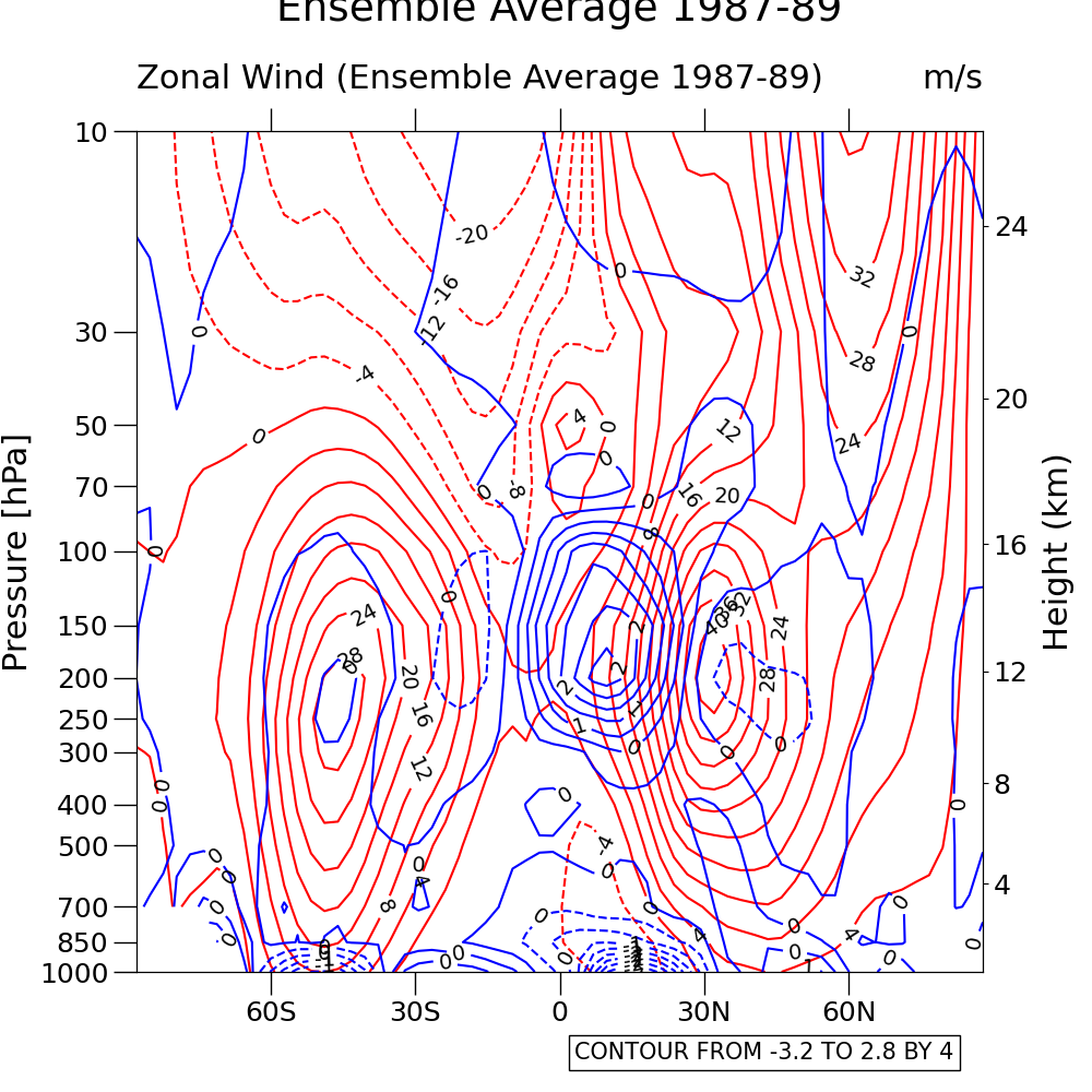
- This script illustrates the following concepts:
Drawing pressure/height contours on top of another set of contours
Drawing negative contour lines as dashed lines
Drawing the zero contour line thicker
Changing the color of a contour line
Overlaying dashed contours on solid line contours
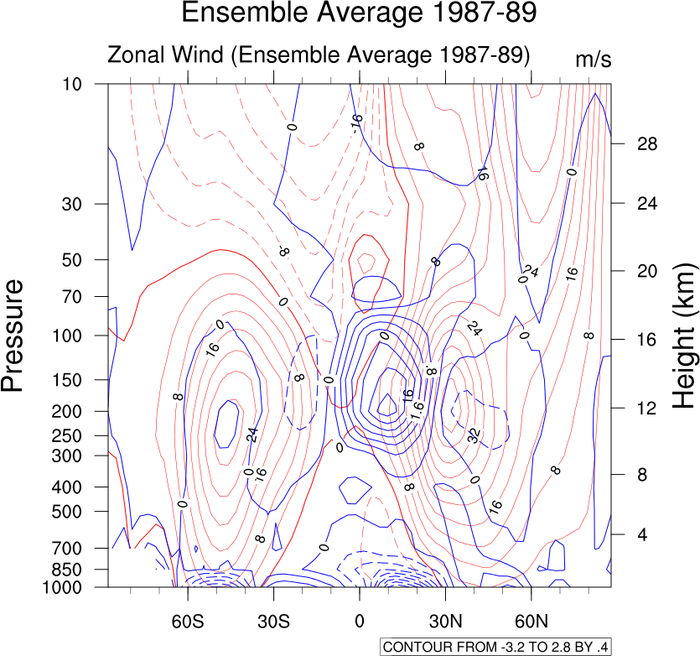
- See following URLs to see the reproduced NCL plot & script:
Original NCL script: https://www.ncl.ucar.edu/Applications/Scripts/conOncon_1.ncl
Original NCL plot: https://www.ncl.ucar.edu/Applications/Images/conOncon_1_lg.png
Import packages:
import numpy as np
import xarray as xr
import matplotlib.pyplot as plt
from matplotlib.ticker import ScalarFormatter

import geocat.datafiles as gdf
import geocat.viz as gv
Read in data:
# Open a netCDF data file using xarray default engine and load the data into xarrays
ds = xr.open_dataset(gdf.get("netcdf_files/mxclim.nc"))
# Extract variables
U = ds.U[0, :, :]
V = ds.V[0, :, :]
Plot:
# Generate figure (set its size (width, height) in inches) and axes
fig = plt.figure(figsize=(10, 10))
ax = plt.gca()

# Set y-axis to have log-scale
plt.yscale('log')

# Contour-plot U-data
p = U.plot.contour(ax=ax, levels=27, colors='red', extend='neither')
ax.clabel(p, fmt='%d', inline=1, fontsize=14, colors='k')

# Contour-plot V-data
p = V.plot.contour(ax=ax, levels=20, colors='blue', extend='neither')
ax.clabel(p, fmt='%d', inline=1, fontsize=14, colors='k')

# Use geocat-viz utility function to add minor ticks to x-axis
gv.add_major_minor_ticks(ax, x_minor_per_major=3, y_minor_per_major=0)

# Use geocat.viz.util convenience function to set axes tick values
# Set y-lim inorder for y-axis to have descending values
gv.set_axes_limits_and_ticks(
    ax,
    xticks=np.linspace(-60, 60, 5),
    xticklabels=['60S', '30S', '0', '30N', '60N'],
    ylim=ax.get_ylim()[::-1],
    yticks=U["lev"],
)

# Change formatter or else we tick values formatted in exponential form
ax.yaxis.set_major_formatter(ScalarFormatter())

# Set font size for y-axis, turn off minor ticks
ax.yaxis.label.set_size(22)

# Adjust length and width of tick marks for left and right y-axis
ax.tick_params('both', length=15, width=1, which='major', labelsize=18)
ax.tick_params('x', length=7, width=0.6, which='minor')

# Use geocat.viz.util convenience function to add titles to left and right of the plot axis.
gv.set_titles_and_labels(
    ax,
    maintitle="Ensemble Average 1987-89",
    maintitlefontsize=25,
    lefttitle=U.long_name,
    lefttitlefontsize=22,
    righttitle=U.units,
    righttitlefontsize=22,
    xlabel="",
)

# Create second y-axis to show geo-potential height.
axRHS = gv.add_height_from_pressure_axis(
    ax, heights=np.arange(4, 28, 4), ticklabelsize=18, axislabelsize=22
)

# Add figure label
fig.text(
    0.7,
    0.03,
    "CONTOUR FROM -3.2 TO 2.8 BY 4",
    horizontalalignment='center',
    fontsize=15,
    bbox=dict(facecolor='none', edgecolor='k'),
)

# Show the plot
plt.show()
Total running time of the script: (0 minutes 0.424 seconds)