
Note
Go to the end to download the full example code
NCL_vector_5.py#
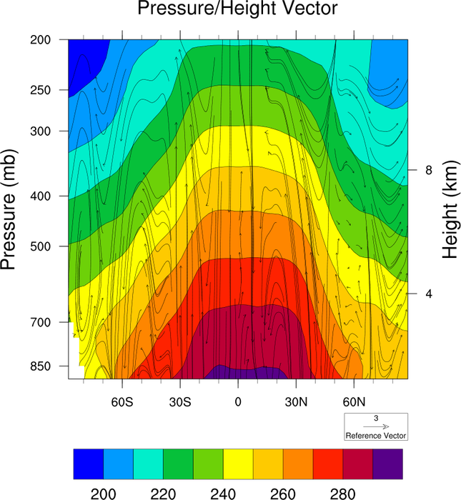
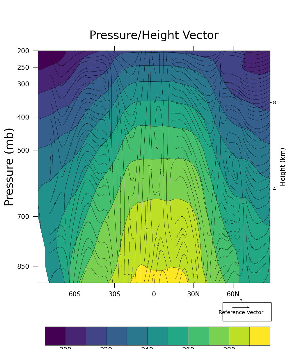
A vector pressure/height plot
- This script illustrates the following concepts:
Using streamplot to resemble curly vectors
Drawing pressure/height vectors over filled contours
Using inset_axes() to create additional axes for color bars
Interpolate to user specified pressure levels
Using the geocat-comp method interp_hybrid_to_pressure
Using a different color scheme to follow best practices <https://geocat-examples.readthedocs.io/en/latest/gallery/Colors/CB_Temperature.html#sphx-glr-gallery-colors-cb-temperature-py for visualizations
- See following URLs to see the reproduced NCL plot & script:
Original NCL script: https://www.ncl.ucar.edu/Applications/Scripts/vector_5.ncl
Original NCL plot: https://www.ncl.ucar.edu/Applications/Images/vector_5_lg.png
Import packages:
import numpy as np
import xarray as xr
from matplotlib import pyplot as plt
from scipy.interpolate import interp2d
from mpl_toolkits.axes_grid1.inset_locator import inset_axes
import metpy.calc as mpcalc
from metpy.units import units

import geocat.datafiles as gdf
import geocat.viz as gv
from geocat.comp import interp_hybrid_to_pressure

import warnings
Read in data:
ds = xr.open_dataset(gdf.get("netcdf_files/atmos.nc"), decode_times=False)

# Define an array of surface pressures
pnew = np.arange(200, 901, 50)

# Read in variables
P0mb = 1000.
hyam = ds.hyam  # get a coefficiants
hybm = ds.hybm  # get b coefficiants
PS = ds.PS  # get pressure
PS = PS / 100  # Convert from Pascal to mb

# Suppress userwarnings from metpy package
warnings.filterwarnings("ignore")

# Read in variables from data interpolated to pressure levels
# interp_hybrid_to_pressure is the Python version of vinth2p in NCL script
T = interp_hybrid_to_pressure(data=ds.T,
                              ps=PS,
                              hyam=hyam,
                              hybm=hybm,
                              p0=P0mb,
                              new_levels=pnew,
                              method='log')
W = interp_hybrid_to_pressure(data=ds.OMEGA,
                              ps=PS,
                              hyam=hyam,
                              hybm=hybm,
                              p0=P0mb,
                              new_levels=pnew,
                              method='log')
V = interp_hybrid_to_pressure(data=ds.V,
                              ps=PS,
                              hyam=hyam,
                              hybm=hybm,
                              p0=P0mb,
                              new_levels=pnew,
                              method='log')

# Extract data
T = T.isel(time=0).sel(lon=170, method="nearest")
W = W.isel(time=0).sel(lon=170, method="nearest")
V = V.isel(time=0).sel(lon=170, method="nearest")

# Scale W
wscaler = np.mean(W)
vscaler = np.mean(V)
scale = abs(vscaler / wscaler)

# We need to flip the sign of wscale to make sure that the vertical component
# of the streamplot is correct. We are currently unsure why this is needed yet since this
# is not in the original NCL script. We will continue to research into implementing
# curly vectors in Matplotlib
wscale = W * scale * -1
Plot:
# Generate figure (set its size (width, height) in inches)
fig = plt.figure(figsize=(10, 12))

# Generate axes using Cartopy and draw coastlines
ax = plt.axes()

# Specify which contours should be drawn
levels = np.linspace(200, 300, 11)

# # Plot contour lines
T.plot.contour(ax=ax,
               levels=levels,
               colors='black',
               linewidths=0.5,
               linestyles='solid',
               add_labels=False)

# # Plot filled contours
colors = T.plot.contourf(ax=ax,
                         levels=levels,
                         cmap='viridis',
                         add_labels=False,
                         add_colorbar=False)

# We attempt to recreate curly vectors with Matplotlib's streamplot function.
# streamplot requires the input parameter x, y to be evenly spaced strictly increasing arrays.
# Therefore we interpolate the original dataset onto an manually set, evenly spaced grid.
# There are probably more suitable interpolation routines than scipy's interp2d,
# but we do not have a standardized procedure for interpolation for streamplot as of this point.

# regularly spaced grid spanning the domain of x and y
xi = np.linspace(T['lat'].min(), T['lat'].max(), T['lat'].size)
yi = np.linspace(T['plev'].min(), T['plev'].max(), T['plev'].size)

# interp2d function creates interpolator classes
u_func = interp2d(T['lat'], T['plev'], V)
v_func = interp2d(T['lat'], T['plev'], wscale)
uCi = u_func(xi, yi)
vCi = v_func(xi, yi)

# Use streamplot to match curly vector
ax.streamplot(xi,
              yi,
              uCi,
              vCi,
              linewidth=0.5,
              density=2.0,
              arrowsize=0.7,
              arrowstyle='->',
              color='black',
              integration_direction='backward')

# Draw legend for vector plot
ax.add_patch(
    plt.Rectangle((52, 960),
                  37,
                  56,
                  facecolor='white',
                  edgecolor='black',
                  clip_on=False))

# Add quiverkey
# Draw translucent vector plot to be set as input for quiverkey
Q = ax.quiver(T['lat'], T['plev'], V, wscale, alpha=0, scale=400)
ax.quiverkey(Q,
             0.828,
             0.120,
             30,
             '3',
             labelpos='N',
             coordinates='figure',
             color='black',
             alpha=1,
             fontproperties={'size': 13})
ax.quiverkey(Q,
             0.828,
             0.120,
             30,
             'Reference Vector',
             labelpos='S',
             coordinates='figure',
             color='black',
             alpha=1,
             fontproperties={'size': 13})

# Use geocat.viz.util convenience function to add minor and major tick lines
gv.add_major_minor_ticks(ax, x_minor_per_major=3, labelsize=16)

# Use geocat.viz.util convenience function to set axes tick values
gv.set_axes_limits_and_ticks(ax,
                             xlim=(-88, 88),
                             ylim=(900, 200),
                             xticks=np.arange(-60, 61, 30),
                             yticks=np.array(
                                 [200, 250, 300, 400, 500, 700, 850]),
                             xticklabels=['60S', '30S', '0', '30N', '60N'])

# Use geocat.viz.util convenience function to add titles and the pressure label
gv.set_titles_and_labels(ax,
                         maintitle="Pressure/Height Vector",
                         maintitlefontsize=28,
                         ylabel='Pressure (mb)',
                         labelfontsize=28)

# Create second y-axis to show geo-potential height.
axRHS = gv.add_height_from_pressure_axis(ax, heights=[4, 8, 12])

# Force the plot to be square by setting the aspect ratio to 1
ax.set_box_aspect(1)
axRHS.set_box_aspect(1)

# Set tick lengths
ax.tick_params('both', which='major', length=12, pad=9)
ax.tick_params('both', which='minor', length=8, pad=9)

# Turn off minor ticks on Y axis on the left hand side
ax.tick_params(axis='y', which='minor', left=False, right=False)

# Call tight_layout function before adding the color bar to prevent user warnings
plt.tight_layout()

# Create inset axes for color bars
cax = inset_axes(ax,
                 width='97%',
                 height='8%',
                 loc='lower left',
                 bbox_to_anchor=(0.03, -0.27, 1, 1),
                 bbox_transform=ax.transAxes,
                 borderpad=0)

# Add a colorbar
cab = plt.colorbar(colors,
                   cax=cax,
                   orientation='horizontal',
                   ticks=levels[:-2:2],
                   extendfrac='auto',
                   extendrect=True,
                   drawedges=True,
                   spacing='uniform')

# Set colorbar ticklabel font size
cab.ax.xaxis.set_tick_params(length=0, labelsize=16)

# Show plot
plt.show()
Total running time of the script: (0 minutes 2.439 seconds)