

Note
Go to the end to download the full example code.
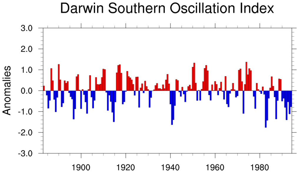
NCL_bar_2.py#
- This script illustrates the following concepts:
Drawing bars instead of curves in an XY plot
Changing the aspect ratio of a bar plot
Drawing filled bars up or down based on a Y reference value
Setting the minimum/maximum value of the Y axis in a bar plot
Using named colors to indicate a fill color
Creating array of dates to use as x-axis tick labels
Creating a main title
- See following URLs to see the reproduced NCL plot & script:
Original NCL script: https://www.ncl.ucar.edu/Applications/Scripts/bar_2.ncl
Original NCL plot: https://www.ncl.ucar.edu/Applications/Images/bar_2_lg.png
Import packages:
import numpy as np
import xarray as xr

import geocat.viz as gv
import geocat.datafiles as gdf
import matplotlib.pyplot as plt
Read in data:
# Open a netCDF data file using xarray default engine and load the data into xarrays
ds = xr.open_dataset(gdf.get("netcdf_files/soi.nc"))
dsoik = ds.DSOI_KET
date = ds.date
num_months = np.shape(date)[0]

# Dates in the file are represented by year and month (YYYYMM)
# representing them fractionally will make plotting the data easier
# This produces the same results as NCL's yyyymm_to_yyyyfrac() function
date_frac = np.empty_like(date)
for n in np.arange(0, num_months, 1):
    yyyy = int(date[n] / 100)
    mon = (date[n] / 100 - yyyy) * 100
    date_frac[n] = yyyy + (mon - 1) / 12
Plot
# Generate figure (set its size (width, height) in inches) and axes
plt.figure(figsize=(12, 6))
ax = plt.axes()

# Create a list of colors based on the color bar values
colors = ['red' if (value > 0) else 'blue' for value in dsoik[::8]]
plt.bar(
    date_frac[::8],
    dsoik[::8],
    align='edge',
    edgecolor='black',
    color=colors,
    width=8 / 12,
    linewidth=0.6,
)

# Use geocat.viz.util convenience function to add minor and major tick lines
gv.add_major_minor_ticks(ax, x_minor_per_major=4, y_minor_per_major=5, labelsize=20)

# Use geocat.viz.util convenience function to set axes parameters
gv.set_axes_limits_and_ticks(
    ax,
    ylim=(-3, 3),
    yticks=np.linspace(-3, 3, 7),
    yticklabels=np.linspace(-3, 3, 7),
    xlim=(date_frac[40], date_frac[-16]),
    xticks=np.linspace(1900, 1980, 5),
)

# Use geocat.viz.util convenience function to set titles and labels
gv.set_titles_and_labels(
    ax,
    maintitle="Darwin Southern Oscillation Index",
    ylabel='Anomalies',
    maintitlefontsize=28,
    labelfontsize=20,
)

plt.show()
Total running time of the script: (0 minutes 0.494 seconds)