Note
Click here to download the full example code
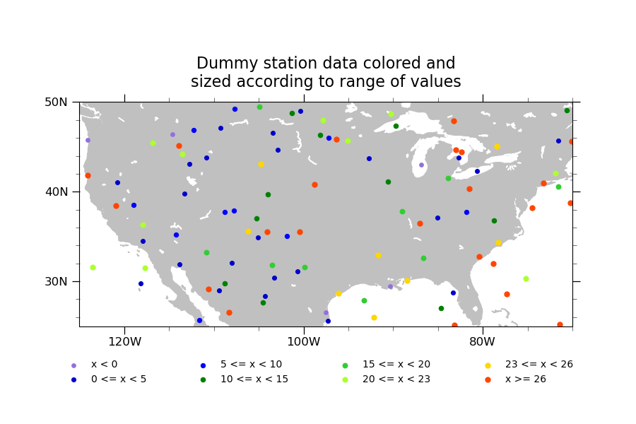
NCL_polyg_8.py
- This script illustrates the following concepts:
Drawing a scatter plot on a map
Changing the marker color and size in a map plot
Plotting station locations using markers
Manually creating a legend using markers and text
Adding text to a plot
Generating dummy data using “random_uniform”
Binning data
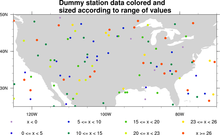
- See following URLs to see the reproduced NCL plot & script:
Original NCL script: https://www.ncl.ucar.edu/Applications/Scripts/polyg_8.ncl
Original NCL plot: https://www.ncl.ucar.edu/Applications/Images/polyg_8_lg.png
Import packages:
import numpy as np
import cartopy.crs as ccrs
import cartopy.feature as cfeature
from cartopy.mpl.gridliner import LongitudeFormatter, LatitudeFormatter
import matplotlib.pyplot as plt

from geocat.viz import util as gvutil
Generate dummy data
npts = 100
random = np.random.default_rng(seed=1)
# Create random coordinates to position the markers
lat = random.uniform(low=25, high=50, size=npts)
lon = random.uniform(low=-125, high=-70, size=npts)
# Create random data which the color will be based off of
r = random.uniform(low=-1.2, high=35, size=npts)

bins = [0, 5, 10, 15, 20, 23, 26]
colors = [
    'mediumpurple', 'mediumblue', 'blue', 'green', 'limegreen', 'greenyellow',
    'gold', 'orangered'
]
# increasing sizes for the markers in each bin
sizes = np.linspace(15, 25, len(bins))
Plot:
plt.figure(figsize=(9, 6))
projection = ccrs.PlateCarree()
ax = plt.axes(projection=projection)
ax.set_extent([-125, -70, 25, 50], crs=projection)

# Draw land
ax.add_feature(cfeature.LAND, color='silver', zorder=0)
ax.add_feature(cfeature.LAKES, color='white', zorder=0)

# Use geocat.viz.util convenience function to set axes tick values
gvutil.set_axes_limits_and_ticks(ax,
                                 xticks=np.linspace(-120, -80, 3),
                                 yticks=np.linspace(30, 50, 3))

# Use geocat.viz.util convenience function to make latitude and longitude tick
# labels
gvutil.add_lat_lon_ticklabels(ax)
# Removing degree symbol from tick labels to more closely resemble NCL example
ax.yaxis.set_major_formatter(LatitudeFormatter(degree_symbol=''))
ax.xaxis.set_major_formatter(LongitudeFormatter(degree_symbol=''))

# Use geocat.viz.util convenience function to add minor and major tick lines
gvutil.add_major_minor_ticks(ax,
                             x_minor_per_major=4,
                             y_minor_per_major=5,
                             labelsize=12)

# Use geocat.viz.util convenience function to add titles
gvutil.set_titles_and_labels(
    ax,
    maintitlefontsize=16,
    maintitle=
    "Dummy station data colored and\nsized according to range of values")

# Plot markers with values less than first bin value
masked_lon = np.where(r < bins[0], lon, np.nan)
masked_lat = np.where(r < bins[0], lat, np.nan)
label = "x < " + str(bins[0])
plt.scatter(masked_lon,
            masked_lat,
            label=label,
            s=sizes[0],
            color=colors[0],
            zorder=1)

# Plot all other markers but those in the last bin
label_format = "{} <= x < {}"
for x in range(1, len(bins)):
    masked_lon = np.where(bins[x - 1] <= r, lon, np.nan)
    masked_lon = np.where(r < bins[x], masked_lon, np.nan)
    masked_lat = np.where(bins[x - 1] <= r, lat, np.nan)
    masked_lat = np.where(r < bins[x], masked_lat, np.nan)
    label = label_format.format(bins[x - 1], bins[x])
    plt.scatter(masked_lon,
                masked_lat,
                label=label,
                s=sizes[x],
                color=colors[x],
                zorder=1)

# Plot markers with values greater than or equal to last bin value
masked_lon = np.where(r >= bins[-1], lon, np.nan)
masked_lat = np.where(r >= bins[-1], lat, np.nan)
label = "x >= " + str(bins[-1])
plt.scatter(masked_lon,
            masked_lat,
            label=label,
            s=sizes[-1],
            color=colors[-1],
            zorder=1)

# `ncol` being equal to half of the number of labels makes the legend appear
# horizontal with two rows
legend = ax.legend(bbox_to_anchor=(-0.05, -0.3),
                   ncol=4,
                   loc='lower left',
                   columnspacing=4.75,
                   frameon=False)
plt.show()
Total running time of the script: ( 0 minutes 0.210 seconds)