Note
Click here to download the full example code
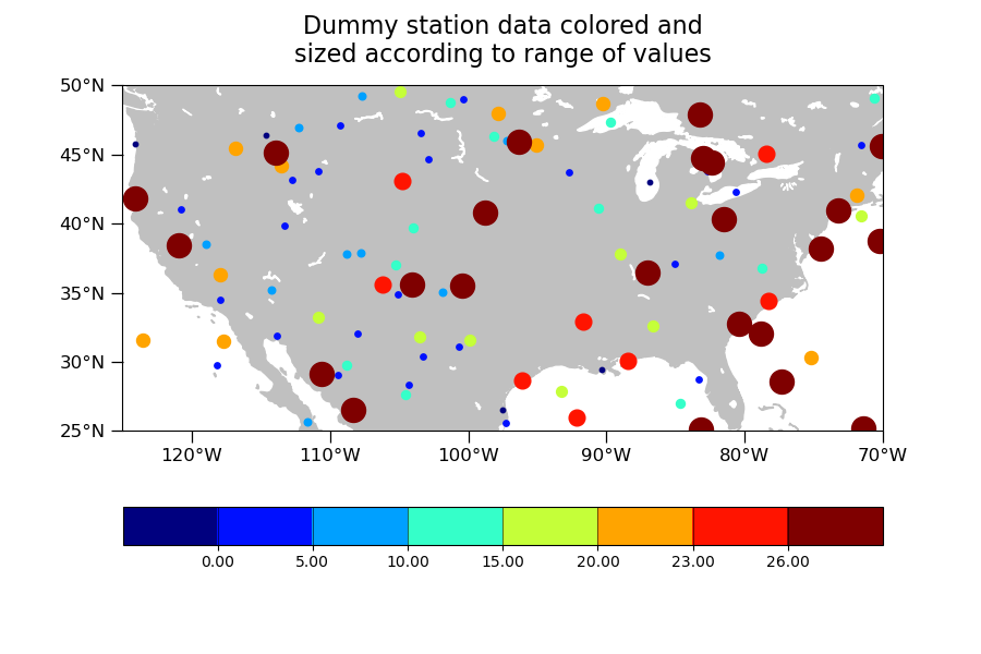
NCL_polyg_8_lbar.py
- This script illustrates the following concepts:
Drawing a scatter plot on a map
Changing the marker color and size in a map plot
Plotting station locations using markers
Creating a custom color bar
Adding text to a plot
Generating dummy data using “random_uniform”
Binning data
- See following URLs to see the reproduced NCL plot & script:
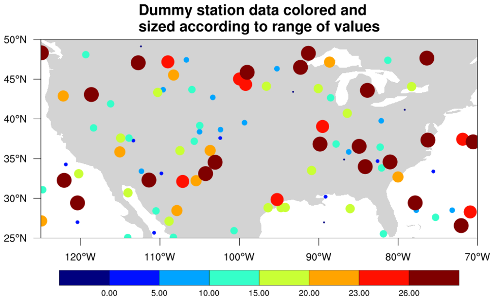
Original NCL script: https://www.ncl.ucar.edu/Applications/Scripts/polyg_8_lbar.ncl
Original NCL plot: https://www.ncl.ucar.edu/Applications/Images/polyg_8_lbar_lg.png
Import packages:
import numpy as np
import cartopy.crs as ccrs
import cartopy.feature as cfeature
import matplotlib.pyplot as plt
from matplotlib import colors, cm

from geocat.viz import util as gvutil
from geocat.viz import cmaps as gvcmap
Generate dummy data
npts = 100
random = np.random.default_rng(seed=1)

# Create random coordinates to position the markers
lat = random.uniform(low=25, high=50, size=npts)
lon = random.uniform(low=-125, high=-70, size=npts)

# Create random data which the color will be based off of
r = random.uniform(low=-1.2, high=35, size=npts)
Specify bins and sizes and create custom mappable based on NCV_jet colormap
bins = [0, 5, 10, 15, 20, 23, 26]
cmap = gvcmap.NCV_jet

# Create the boundaries for your data, this may be larger than bins to
# accomodate colors for data outside of the smallest and largest bins
boundaries = [-1.2, 0, 5, 10, 15, 20, 23, 26, 35]
norm = colors.BoundaryNorm(boundaries, cmap.N)
mappable = cm.ScalarMappable(norm=norm, cmap=cmap)

# Retreive the list of colors to use for the markers
marker_colors = mappable.to_rgba(boundaries)

# Increasing sizes for the markers in each bin, by using numpy.geomspace the
# size differences are more noticeable
sizes = np.geomspace(10, 250, len(boundaries))
Plot:
plt.figure(figsize=(9, 6))
projection = ccrs.PlateCarree()
ax = plt.axes(projection=projection)
ax.set_extent([-125, -70, 25, 50], crs=projection)

# Draw land
ax.add_feature(cfeature.LAND, color='silver', zorder=0)
ax.add_feature(cfeature.LAKES, color='white', zorder=0)

# Use geocat.viz.util convenience function to set axes tick values
gvutil.set_axes_limits_and_ticks(ax,
                                 xticks=np.linspace(-120, -70, 6),
                                 yticks=np.linspace(25, 50, 6))

# Use geocat.viz.util convenience function to make latitude and longitude tick
# labels
gvutil.add_lat_lon_ticklabels(ax)

# Use geocat.viz.util convenience function to add minor and major tick lines
gvutil.add_major_minor_ticks(ax,
                             x_minor_per_major=1,
                             y_minor_per_major=1,
                             labelsize=12)

# Remove ticks on the top and right sides of the plot
ax.tick_params(axis='both', which='both', top=False, right=False)

# Use geocat.viz.util convenience function to add titles
gvutil.set_titles_and_labels(
    ax,
    maintitlefontsize=16,
    maintitle=
    "Dummy station data colored and\nsized according to range of values")

# Plot markers with values less than first bin value
masked_lon = np.where(r < bins[0], lon, np.nan)
masked_lat = np.where(r < bins[0], lat, np.nan)
plt.scatter(masked_lon,
            masked_lat,
            s=sizes[0],
            color=marker_colors[0],
            zorder=1)

# Plot all other markers but those in the last bin
for x in range(1, len(bins)):
    masked_lon = np.where(bins[x - 1] <= r, lon, np.nan)
    masked_lon = np.where(r < bins[x], masked_lon, np.nan)
    masked_lat = np.where(bins[x - 1] <= r, lat, np.nan)
    masked_lat = np.where(r < bins[x], masked_lat, np.nan)
    plt.scatter(masked_lon,
                masked_lat,
                s=sizes[x],
                color=marker_colors[x],
                zorder=1)

# Plot markers with values greater than or equal to last bin value
masked_lon = np.where(r >= bins[-1], lon, np.nan)
masked_lat = np.where(r >= bins[-1], lat, np.nan)
plt.scatter(masked_lon,
            masked_lat,
            s=sizes[-1],
            color=marker_colors[-1],
            zorder=1)

# Create colorbar
plt.colorbar(mappable=mappable,
             ax=ax,
             orientation='horizontal',
             drawedges=True,
             format='%.2f',
             ticks=bins)

plt.show()
Total running time of the script: ( 0 minutes 0.241 seconds)