Note
Click here to download the full example code
NCL_polyg_4.py
- This script illustrates the following concepts:
Drawing a cylindrical equidistant map
Zooming in on a particular area on a cylindrical equidistant map
Attaching an outlined box to a map plot
Attaching filled polygons to a map plot
Filling in polygons with a shaded pattern
Changing the color and thickness of polylines
Changing the color of a filled polygon
Labeling the lines in a polyline
Changing the density of a fill pattern
Adding text to a plot
- See following URLs to see the reproduced NCL plot & script:
Original NCL script: https://www.ncl.ucar.edu/Applications/Scripts/polyg_4.ncl
Original NCL plot: https://www.ncl.ucar.edu/Applications/Images/polyg_4_1_lg.png and https://www.ncl.ucar.edu/Applications/Images/polyg_4_2_lg.png
Import packages:
import numpy as np
import xarray as xr
import cartopy
import cartopy.crs as ccrs
import matplotlib.pyplot as plt

import geocat.datafiles as gdf
from geocat.viz import util as gvutil
Read in data:
# Open a netCDF data file using xarray default engine and load the data into xarrays, choosing the 2nd timestamp
ds = xr.open_dataset(gdf.get("netcdf_files/uv300.nc")).isel(time=1)
Utility Function: Make Base Plot:
# Define a utility function to create the basic contour plot, which will get used twice to create two slightly
# different plots
def make_base_plot():

    # Generate axes using Cartopy projection
    ax = plt.axes(projection=ccrs.PlateCarree())

    # Add continents
    continents = cartopy.feature.NaturalEarthFeature(
        name="coastline",
        category="physical",
        scale="50m",
        edgecolor="None",
        facecolor="lightgray",
    )
    ax.add_feature(continents)

    # Set map extent
    ax.set_extent([-130, 0, -20, 40], crs=ccrs.PlateCarree())

    # Define the contour levels. The top range value of 44 is not included in the levels.
    levels = np.arange(-12, 44, 4)

    # Using a dictionary prevents repeating the same keyword arguments twice for the contours.
    kwargs = dict(
        levels=levels,  # contour levels specified outside this function
        xticks=[-120, -90, -60, -30, 0],  # nice x ticks
        yticks=[-20, 0, 20, 40],  # nice y ticks
        transform=ccrs.PlateCarree(),  # ds projection
        add_colorbar=False,  # don't add individual colorbars for each plot call
        add_labels=False,  # turn off xarray's automatic Lat, lon labels
        colors="gray",  # note plurals in this and following kwargs
        linestyles="-",
        linewidths=0.5,
    )

    # Contourf-plot data (for filled contours)
    hdl = ds.U.plot.contour(x="lon", y="lat", ax=ax, **kwargs)

    # Add contour labels.   Default contour labels are sparsely placed, so we specify label locations manually.
    # Label locations only need to be approximate; the nearest contour will be selected.
    label_locations = [
        (-123, 35),
        (-116, 17),
        (-94, 4),
        (-85, -6),
        (-95, -10),
        (-85, -15),
        (-70, 35),
        (-42, 28),
        (-54, 7),
        (-53, -5),
        (-39, -11),
        (-28, 11),
        (-16, -1),
        (-8, -9),  # Python allows trailing list separators.
    ]
    ax.clabel(
        hdl,
        np.arange(-8, 24, 8),  # Only label these contour levels: [-8, 0, 8, 16]
        fontsize="small",
        colors="black",
        fmt="%.0f",  # Turn off decimal points
        manual=label_locations,  # Manual label locations
        inline=False)  # Don't remove the contour line where labels are located.

    # Create a rectangle patch, to color the border of the rectangle a different color.
    # Specify the rectangle as a corner point with width and height, to help place border text more easily.
    left, width = -90, 45
    bottom, height = 0, 30
    right = left + width
    top = bottom + height

    # Draw rectangle patch on the plot
    p = plt.Rectangle(
        (left, bottom),
        width,
        height,
        fill=False,
        zorder=3,  # Plot on top of the purple box border.
        edgecolor='red',
        alpha=0.5)  # Lower color intensity.
    ax.add_patch(p)

    # Draw text labels around the box.
    # Change the default padding around a text box to zero, making it a "tight" box.
    # Create "text_args" to keep from repeating code when drawing text.
    text_shared_args = dict(
        fontsize=8,
        bbox=dict(boxstyle='square, pad=0',
                  facecolor='white',
                  edgecolor='white'),
    )

    # Draw top text
    ax.text(left + 0.6 * width,
            top,
            'test',
            horizontalalignment='right',
            verticalalignment='center',
            **text_shared_args)

    # Draw bottom text.   Change text background to match the map.
    ax.text(
        left + 0.5 * width,
        bottom,
        'test',
        horizontalalignment='right',
        verticalalignment='center',
        fontsize=8,
        bbox=dict(boxstyle='square, pad=0',
                  facecolor='lightgrey',
                  edgecolor='lightgrey'),
    )

    # Draw left text
    ax.text(left,
            top,
            'test',
            horizontalalignment='center',
            verticalalignment='top',
            rotation=90,
            **text_shared_args)

    # Draw right text
    ax.text(right,
            bottom,
            'test',
            horizontalalignment='center',
            verticalalignment='bottom',
            rotation=-90,
            **text_shared_args)

    # Add lower text box.  Box appears off-center, but this is to leave room
    # for lower-case letters that drop lower.
    ax.text(1.0,
            -0.20,
            "CONTOUR FROM -12 TO 40 BY 4",
            fontname='Helvetica',
            horizontalalignment='right',
            transform=ax.transAxes,
            bbox=dict(boxstyle='square, pad=0.15',
                      facecolor='white',
                      edgecolor='black'))

    # Use geocat.viz.util convenience function to add main title as well as titles to left and right of the plot axes.
    gvutil.set_titles_and_labels(ax,
                                 lefttitle="Zonal Wind",
                                 lefttitlefontsize=12,
                                 righttitle="m/s",
                                 righttitlefontsize=12)

    # Use geocat.viz.util convenience function to add minor and major tick lines
    gvutil.add_major_minor_ticks(ax, y_minor_per_major=4)

    # Use geocat.viz.util convenience function to make plots look like NCL plots by using latitude, longitude tick labels
    gvutil.add_lat_lon_ticklabels(ax)

    return ax
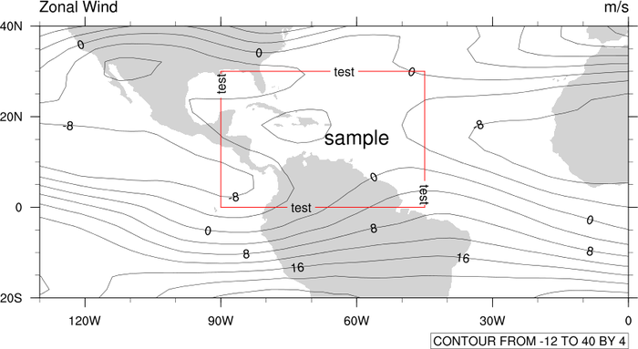
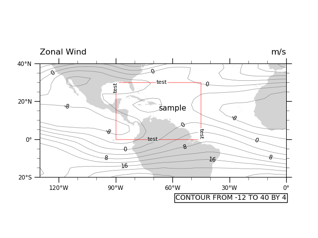
Plot 1 (Text inside a box):
# Create the base figure
ax = make_base_plot()

# Draw text inside of box
ax.text(-60.0, 15.0, "sample", fontsize=11, horizontalalignment='center')

# Show the plot
plt.show()
Utility Function: Draw Hatch Polygon:
# Define a utility function that draws a polygon and then erases its border with another polygon.
def draw_hatch_polygon(xvals, yvals, hatchcolor, hatchpattern):
    """Draw a polygon filled with a hatch pattern, but with no edges on the
    polygon."""
    ax.fill(
        xvals,
        yvals,
        edgecolor=hatchcolor,
        zorder=
        -1,  # Place underneath contour map (larger zorder is closer to viewer).
        fill=False,
        linewidth=0.5,
        hatch=hatchpattern,
        alpha=0.3  # Reduce color intensity
    )

    # Hatch color and polygon edge color are tied together, so we have to draw a white polygon edge
    # on top of the original polygon to remove the edge.
    ax.fill(
        xvals,
        yvals,
        edgecolor='white',
        zorder=
        0,  # Place on top of other polygon (larger zorder is closer to viewer).
        fill=False,
        linewidth=1  # Slightly larger linewidth removes ghost edges.
    )
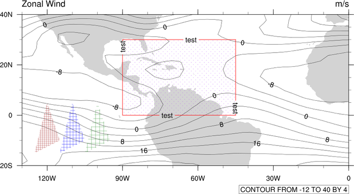
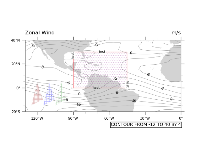
Plot 2 (Polygons with hatch patterns):
# Make this figure the thumbnail image on the HTML page.
# sphinx_gallery_thumbnail_number = 2

# Create the base figure
ax = make_base_plot()

# Plot the hatch pattern "underneath" the red box, to hide the purple border that is unavoidably attached to producing
# the hatch pattern.
x_points = [-90.0, -45.0, -45.0, -90.0, -90.0]
y_points = [30.0, 30.0, 0.0, 0.0, 30.0]

ax.fill(
    x_points,
    y_points,
    edgecolor='purple',  # Box hatch pattern is purple.
    zorder=2,  # Place on top of map (larger zorder is closer to viewer).
    fill=False,
    hatch='...',  # Adding more or fewer dots to '...' will change hatch density.
    linewidth=0.5,  # Make each dot smaller
    alpha=0.2  # Make hatch semi-transparent using alpha level in range [0, 1].
)

# Draw some triangles with various hatch pattern densities.
x_tri = np.array([-125, -115, -120])
y_tri = np.array([-15, -10, 5])

draw_hatch_polygon(x_tri, y_tri, 'brown', '++++')

draw_hatch_polygon(x_tri + 10, y_tri, 'blue', '+++')

draw_hatch_polygon(x_tri + 20, y_tri, 'forestgreen', '++')

# Show the plot
plt.show()
Total running time of the script: ( 0 minutes 0.531 seconds)