Note
Click here to download the full example code
NCL_conwomap_1.py
- This script illustrates the following concepts:
Drawing a simple line contour plot
Drawing a line contour plot with multiple colors
Increasing the thickness of contour lines
- See following URLs to see the reproduced NCL plot & script:
Original NCL script: https://www.ncl.ucar.edu/Applications/Scripts/conwomap_1.ncl
Original NCL plot: https://www.ncl.ucar.edu/Applications/Images/conwomap_1_2_lg.png
Import packages:
import numpy as np
import xarray as xr
import matplotlib.pyplot as plt

import geocat.datafiles as gdf
from geocat.viz import cmaps as gvcmaps
from geocat.viz import util as gvutil
Read in data:
# Open a netCDF data file using xarray default engine and load the data into xarrays
ds = xr.open_dataset(gdf.get("netcdf_files/cone.nc"))
u = ds.u.isel(time=4)
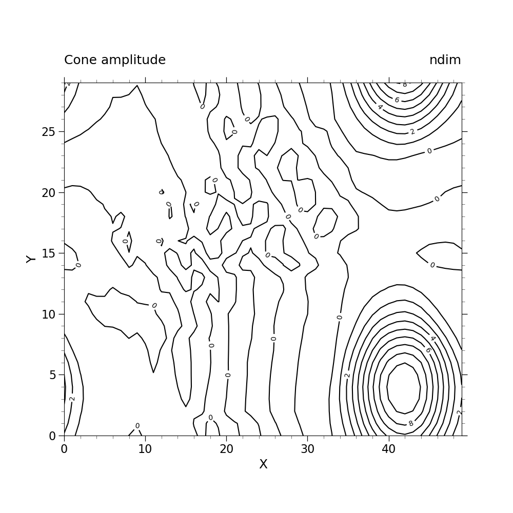
Plot Without Enhancements:
#create figure
plt.figure(figsize=(10, 10))

#create axes
ax = plt.axes()
ax.set_aspect(1.5)

#contour plot data
p = u.plot.contour(ax=ax,
                   vmin=0,
                   vmax=10,
                   levels=11,
                   add_labels=False,
                   colors="black")

#label contours
ax.clabel(p, np.arange(0, 9, 2), colors='black', fmt="%.0f")

# Use geocat.viz.util convenience function to set axes limits & tick values without calling several matplotlib functions
gvutil.set_axes_limits_and_ticks(ax,
                                 xlim=(0, 49),
                                 ylim=(0, 29),
                                 xticks=np.linspace(0, 40, 5),
                                 yticks=np.linspace(0, 25, 6))

# Use geocat.viz.util convenience function to add minor and major tick lines
gvutil.add_major_minor_ticks(ax,
                             x_minor_per_major=5,
                             y_minor_per_major=5,
                             labelsize=16)

# Use geocat.viz.util convenience function to add titles to left and right of the plot axis.
gvutil.set_titles_and_labels(ax,
                             lefttitle="Cone amplitude",
                             lefttitlefontsize=18,
                             righttitle="ndim",
                             righttitlefontsize=18,
                             xlabel="X",
                             ylabel="Y",
                             labelfontsize=18)

plt.show()
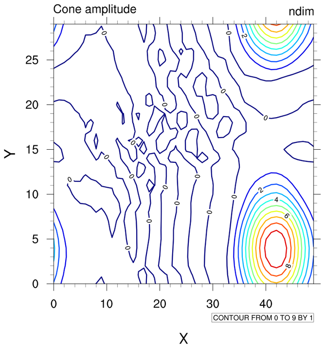
Plot With Enhancements:
# Make this figure the thumbnail image on the HTML page.
# sphinx_gallery_thumbnail_number = 2

#create figure
plt.figure(figsize=(10, 10))

#create axes
ax = plt.axes()
ax.set_aspect(1.5)

#import colormap
newcmp = gvcmaps.NCV_jet

#contour plot data
p = u.plot.contour(ax=ax,
                   vmin=0,
                   vmax=10,
                   levels=11,
                   cmap=newcmp,
                   add_labels=False,
                   linewidths=2.3)

# label contours
ax.clabel(p, np.arange(0, 9, 2), colors='black', fmt="%.0f")

# Use geocat.viz.util convenience function to set axes limits & tick values without calling several matplotlib functions
gvutil.set_axes_limits_and_ticks(ax,
                                 xlim=(0, 49),
                                 ylim=(0, 29),
                                 xticks=np.linspace(0, 40, 5),
                                 yticks=np.linspace(0, 25, 6))

# Use geocat.viz.util convenience function to add minor and major tick lines
gvutil.add_major_minor_ticks(ax,
                             x_minor_per_major=5,
                             y_minor_per_major=5,
                             labelsize=16)

# Use geocat.viz.util convenience function to add titles to left and right of the plot axis.
gvutil.set_titles_and_labels(ax,
                             lefttitle="Cone amplitude",
                             lefttitlefontsize=18,
                             righttitle="ndim",
                             righttitlefontsize=18,
                             xlabel="X",
                             ylabel="Y",
                             labelfontsize=18)

plt.show()
Total running time of the script: ( 0 minutes 0.822 seconds)