Note
Click here to download the full example code
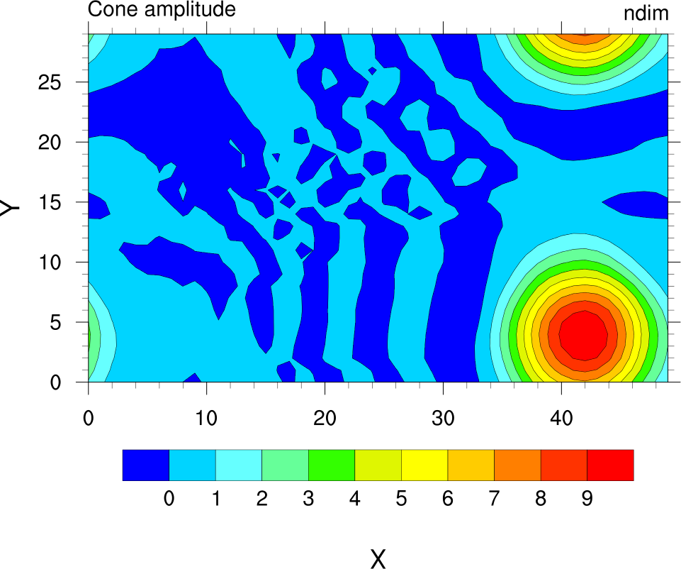
NCL_conwomap_2.py
- This script illustrates the following concepts:
Drawing a simple filled contour plot
Selecting a different color map
Changing the size/shape of a contour plot
- See following URLs to see the reproduced NCL plot & script:
Original NCL script: https://www.ncl.ucar.edu/Applications/Scripts/conwomap_2.ncl
Original NCL plot: https://www.ncl.ucar.edu/Applications/Images/conwomap_2_lg.png
Import packages:
import numpy as np
import xarray as xr
import cartopy.crs as ccrs
import matplotlib.pyplot as plt

import geocat.datafiles as gdf
from geocat.viz import cmaps as gvcmaps
from geocat.viz import util as gvutil
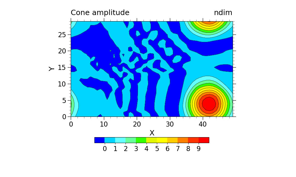
Read in data:
# Open a netCDF data file using xarray default engine and load the data into xarrays
ds = xr.open_dataset(gdf.get("netcdf_files/cone.nc"))
u = ds.u.isel(time=4)
Plot:
# Generate figure (set its size (width, height) in inches)
plt.figure(figsize=(10, 6))

# Generate axes, using Cartopy
projection = ccrs.PlateCarree()
ax = plt.axes(projection=projection)

# Import an NCL colormap
newcmp = gvcmaps.gui_default

# Contourf-plot data (for filled contours)
p = u.plot.contourf(ax=ax,
                    vmin=-1,
                    vmax=10,
                    levels=12,
                    cmap=newcmp,
                    add_colorbar=False,
                    transform=projection,
                    extend='neither',
                    add_labels=False)
# Contour-plot data (for borderlines)
u.plot.contour(ax=ax,
               vmin=-1,
               vmax=10,
               levels=12,
               linewidths=0.5,
               colors='black',
               add_colorbar=False,
               transform=projection,
               extend='neither',
               add_labels=False)

# Add horizontal colorbar
cbar = plt.colorbar(p, orientation='horizontal', shrink=0.5)
cbar.ax.tick_params(labelsize=16)
cbar.set_ticks(np.linspace(0, 9, 10))

# Use geocat.viz.util convenience function to set axes limits & tick values without calling several matplotlib functions
gvutil.set_axes_limits_and_ticks(ax,
                                 xlim=(0, 49),
                                 ylim=(0, 29),
                                 xticks=np.linspace(0, 40, 5),
                                 yticks=np.linspace(0, 25, 6))

# Use geocat.viz.util convenience function to add minor and major tick lines
gvutil.add_major_minor_ticks(ax,
                             x_minor_per_major=5,
                             y_minor_per_major=5,
                             labelsize=16)

# Use geocat.viz.util convenience function to add titles to left and right of the plot axis.
gvutil.set_titles_and_labels(ax,
                             lefttitle="Cone amplitude",
                             lefttitlefontsize=18,
                             righttitle="ndim",
                             righttitlefontsize=18,
                             xlabel="X",
                             ylabel="Y",
                             labelfontsize=18)

# Show the plot
plt.show()
Total running time of the script: ( 0 minutes 0.292 seconds)