Note
Click here to download the full example code
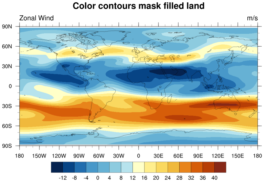
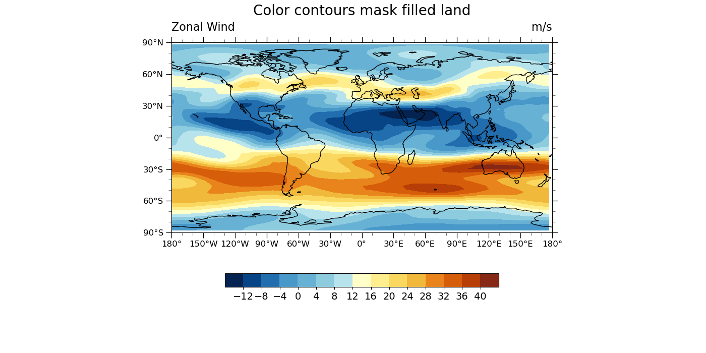
NCL_coneff_16.py
- This script illustrates the following concepts:
Showing features of the new color display model
Using a NCL colormap with levels to assign a color palette to contours
Drawing partially transparent filled contours
- See following URLs to see the reproduced NCL plot & script:
Original NCL script: https://www.ncl.ucar.edu/Applications/Scripts/coneff_16.ncl
Original NCL plot: https://www.ncl.ucar.edu/Applications/Images/coneff_16_1_lg.png
Import packages:
import numpy as np
import xarray as xr
import cartopy.crs as ccrs
import matplotlib.pyplot as plt

import geocat.datafiles as gdf
from geocat.viz import cmaps as gvcmaps
from geocat.viz import util as gvutil
Read in data:
# Open a netCDF data file using xarray default engine and load the data into xarrays
ds = xr.open_dataset(gdf.get('netcdf_files/uv300.nc'))
U = ds.U[1, :, :]
Plot:
# Generate figure (set its size (width, height) in inches)
plt.figure(figsize=(14, 7))

# Generate axes, using Cartopy
projection = ccrs.PlateCarree()
ax = plt.axes(projection=projection)

# Use global map and draw coastlines
ax.set_global()
ax.coastlines()

# Import an NCL colormap
newcmp = gvcmaps.BlueYellowRed

# Contourf-plot data (for filled contours)
# Note, min-max contour levels are hard-coded. contourf's automatic contour value selector produces fractional values.
p = U.plot.contourf(ax=ax,
                    vmin=-16.0,
                    vmax=44,
                    levels=16,
                    cmap=newcmp,
                    add_colorbar=False,
                    transform=projection,
                    extend='neither')

# Add horizontal colorbar
cbar = plt.colorbar(p, orientation='horizontal', shrink=0.5)
cbar.ax.tick_params(labelsize=14)
cbar.set_ticks(np.linspace(-12, 40, 14))

# Use geocat.viz.util convenience function to set axes tick values
gvutil.set_axes_limits_and_ticks(ax,
                                 xticks=np.linspace(-180, 180, 13),
                                 yticks=np.linspace(-90, 90, 7))

# Use geocat.viz.util convenience function to make plots look like NCL plots by using latitude, longitude tick labels
gvutil.add_lat_lon_ticklabels(ax)

# Use geocat.viz.util convenience function to add minor and major tick lines
gvutil.add_major_minor_ticks(ax, labelsize=12)

# Use geocat.viz.util convenience function to add titles to left and right of the plot axis.
gvutil.set_titles_and_labels(ax,
                             maintitle="Color contours mask filled land",
                             lefttitle=U.long_name,
                             lefttitlefontsize=16,
                             righttitle=U.units,
                             righttitlefontsize=16,
                             xlabel="",
                             ylabel="")

# Show the plot
plt.show()
Total running time of the script: ( 0 minutes 0.330 seconds)