Note
Click here to download the full example code
NCL_scatter_3.py
- This script illustrates the following concepts:
Drawing a scatter plot over a map
Choosing marker color, size, and style
Drawing markers on a map indicating the locations of station data
- See following URLs to see the reproduced NCL plot & script:
Import packages:
import xarray as xr
import cartopy.crs as ccrs
import cartopy.feature as cfeature
from cartopy.mpl.gridliner import LongitudeFormatter, LatitudeFormatter
import matplotlib.pyplot as plt

from geocat.viz import util as gvutil
import geocat.datafiles as gdf
Open a netCDF data file using xarray default engine and load the data into xarrays
ds = xr.open_dataset(gdf.get("netcdf_files/95031800_sao.cdf"),
                     decode_times=False)
lat = ds.lat.isel()
lon = ds.lon.isel()
Plot
def Plots(xlim, ylim, xtic, ytic, xminor, yminor, size, color):
"""Creates plot using user specified variables.
Parameters
----------
xext : 'tuple'
Inclusive extent of projection in format (xstart, xend) with values between -180
and 180.
yext : 'tuple'
Inclusive extent of projection in format (ystart, yend) with values between -90
and 90.
xtic : 'int'
Step number of major x tick label instances in format of number between each tick.
This is passed to range() as the 'step' argument.
ytic : 'int'
Step number of major y tick label instances in format of number between each tick.
This is passed to range() as the 'step' argument.
xminor : 'int'
Exclusive number of minor ticks between each major x-axis tick mark
yminor : 'int'
Exclusive number of minor ticks between each major y-axis tick mark
size : 'int'
Size of marker being used in format of font size number.
color : 'str'
Matplotlib color of marker being used in format 'color'.
"""
# Generate figure (set its size (width, height) in inches) and axes using Cartopy projection
plt.figure(figsize=(12, 12))
# Generate axes using Cartopy
ax = plt.axes(projection=ccrs.PlateCarree())
# Use geocat.viz.util convenience function to add minor and major tick lines
gvutil.add_major_minor_ticks(ax,
x_minor_per_major=xminor,
y_minor_per_major=yminor,
labelsize=14)
# Use geocat.viz.util convenience function to make plots look like NCL plots by using latitude, longitude tick labels
gvutil.add_lat_lon_ticklabels(ax)
# Use geocat.viz.util convenience function to set axes limits & tick values without calling several matplotlib functions
gvutil.set_axes_limits_and_ticks(ax,
xlim=xlim,
ylim=ylim,
xticks=range(-180, 180, xtic),
yticks=range(-90, 90, ytic))
# Remove the degree symbol from tick labels
ax.yaxis.set_major_formatter(LatitudeFormatter(degree_symbol=''))
ax.xaxis.set_major_formatter(LongitudeFormatter(degree_symbol=''))
# Turn on continent shading
ax.add_feature(cfeature.LAND,
edgecolor='lightgray',
facecolor='lightgray',
zorder=0)
ax.add_feature(cfeature.LAKES,
edgecolor='white',
facecolor='white',
zorder=0)
# Scatter-plot the location data on the map
plt.scatter(lon, lat, s=size, c=color, marker='+', linewidth=0.5, zorder=1)
plt.title("Locations of stations",
loc="center",
y=1.03,
size=15,
fontweight="bold")
plt.show()
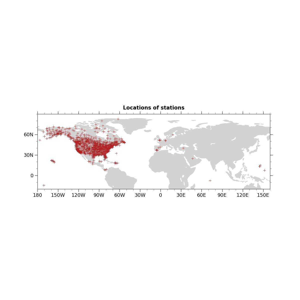
Plots((-180, 160), (-20, 90), 30, 30, 3, 3, 50, 'firebrick')
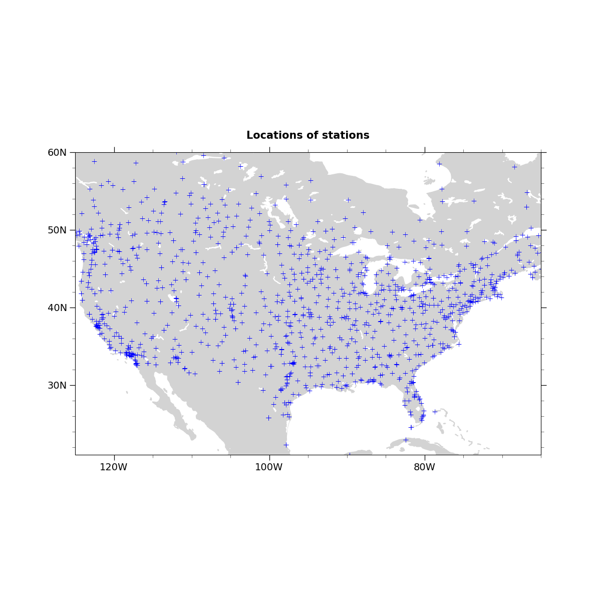
Plots((-125, -65), (21, 60), 20, 10, 4, 5, 50, 'blue')
Total running time of the script: ( 0 minutes 0.578 seconds)