Note
Click here to download the full example code
NCL_scatter_1.py
- This script illustrates the following concepts:
Drawing a scatter plot
Changing the markers in an XY plot
Changing the marker color in an XY plot
Changing the marker size in an XY plot
Generating dummy data using “random.chisquared”
- See following URLs to see the reproduced NCL plot & script:
Original NCL script: https://www.ncl.ucar.edu/Applications/Scripts/scatter_1.ncl
Original NCL plot: https://www.ncl.ucar.edu/Applications/Images/scatter_1_lg.png
Import packages
import numpy as np
import matplotlib.pyplot as plt

from geocat.viz import util as gvutil
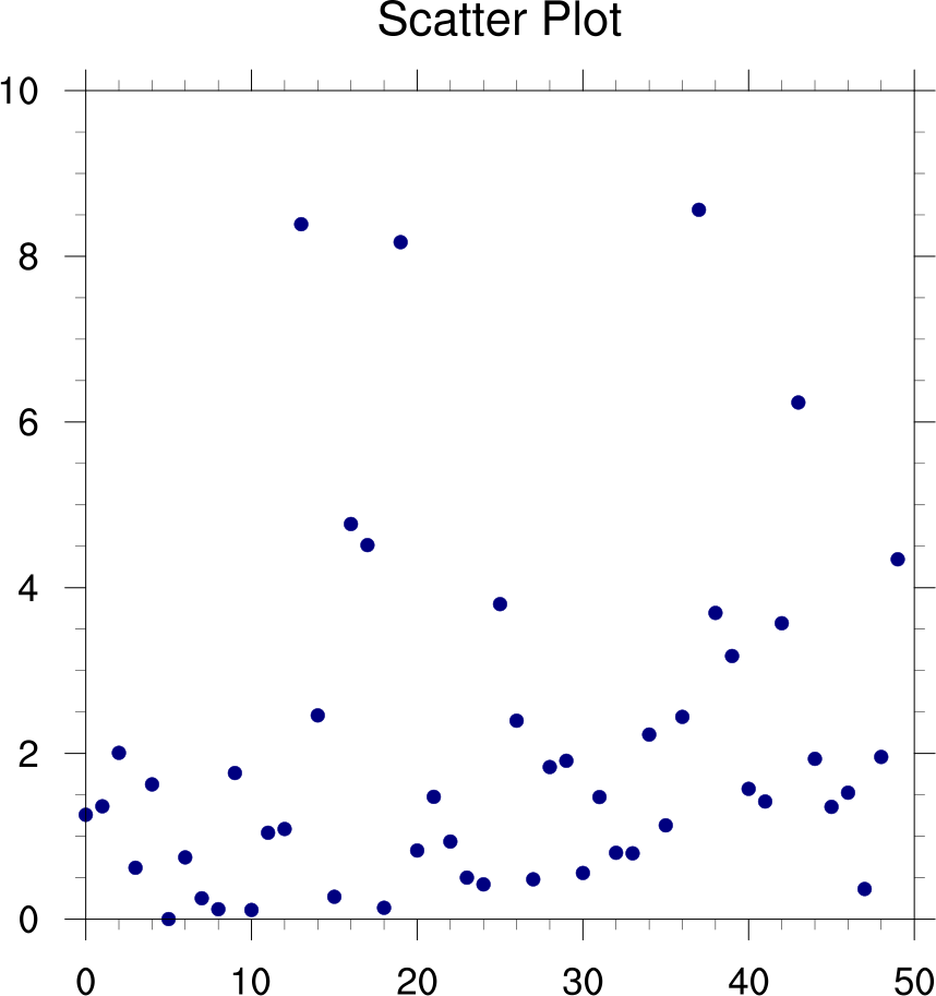
Generate random data from a chi squared distribution with 2 dof
npts = 50
random = np.random.default_rng(seed=1)
data = random.chisquare(2.0, npts)
Plot
fig = plt.figure(figsize=(8, 8))
ax = plt.axes()

plt.plot(data, marker='o', linewidth=0, color='darkblue')

# Use geocat.viz.util convenience function to set axes parameters
gvutil.set_axes_limits_and_ticks(ax,
                                 xlim=(0, 50),
                                 ylim=(0, 10),
                                 xticks=range(0, 51, 10),
                                 yticks=range(0, 11, 2))

# Use geocat.viz.util convenience function to add minor and major tick lines
gvutil.add_major_minor_ticks(ax,
                             x_minor_per_major=5,
                             y_minor_per_major=4,
                             labelsize=14)

# Use geocat.viz.util convenience function to set titles and labels
gvutil.set_titles_and_labels(ax, maintitle="Scatter Plot")

plt.show()
Total running time of the script: ( 0 minutes 0.131 seconds)