Note
Click here to download the full example code
NCL_panel_3.py
- This script illustrates the following concepts:
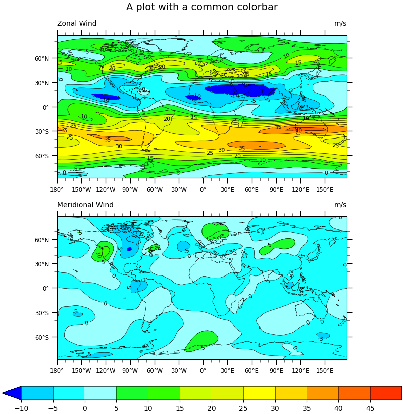
Two panel (subplot) image with shared colorbar and title
Adding a common title to paneled plots
Adding a common colorbar to paneled plots
Importing and truncating a NCL colormap
- See following URLs to see the reproduced NCL plot & script:
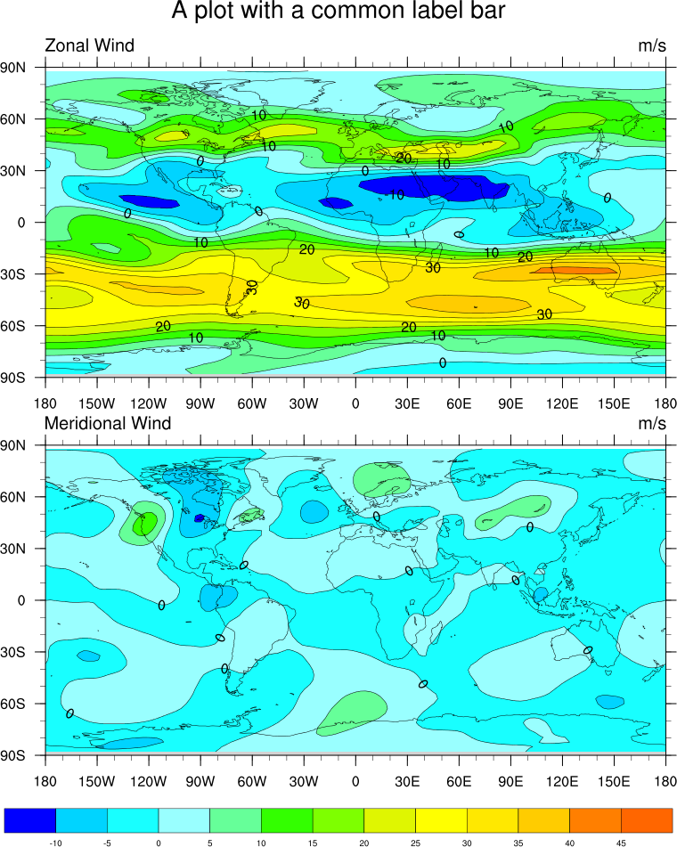
Original NCL script: https://www.ncl.ucar.edu/Applications/Scripts/panel_3.ncl
Original NCL plot: https://www.ncl.ucar.edu/Applications/Images/panel_3_lg.png
Import packages:
import cartopy.crs as ccrs
import matplotlib.pyplot as plt
import numpy as np
import xarray as xr

import geocat.datafiles as gdf
from geocat.viz import cmaps as gvcmaps
import geocat.viz.util as gvutil
Read in data:
# Open a netCDF data file using xarray default engine and load the data into xarrays, choosing the 2nd timestamp
ds = xr.open_dataset(gdf.get("netcdf_files/uv300.nc")).isel(time=1)
Utility Function: Labelled Filled Contour Plot:
# Define a utility plotting function in order not to repeat many lines of codes since we need to make the same figure
# with two different variables.


def plot_labelled_filled_contours(data, ax=None):
    """A utility function for convenience that plots labelled, filled contours
    with black contours marking each level.It will return a dictionary
    containing three objects corresponding to the filled contours, the black
    contours, and the contour labels."""

    # Import an NCL colormap, truncating it by using geocat.viz.util convenience function
    newcmp = gvutil.truncate_colormap(gvcmaps.gui_default,
                                      minval=0.03,
                                      maxval=0.9)

    handles = dict()
    handles["filled"] = data.plot.contourf(
        ax=ax,  # this is the axes we want to plot to
        cmap=newcmp,  # our special colormap
        levels=levels,  # contour levels specified outside this function
        xticks=np.arange(-180, 181, 30),  # nice x ticks
        yticks=np.arange(-90, 91, 30),  # nice y ticks
        transform=projection,  # data projection
        add_colorbar=False,  # don't add individual colorbars for each plot call
        add_labels=False,  # turn off xarray's automatic Lat, lon labels
    )

    # matplotlib's contourf doesn't let you specify the "edgecolors" (MATLAB terminology)
    # instead we plot black contours on top of the filled contours
    handles["contour"] = data.plot.contour(
        ax=ax,
        levels=levels,
        colors="black",  # note plurals in this and following kwargs
        linestyles="-",
        linewidths=0.5,
        add_labels=False,  # again turn off automatic labels
    )

    # Label the contours
    ax.clabel(
        handles["contour"],
        fontsize=8,
        fmt="%.0f",  # Turn off decimal points
    )

    # Add coastlines
    ax.coastlines(linewidth=0.5)

    # Use geocat.viz.util convenience function to add minor and major tick lines
    gvutil.add_major_minor_ticks(ax)

    # Use geocat.viz.util convenience function to make plots look like NCL plots by using latitude, longitude tick labels
    gvutil.add_lat_lon_ticklabels(ax)

    # Use geocat.viz.util convenience function to add main title as well as titles to left and right of the plot axes.
    gvutil.set_titles_and_labels(ax,
                                 lefttitle=data.attrs['long_name'],
                                 lefttitlefontsize=10,
                                 righttitle=data.attrs['units'],
                                 righttitlefontsize=10)

    return handles
Plot:
# Make two panels (i.e. subplots in matplotlib)
# Specify ``constrained_layout=True`` to automatically layout panels, colorbars and axes decorations nicely.
# See https://matplotlib.org/tutorials/intermediate/constrainedlayout_guide.html
# Generate figure and axes using Cartopy projection
projection = ccrs.PlateCarree()
fig, ax = plt.subplots(2,
                       1,
                       constrained_layout=True,
                       subplot_kw={"projection": projection})

# Set figure size (width, height) in inches
fig.set_size_inches((8, 8.2))

# Define the contour levels
levels = np.linspace(-10, 50, 13)

# Contour-plot U data, save "handles" to add a colorbar later
handles = plot_labelled_filled_contours(ds.U, ax=ax[0])

# Set a common title
ax[0].set_title("A plot with a common colorbar", fontsize=14, y=1.15)

# Contour-plot V data
plot_labelled_filled_contours(ds.V, ax=ax[1])

# Add horizontal colorbar
cbar = plt.colorbar(handles["filled"],
                    ax=ax,
                    orientation="horizontal",
                    ticks=levels[:-1],
                    drawedges=True,
                    aspect=30)
cbar.ax.tick_params(labelsize=10)

# Show the plot
plt.show()
Total running time of the script: ( 0 minutes 1.329 seconds)