Note
Click here to download the full example code
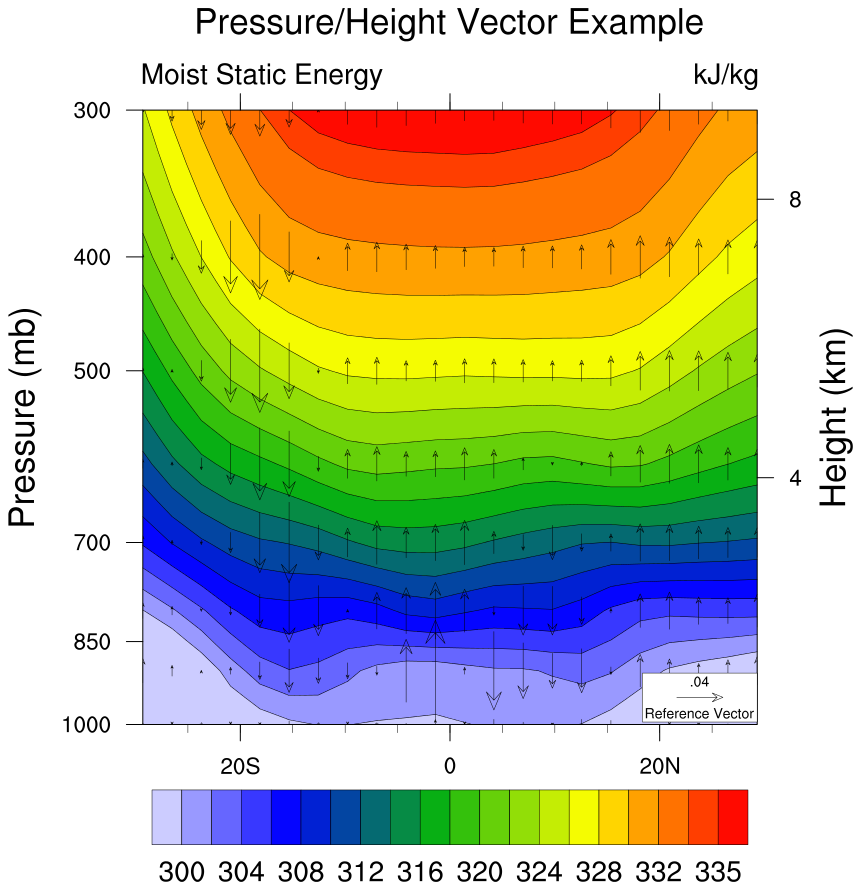
NCL_h_lat_7.py
- This script illustrates the following concepts:
Drawing vectors over filled contours
Drawing pressure and height scales
Interpolate to user specified pressure levels
Using the geocat-comp method interp_hybrid_to_pressure
Using a different color scheme to follow best practices for visualizations
- See following URLs to see the reproduced NCL plot & script:
Original NCL script: https://www.ncl.ucar.edu/Applications/Scripts/h_lat_7.ncl
Original NCL plot: https://www.ncl.ucar.edu/Applications/Images/h_lat_7_lg.png
Import packages:
import xarray as xr
from matplotlib import pyplot as plt
import numpy as np

import geocat.datafiles as gdf
from geocat.viz import util as gvutil
from geocat.comp import interp_hybrid_to_pressure
Read in data:
# Open a netCDF data file using xarray default engine and load the data into xarrays
ds = xr.open_dataset(gdf.get("netcdf_files/atmos.nc"), decode_times=False)

# Extract variables
T = ds.T  # temperature (K)
V = ds.V  # meridional wind (m/s)
Z = ds.Z3  # geopotential height (m)
omega = ds.OMEGA  # vertical pressure velocity (mb/day)
lev = ds.lev  # pressure levels (millibars)
lev = 100 * lev  # change units to Pa
q = ds.Q  # specific humidity (g/kg)
q = q / 1000  # change units to kg/kg

# Calculate moist static energy (h)
g = 9.81
L = 2.5e6
Cp = 1004.0

h = Cp * T + g * Z + L * q
h = h / 1000  # Convert to kJ/kg

# Convert h and omega to pressure levels
hyam = ds.hyam
hybm = ds.hybm
P0mb = ds.P0 * 0.01
ps = ds.PS
ps = ps / 100  # Convert from pascal to millibar
lev_p = np.array([300, 400, 500, 600, 700, 800, 900, 1000])

# interp_hybrid_to_pressure is the Python version of vinth2p in NCL script
hp = interp_hybrid_to_pressure(data=h,
                               ps=ps,
                               hyam=hyam,
                               hybm=hybm,
                               p0=P0mb,
                               new_levels=lev_p,
                               method='log')
# Assign attribute values
hp.attrs['units'] = "kJ/kg"
hp.attrs['long_name'] = "Moist Static Energy"

op = interp_hybrid_to_pressure(data=omega,
                               ps=ps,
                               hyam=hyam,
                               hybm=hybm,
                               p0=P0mb,
                               new_levels=lev_p,
                               method='log')
vp = interp_hybrid_to_pressure(data=V,
                               ps=ps,
                               hyam=hyam,
                               hybm=hybm,
                               p0=P0mb,
                               new_levels=lev_p,
                               method='log')

# Extract slices of the data
hp = hp.isel(time=0).sel(lat=slice(-30, 30)).sel(lon=210, method='nearest')
op = op.isel(time=0).sel(lat=slice(-30, 30)).sel(lon=210, method='nearest')
vp = vp.isel(time=0).sel(lat=slice(-30, 30)).sel(lon=210, method='nearest')

# Set vp equal to zero so that we plot only the vertical component
# while retaining the coordinate information
vp = xr.zeros_like(vp)
Plot:
# Generate figure (set its size (width, height) in inches)
fig = plt.figure(figsize=(10, 12))

# Generate axes
ax = plt.axes()

# Specify which contours should be drawn
levels = np.arange(300, 335, 2)
levels = np.append(levels, 335)

# Plot contour lines
hp.plot.contour(ax=ax,
                colors='black',
                levels=levels,
                linewidths=0.5,
                linestyles='solid',
                add_labels=False)

# Plot filled contours
colors = hp.plot.contourf(ax=ax,
                          levels=levels,
                          cmap='viridis',
                          add_labels=False,
                          add_colorbar=False)

# Draw vector plot
# (there is no matplotlib equivalent to "CurlyVector" yet)
Q = ax.quiver(
    hp['lat'],  # horizontal location
    hp['plev'],  # vertical location
    vp,  # horizontal component of the vectors
    op,  # vertical component of the vectors
    color='black',
    pivot="middle",
    width=0.001,
    headwidth=15,
    zorder=1)

# Draw legend for vector plot
ax.add_patch(
    plt.Rectangle(
        (17.3,
         944),  # location of the SW corner of box in the same units as the data
        12,  # the width of the box in the same units as the x axis
        55,  # the height of the box in the same units as the y axis
        facecolor='white',
        edgecolor='black',
        clip_on=False))
# Call quiver key twice to draw the text above and below the key arrow
qk = ax.quiverkey(
    Q,
    0.828,  # x coordinate of the center of the arrow as a percent of the plot width
    0.18,  # y coordinate of the center of the arrow as a percent of the plot height
    0.04,  # the size of the arrow in the same units as the data
    'Reference Vector',
    labelpos='S',
    coordinates='figure',
    color='black',
    fontproperties={'size': 13})
qk = ax.quiverkey(
    Q,
    0.828,  # x coordinate of the center of the arrow as a percent of the plot width
    0.18,  # y coordinate of the center of the arrow as a percent of the plot height
    0.04,  # the size of the arrow in the same units as the data
    '.04',
    labelpos='N',
    coordinates='figure',
    color='black',
    fontproperties={'size': 13})

# Use geocat.viz.util convenience function to add minor and major tick lines
gvutil.add_major_minor_ticks(ax,
                             x_minor_per_major=4,
                             y_minor_per_major=1,
                             labelsize=18)

# Use geocat.viz.util convenience function to set axes tick values
gvutil.set_axes_limits_and_ticks(ax,
                                 ylim=ax.get_ylim()[::-1],
                                 xticks=np.array([-20, 0, 20]),
                                 yticks=np.array(
                                     [300, 400, 500, 700, 850, 1000]),
                                 xticklabels=['20S', '0', '20N'])

# Use geocat.viz.util convenience function to add titles and the pressure label
gvutil.set_titles_and_labels(ax,
                             maintitle="Pressure/Height Vector Example",
                             maintitlefontsize=24,
                             lefttitle=hp.long_name,
                             lefttitlefontsize=22,
                             righttitle=hp.units,
                             righttitlefontsize=22,
                             ylabel='Pressure (mb)',
                             labelfontsize=24)

# Create second y-axis to show geo-potential height. Currently we're using
# arbitrary values for height as we haven't figured out how to make this work
# properly yet.
axRHS = ax.twinx()

# Use geocat.viz.util convenience function to set axes tick values
gvutil.set_axes_limits_and_ticks(axRHS, ylim=(0, 13), yticks=np.array([4, 8]))

# manually set tick length, width and ticklabel size
axRHS.tick_params(labelsize=18, length=8, width=0.9)

# Use geocat.viz.util convenience function to add titles and the pressure label
axRHS.set_ylabel(ylabel='Height (km)', labelpad=10, fontsize=24)

# Force the plot to be square by setting the aspect ratio to 1
ax.set_box_aspect(1)
axRHS.set_box_aspect(1)

# Turn off minor ticks on Y axis on the left hand side
ax.tick_params(axis='y', which='minor', left=False, right=False)

# Add a color bar after calling tight_layout function to prevent user warnings
plt.tight_layout()

cax = plt.axes((0.15, 0.03, 0.75, 0.06))
cab = fig.colorbar(colors,
                   ax=ax,
                   cax=cax,
                   orientation='horizontal',
                   ticks=levels[::2],
                   extendrect=True,
                   drawedges=True,
                   spacing='uniform')

# Set colorbar ticklabel font size
cab.ax.xaxis.set_tick_params(length=0, labelsize=18)

# Show plot
plt.show()
Out:
/home/docs/checkouts/readthedocs.org/user_builds/geocat-examples/conda/v2022.5.0/lib/python3.8/site-packages/metpy/interpolate/one_dimension.py:137: UserWarning: Interpolation point out of data bounds encountered
  warnings.warn('Interpolation point out of data bounds encountered')
Total running time of the script: ( 0 minutes 0.711 seconds)