Note
Click here to download the full example code
NCL_vector_4.py
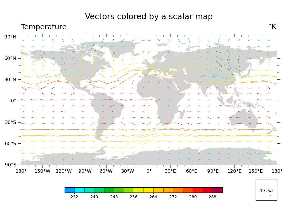
Plot U & V vectors globally, colored according to temperature
- This script illustrates the following concepts:
Coloring vectors based on temperature data
Changing the scale of the vectors on the plot
- See following URLs to see the reproduced NCL plot & script:
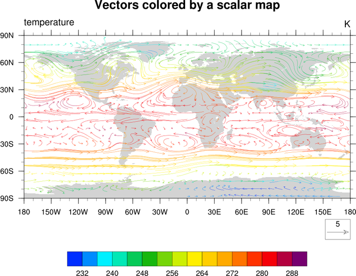
Original NCL script: https://www.ncl.ucar.edu/Applications/Scripts/vector_4.ncl
Original NCL plot: https://www.ncl.ucar.edu/Applications/Images/vector_4_lg.png
Import packages:
import xarray as xr
from matplotlib import pyplot as plt
import cartopy
import cartopy.crs as ccrs

import geocat.datafiles as gdf
from geocat.viz import cmaps as gvcmaps
from geocat.viz import util as gvutil
Read in data:
# Open a netCDF data file using xarray default engine and load the data into xarrays
file_in = xr.open_dataset(gdf.get("netcdf_files/83.nc"))

# Extract slices of lon and lat for first timestamp and 13th lev
ds = file_in.isel(time=0, lev=12, lon=slice(0, -1, 5), lat=slice(2, -1, 3))
Plot:
# Because there is no equivalent to ``CurlyVector`` in ``geocat.viz`` yet,
# this plot does not look as identical as the NCL version.

# Generate figure (set its size (width, height) in inches)
fig, ax = plt.subplots(figsize=(10, 7.25))

# Generate axes using Cartopy projection
ax = plt.axes(projection=ccrs.PlateCarree())

# Import an NCL colormap and truncate it for a range and color levels
plt.cm.register_cmap(
    'BlAqGrYeOrReVi200',
    gvutil.truncate_colormap(gvcmaps.BlAqGrYeOrReVi200,
                             minval=0.03,
                             maxval=0.95,
                             n=16))
cmap = plt.cm.get_cmap('BlAqGrYeOrReVi200', 16)

# Draw vector plot
# (there is no matplotlib equivalent to "CurlyVector" yet)
Q = plt.quiver(ds['lon'],
               ds['lat'],
               ds['U'].data,
               ds['V'].data,
               ds['T'].data,
               cmap=cmap,
               zorder=1,
               pivot="middle",
               width=0.001)
plt.clim(228, 292)

# Draw legend for vector plot
ax.add_patch(
    plt.Rectangle((150, -140),
                  30,
                  30,
                  facecolor='white',
                  edgecolor='black',
                  clip_on=False))
qk = ax.quiverkey(Q,
                  0.93,
                  0.06,
                  10,
                  r'10 $m/s$',
                  labelpos='N',
                  coordinates='figure',
                  color='black')

# Use geocat.viz.util convenience function to add minor and major tick lines
gvutil.add_major_minor_ticks(ax, labelsize=12)

# Use geocat.viz.util convenience function to make plots look like NCL plots by using latitude, longitude tick labels
gvutil.add_lat_lon_ticklabels(ax)

# Set major and minor ticks
plt.xticks(range(-180, 181, 30))
plt.yticks(range(-90, 91, 30))

# Use geocat.viz.util convenience function to add titles to left and right of the plot axis.
gvutil.set_titles_and_labels(ax,
                             maintitle="Vectors colored by a scalar map",
                             lefttitle="Temperature",
                             righttitle="$^{\circ}$K")

cax = plt.axes((0.225, 0.075, 0.55, 0.025))
cbar = fig.colorbar(Q,
                    ax=ax,
                    cax=cax,
                    orientation='horizontal',
                    ticks=range(232, 289, 8),
                    drawedges=True)

# Turn on continent shading
ax.add_feature(cartopy.feature.LAND,
               edgecolor='lightgray',
               facecolor='lightgray',
               zorder=0)

# Generate plot!
plt.tight_layout()
plt.show()
Out:
/home/docs/checkouts/readthedocs.org/user_builds/geocat-examples/checkouts/v2022.5.0/Gallery/Vectors/NCL_vector_4.py:118: UserWarning: This figure includes Axes that are not compatible with tight_layout, so results might be incorrect.
  plt.tight_layout()
Total running time of the script: ( 0 minutes 0.449 seconds)