Note
Click here to download the full example code
NCL_vector_1.py
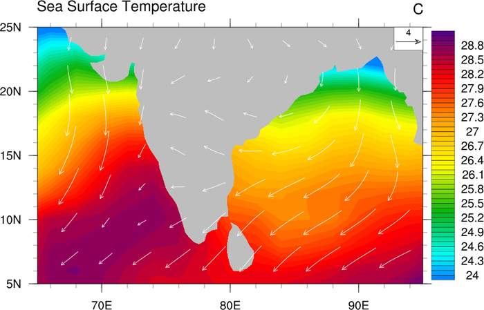
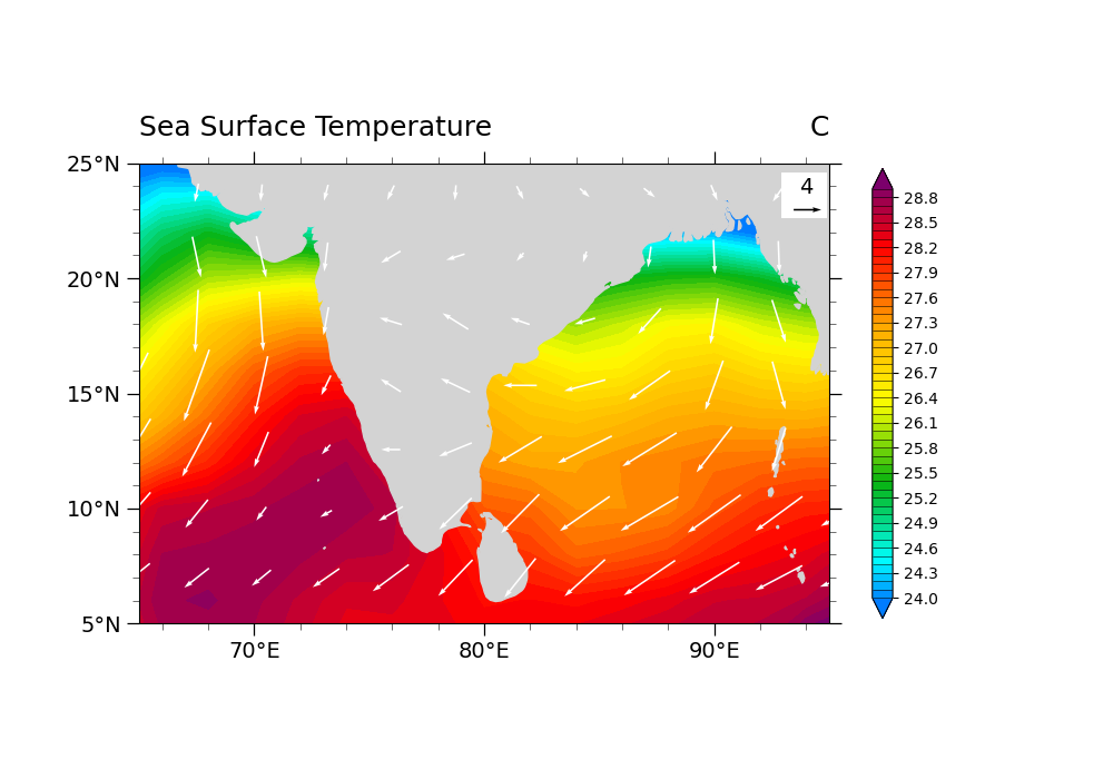
Plot U & V vector over SST
- This script illustrates the following concepts:
Overlaying vectors and filled contours on a map
Changing the scale of the vectors on the plot
Moving the vector reference annotation to the top right of the plot
Setting the color for vectors
Increasing the thickness of vectors
- See following URLs to see the reproduced NCL plot & script:
Original NCL script: https://www.ncl.ucar.edu/Applications/Scripts/vector_1.ncl
Original NCL plot: https://www.ncl.ucar.edu/Applications/Images/vector_1_lg.png
Import packages
import xarray as xr
import numpy as np
from matplotlib import pyplot as plt
import cartopy
import cartopy.crs as ccrs

import geocat.datafiles as gdf
from geocat.viz import cmaps as gvcmaps
from geocat.viz import util as gvutil
Read in data:
# Open a netCDF data file using xarray default engine and load the data into xarrays
sst_in = xr.open_dataset(gdf.get("netcdf_files/sst8292.nc"))
uv_in = xr.open_dataset(gdf.get("netcdf_files/uvt.nc"))

# Use date as the dimension rather than time
sst_in = sst_in.set_coords("date").swap_dims({"time": "date"}).drop('time')
uv_in = uv_in.set_coords("date").swap_dims({"time": "date"}).drop('time')

# Extract required variables
# Read SST and U, V for Jan 1988 (at 1000 mb for U, V)
# Note that we could use .isel() if we know the indices of date and lev
sst = sst_in['SST'].sel(date=198801)
u = uv_in['U'].sel(date=198801, lev=1000)
v = uv_in['V'].sel(date=198801, lev=1000)

# Read in grid information
lat_sst = sst['lat']
lon_sst = sst['lon']
lat_uv = u['lat']
lon_uv = u['lon']
Plot:
# Generate figure (set its size (width, height) in inches)
plt.subplots(figsize=(10, 7))

# Generate axes using Cartopy projection
ax = plt.axes(projection=ccrs.PlateCarree())

# Draw vector plot
Q = plt.quiver(lon_uv,
               lat_uv,
               u,
               v,
               color='white',
               pivot='middle',
               width=.0025,
               scale=75,
               zorder=2)

# Turn on continent shading
ax.add_feature(cartopy.feature.LAND,
               edgecolor='lightgray',
               facecolor='lightgray',
               zorder=1)

# Define levels for contour map (24, 24.1, ..., 28.8, 28.9)
levels = np.linspace(24, 28.9, 50)

# Import an NCL colormap, truncating it by using geocat.viz.util convenience function
gvutil.truncate_colormap(gvcmaps.BlAqGrYeOrReVi200,
                         minval=0.08,
                         maxval=0.96,
                         n=len(levels),
                         name='BlAqGrYeOrReVi200')

# Contourf-plot the SST data
cf = sst.plot.contourf('lon',
                       'lat',
                       extend='both',
                       levels=levels,
                       cmap='BlAqGrYeOrReVi200',
                       zorder=0,
                       add_labels=False,
                       add_colorbar=False)

# Add color bar
cbar_ticks = np.arange(24, 29.1, .3)
cbar = plt.colorbar(cf,
                    orientation='vertical',
                    drawedges=True,
                    shrink=0.75,
                    pad=0.05,
                    ticks=cbar_ticks)

# Draw the key for the quiver plot as a rectangle patch
rect = plt.Rectangle((92.9, 22.6),
                     2,
                     2,
                     facecolor='white',
                     edgecolor=None,
                     zorder=2)
ax.add_patch(rect)
ax.quiverkey(Q,
             0.9675,
             0.9,
             3,
             '4',
             labelpos='N',
             color='black',
             coordinates='axes',
             fontproperties={'size': 14},
             labelsep=0.1)

# Use geocat.viz.util convenience function to set axes tick values
gvutil.set_axes_limits_and_ticks(ax,
                                 xlim=(65, 95),
                                 ylim=(5, 25),
                                 xticks=range(70, 95, 10),
                                 yticks=range(5, 27, 5))

# Use geocat.viz.util convenience function to add minor and major tick lines
gvutil.add_major_minor_ticks(ax,
                             x_minor_per_major=5,
                             y_minor_per_major=5,
                             labelsize=14)

# Use geocat.viz.util convenience function to make plots look like NCL plots by using latitude, longitude tick labels
gvutil.add_lat_lon_ticklabels(ax)

# Use geocat.viz.util convenience function to add titles to left and right of the plot axis.
gvutil.set_titles_and_labels(ax,
                             lefttitle='Sea Surface Temperature',
                             righttitle='C')

# Show the plot
plt.show()
Total running time of the script: ( 0 minutes 2.822 seconds)