Note
Click here to download the full example code
NCL_overlay_11a.py
- This script illustrates the following concepts:
Overlaying vectors and filled contours on a map
Masking out particular areas in a map
Subsetting a color map
- See following URLs to see the reproduced NCL plot & script:
Original NCL script: https://www.ncl.ucar.edu/Applications/Scripts/overlay_11.ncl
Original NCL plot: https://www.ncl.ucar.edu/Applications/Images/overlay_11_lg.png
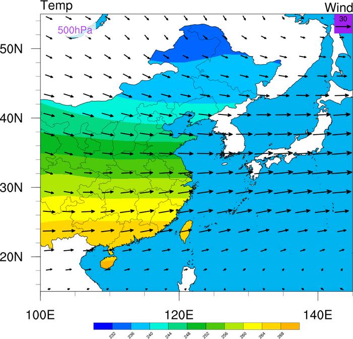
This script shows how to overlay contours and vectors on a map, but with the contours limited to specific areas, and the vectors not limited.
The point of this script is to show how to mask contours against a geographical boundary, but in a way that allows them to be drawn up to the boundary location. This is unlike the shapefile masking examples, where grid points are set to missing if they fall outside a boundary, and hence you can get blocky features close to the boundary.
With Python’s matplotlib, there are 2 general approaches to accomplishing this:
You can “cover” (i.e., “over lay”) geographical features on top of other plots using the
zorderparameter to most rendered objects.You can “clip” a plot object with a geographical boundary.
This example demonstrates approach (a).
See NCL_overlay_11b.py for demonstration of approach (b).
Import packages:
import xarray as xr
import numpy as np

from matplotlib import pyplot as plt

from cartopy.feature import ShapelyFeature, OCEAN, LAKES
from cartopy.crs import PlateCarree
from cartopy.io.shapereader import Reader as ShapeReader, natural_earth

import geocat.datafiles as gdf
from geocat.viz import cmaps as gvcmaps
from geocat.viz import util as gvutil
Read in data:
# Open a netCDF data file using xarray default engine and load the data into xarrays, as well as extract slices for
# ``time=0`` and the ``lev=500`` hPa level
ds = xr.open_dataset(gdf.get("netcdf_files/uvt.nc")).sel(time=0, lev=500)

# For convenience only, extract the U,V,T and lat and lon variables
U = ds["U"]
V = ds["V"]
T = ds["T"]

lat = ds["lat"]
lon = ds["lon"]
Construct shape boundaries:
Using Cartopy’s interface to the Natural Earth Collection of shapefiles and geographical shape data, we construct the geographical boundaries that we are interested in displaying, namely the country borders of China and Taiwan, the borders of Chinese provinces, and all land borders without China or Taiwan.
# Download the Natural Earth shapefile for country boundaries at 10m resolution
shapefile = natural_earth(category='cultural',
                          resolution='10m',
                          name='admin_0_countries')

# Sort the geometries in the shapefile into Chinese/Taiwanese or other
country_geos = []
other_land_geos = []
for record in ShapeReader(shapefile).records():
    if record.attributes['ADMIN'] in ['China', 'Taiwan']:
        country_geos.append(record.geometry)
    else:
        other_land_geos.append(record.geometry)

# Define map projection to allow Cartopy to transform ``lat`` and ``lon`` values accurately into points on the
# matplotlib plot canvas.
projection = PlateCarree()

# Define a Cartopy Feature for the country borders and the land mask (i.e.,
# all other land) from the shapefile geometries, so they can be easily plotted
countries = ShapelyFeature(country_geos,
                           crs=projection,
                           facecolor='none',
                           edgecolor='black',
                           lw=1.5)
land_mask = ShapelyFeature(other_land_geos,
                           crs=projection,
                           facecolor='white',
                           edgecolor='none')

# Download the Natural Earth shapefile for the states/provinces at 10m resolution
shapefile = natural_earth(category='cultural',
                          resolution='10m',
                          name='admin_1_states_provinces')

# Extract the Chinese province borders
province_geos = [
    record.geometry
    for record in ShapeReader(shapefile).records()
    if record.attributes['admin'] == 'China'
]

# Define a Cartopy Feature for the province borders, so they can be easily plotted
provinces = ShapelyFeature(province_geos,
                           crs=projection,
                           facecolor='none',
                           edgecolor='black',
                           lw=0.25)
Out:
/home/docs/checkouts/readthedocs.org/user_builds/geocat-examples/conda/v2022.5.0/lib/python3.8/site-packages/cartopy/io/__init__.py:241: DownloadWarning: Downloading: https://naturalearth.s3.amazonaws.com/10m_cultural/ne_10m_admin_0_countries.zip
  warnings.warn(f'Downloading: {url}', DownloadWarning)
/home/docs/checkouts/readthedocs.org/user_builds/geocat-examples/conda/v2022.5.0/lib/python3.8/site-packages/cartopy/io/__init__.py:241: DownloadWarning: Downloading: https://naturalearth.s3.amazonaws.com/10m_cultural/ne_10m_admin_1_states_provinces.zip
  warnings.warn(f'Downloading: {url}', DownloadWarning)
Plot:
# Generate figure (set its size (width, height) in inches) and axes using Cartopy
fig = plt.figure(figsize=(10, 10))
ax = plt.axes(projection=projection)

ax.set_extent([100, 145, 15, 55], crs=projection)

# Define the contour levels
clevs = np.arange(228, 273, 4, dtype=float)

# Import an NCL colormap, truncating it by using geocat.viz.util convenience function
newcmp = gvutil.truncate_colormap(gvcmaps.BkBlAqGrYeOrReViWh200,
                                  minval=0.1,
                                  maxval=0.6,
                                  n=len(clevs))

# Draw the temperature contour plot with the subselected colormap
# (Place the zorder of the contour plot at the lowest level)
cf = ax.contourf(lon, lat, T, levels=clevs, cmap=newcmp, zorder=1)

# Draw horizontal color bar
cax = plt.axes((0.14, 0.08, 0.74, 0.02))
cbar = plt.colorbar(cf,
                    ax=ax,
                    cax=cax,
                    ticks=clevs[1:-1],
                    drawedges=True,
                    orientation='horizontal')
cbar.ax.tick_params(labelsize=12)

# Add the land mask feature on top of the contour plot (higher zorder)
ax.add_feature(land_mask, zorder=2)

# Add the OCEAN and LAKES features on top of the contour plot
ax.add_feature(OCEAN.with_scale('50m'), edgecolor='black', lw=1, zorder=2)
ax.add_feature(LAKES.with_scale('50m'), edgecolor='black', lw=1, zorder=2)

# Add the country and province features (which are transparent) on top
ax.add_feature(countries, zorder=3)
ax.add_feature(provinces, zorder=3)

# Draw the wind quiver plot on top of everything else
Q = ax.quiver(lon,
              lat,
              U,
              V,
              color='black',
              width=.003,
              scale=600.,
              headwidth=3.75,
              zorder=4)

# Draw the key for the quiver plot
rect = plt.Rectangle((142, 52),
                     3,
                     3,
                     facecolor='mediumorchid',
                     edgecolor=None,
                     zorder=4)
ax.add_patch(rect)
ax.quiverkey(Q,
             0.9675,
             0.95,
             30,
             '30',
             labelpos='N',
             color='black',
             coordinates='axes',
             fontproperties={'size': 14},
             labelsep=0.1)

# Add a text box to indicate the pressure level
props = dict(facecolor='white', edgecolor='none', alpha=0.8)
ax.text(105,
        52.7,
        '500hPa',
        transform=projection,
        fontsize=18,
        ha='center',
        va='center',
        color='mediumorchid',
        bbox=props)

# Use geocat.viz.util convenience function to set axes tick values
gvutil.set_axes_limits_and_ticks(ax,
                                 xticks=[100, 120, 140],
                                 yticks=[20, 30, 40, 50])

# Use geocat.viz.util convenience function to make plots look like NCL plots by using latitude, longitude tick labels
gvutil.add_lat_lon_ticklabels(ax)

# Use geocat.viz.util convenience function to add minor and major tick lines
gvutil.add_major_minor_ticks(ax,
                             x_minor_per_major=4,
                             y_minor_per_major=5,
                             labelsize=18)

# Use geocat.viz.util convenience function to add main title as well as titles to left and right of the plot axes.
gvutil.set_titles_and_labels(ax,
                             lefttitle="Temp",
                             lefttitlefontsize=20,
                             righttitle="Wind",
                             righttitlefontsize=20)

# Show the plot
plt.show()
Total running time of the script: ( 0 minutes 5.889 seconds)