Note
Click here to download the full example code
NCL_mask_1.py
- This script illustrates the following concepts:
Using “mask” to set land or ocean values in your data to missing
Masking the ocean in a map plot
Masking land in a map plot
Spanning part of a color map for contour fill
- See following URLs to see the reproduced NCL plot & script:
Original NCL script: https://www.ncl.ucar.edu/Applications/Scripts/mask_1.ncl
Original NCL plot: https://www.ncl.ucar.edu/Applications/Images/mask_1_1_lg.png and https://www.ncl.ucar.edu/Applications/Images/mask_1_2_lg.png
Import packages:
import cartopy.crs as ccrs
import matplotlib.pyplot as plt
import numpy as np
import xarray as xr

import geocat.datafiles as gdf
from geocat.viz import cmaps as gvcmaps
from geocat.viz import util as gvutil
Read in data:
# Open a netCDF data file using xarray default engine and load the data into xarrays
ds = xr.open_dataset(gdf.get("netcdf_files/atmos.nc"), decode_times=False
                    )  # Disable time decoding due to missing necessary metadata
# Extract a slice of the data
ds = ds.isel(time=0).drop("time")
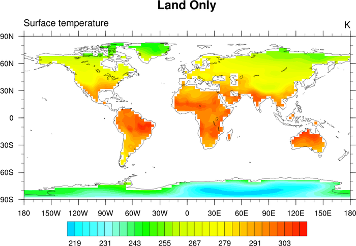
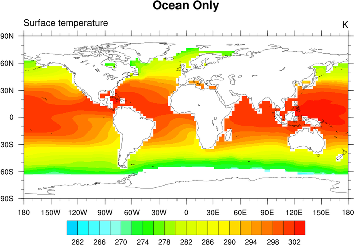
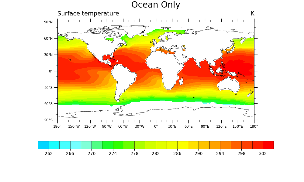
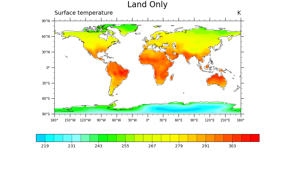
Data Masking:
# Use xarray.DataArray.where() function to mask out land and then ocean data
land_only = ds.TS.where(ds.ORO == 1.0)
ocean_only = ds.TS.where(ds.ORO == 0.0)
land_only = gvutil.xr_add_cyclic_longitudes(land_only, "lon")
ocean_only = gvutil.xr_add_cyclic_longitudes(ocean_only, "lon")
Plot Ocean Only:
# Generate figure (set its size (width, height) in inches)
plt.figure(figsize=(10, 6))

# Generate axes using Cartopy and draw coastlines
projection = ccrs.PlateCarree()
ax = plt.axes(projection=projection)
ax.coastlines(linewidth=0.5, resolution="110m")

# Import an NCL colormap, truncating it by using geocat.viz.util convenience function
newcmp = gvutil.truncate_colormap(gvcmaps.BlAqGrYeOrRe,
                                  minval=0.1,
                                  maxval=1.0,
                                  n=22)

# Contourf-plot ocean-only data (for filled contours)
filled = ocean_only.plot.contourf(ax=ax,
                                  cmap=newcmp,
                                  levels=np.arange(260, 305, 2),
                                  xticks=np.arange(-180, 181, 30),
                                  yticks=np.arange(-90, 91, 30),
                                  transform=ccrs.PlateCarree(),
                                  add_colorbar=False,
                                  add_labels=False,
                                  vmin=260,
                                  vmax=304)

# Add horizontal colorbar
cbar = plt.colorbar(filled,
                    ax=ax,
                    orientation="horizontal",
                    aspect=30,
                    drawedges=True)
cbar.set_ticks(np.arange(262, 304, 4))

# Use geocat.viz.util convenience function to add minor and major tick lines
gvutil.add_major_minor_ticks(ax)

# Use geocat.viz.util convenience function to make plots look like NCL plots by using latitude, longitude tick labels
gvutil.add_lat_lon_ticklabels(ax)

# Use geocat.viz.util convenience function to add main title as well as titles to left and right of the plot axes.
gvutil.set_titles_and_labels(ax,
                             maintitle="Ocean Only",
                             lefttitle=ocean_only.attrs['long_name'],
                             lefttitlefontsize=14,
                             righttitle=ocean_only.attrs['units'],
                             righttitlefontsize=14)

# Show the plot
plt.show()
Plot Land Only:
# Generate figure (set its size (width, height) in inches)
plt.figure(figsize=(10, 6))

# Generate axes using Cartopy and draw coastlines
ax = plt.axes(projection=projection)
ax.coastlines(linewidth=0.5, resolution="110m")

# Import an NCL colormap
newcmp = gvutil.truncate_colormap(gvcmaps.BlAqGrYeOrRe,
                                  minval=0.1,
                                  maxval=1.0,
                                  n=32)

# Contourf-plot land-only data (for filled contours)
filled = land_only.plot.contourf(ax=ax,
                                 cmap=newcmp,
                                 levels=np.arange(215, 316, 4),
                                 xticks=np.arange(-180, 181, 30),
                                 yticks=np.arange(-90, 91, 30),
                                 transform=ccrs.PlateCarree(),
                                 add_colorbar=False,
                                 add_labels=False,
                                 vmin=215,
                                 vmax=315)

# Add horizontal colorbar
cbar = plt.colorbar(filled,
                    ax=ax,
                    orientation="horizontal",
                    aspect=30,
                    drawedges=True)
cbar.set_ticks(np.arange(219, 304, 12))

# Use geocat.viz.util convenience function to add minor and major tick lines
gvutil.add_major_minor_ticks(ax)

# Use geocat.viz.util convenience function to make plots look like NCL plots by using latitude, longitude tick labels
gvutil.add_lat_lon_ticklabels(ax)

# Use geocat.viz.util convenience function to add main title as well as titles to left and right of the plot axes.
gvutil.set_titles_and_labels(ax,
                             maintitle="Land Only",
                             lefttitle=land_only.attrs['long_name'],
                             lefttitlefontsize=14,
                             righttitle=land_only.attrs['units'],
                             righttitlefontsize=14)

# Show the plot
plt.show()
Total running time of the script: ( 0 minutes 1.172 seconds)