Note
Click here to download the full example code
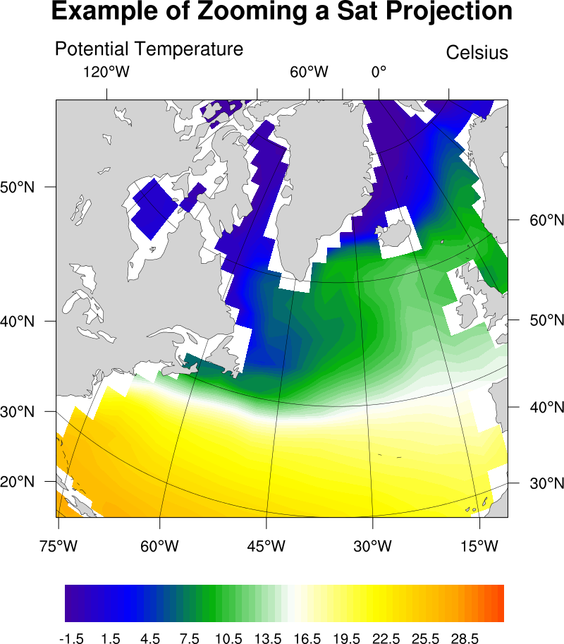
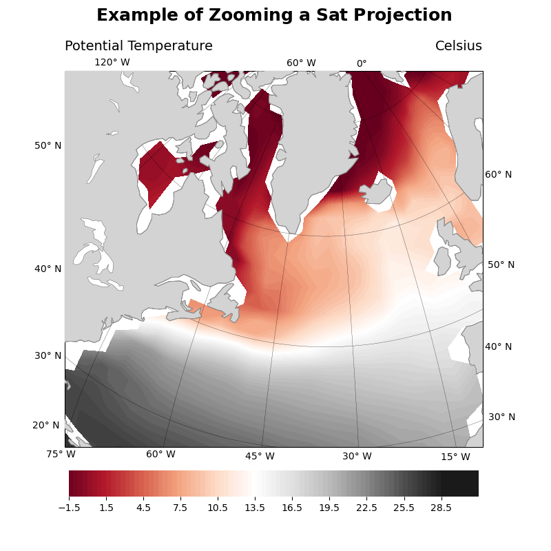
NCL_sat_3.py
- This script illustrates the following concepts:
zooming into an orthographic projection
plotting filled contour data on an orthographic map
plotting lat/lon tick marks on an orthographic map
- See following URLs to see the reproduced NCL plot & script:
Original NCL script: https://www.ncl.ucar.edu/Applications/Scripts/sat_3.ncl
Original NCL plot: https://www.ncl.ucar.edu/Applications/Images/sat_3_lg.png
Import packages:
import matplotlib.pyplot as plt
import cartopy.crs as ccrs
import cartopy.feature as cfeature
import xarray as xr
import numpy as np
import matplotlib.ticker as mticker

import geocat.datafiles as gdf

from geocat.viz import util as gvutil
Define a helper function for plotting lat/lon ticks on an orthographic plane
def plotOrthoTicks(coords, loc):

    if loc == 'zero':
        for lon, lat in coords:
            ax.text(lon,
                    lat,
                    '{0}\N{DEGREE SIGN}'.format(lon),
                    va='bottom',
                    ha='center',
                    transform=ccrs.PlateCarree())
    if loc == 'left':
        for lon, lat in coords:
            ax.text(lon,
                    lat,
                    '{0}\N{DEGREE SIGN} N '.format(lat),
                    va='center',
                    ha='right',
                    transform=ccrs.PlateCarree())

    if loc == 'right':
        for lon, lat in coords:
            ax.text(lon,
                    lat,
                    '{0}\N{DEGREE SIGN} N '.format(lat),
                    va='center',
                    ha='left',
                    transform=ccrs.PlateCarree())

    if loc == 'top':
        for lon, lat in coords:
            ax.text(lon,
                    lat,
                    '{0}\N{DEGREE SIGN} W '.format(-lon),
                    va='bottom',
                    ha='center',
                    transform=ccrs.PlateCarree())

    if loc == 'bottom':
        for lon, lat in coords:
            ax.text(lon,
                    lat,
                    '{0}\N{DEGREE SIGN} W '.format(-lon),
                    va='top',
                    ha='center',
                    transform=ccrs.PlateCarree())
Read in data:
# Open a netCDF data file using xarray default engine and
# load the data into xarrays
ds = xr.open_dataset(gdf.get('netcdf_files/h_avg_Y0191_D000.00.nc'),
                     decode_times=False)

# Extract a slice of the data
t = ds.T.isel(time=0, z_t=0)
Plot:
plt.figure(figsize=(8, 8))

# Create an axis with an orthographic projection
ax = plt.axes(projection=ccrs.Orthographic(central_longitude=-35,
                                           central_latitude=60),
              anchor='C')

# Set extent of map
ax.set_extent((-80, -10, 30, 80), crs=ccrs.PlateCarree())

# Add natural feature to map
ax.coastlines(resolution='110m')
ax.add_feature(cfeature.LAND, facecolor='lightgray', zorder=3)
ax.add_feature(cfeature.COASTLINE, linewidth=0.2, zorder=3)
ax.add_feature(cfeature.LAKES,
               edgecolor='black',
               linewidth=0.2,
               facecolor='white',
               zorder=4)

# plot filled contour data
heatmap = t.plot.contourf(ax=ax,
                          transform=ccrs.PlateCarree(),
                          levels=80,
                          vmin=-1.5,
                          vmax=28.5,
                          cmap='RdGy',
                          add_colorbar=False,
                          zorder=1)

# Add color bar
cbar_ticks = np.arange(-1.5, 31.5, 3)
cbar = plt.colorbar(heatmap,
                    orientation='horizontal',
                    extendfrac=[0, .1],
                    shrink=0.8,
                    aspect=14,
                    pad=0.05,
                    extendrect=True,
                    ticks=cbar_ticks)

cbar.ax.tick_params(labelsize=10)

# Get rid of black outline on colorbar
cbar.outline.set_visible(False)

# Set main plot title
main = r"$\bf{Example}$" + " " + r"$\bf{of}$" + " " + r"$\bf{Zooming}$" + \
       " " + r"$\bf{a}$" + " " + r"$\bf{Sat}$" + " " + r"$\bf{Projection}$"

# Set plot subtitles using NetCDF metadata
left = t.long_name
right = t.units

# Use geocat-viz function to create main, left, and right plot titles
title = gvutil.set_titles_and_labels(ax,
                                     maintitle=main,
                                     maintitlefontsize=16,
                                     lefttitle=left,
                                     lefttitlefontsize=14,
                                     righttitle=right,
                                     righttitlefontsize=14,
                                     xlabel="",
                                     ylabel="")

# Plot gridlines
gl = ax.gridlines(color='black', linewidth=0.2, zorder=2)

# Set frequency of gridlines in the x and y directions
gl.xlocator = mticker.FixedLocator(np.arange(-180, 180, 15))
gl.ylocator = mticker.FixedLocator(np.arange(-90, 90, 15))

# Manually plot tick marks.
# NCL has automatic tick mark placement on orthographic projections,
# Python's cartopy module does not have this functionality yet.
plotOrthoTicks([(0, 81.7)], 'zero')
plotOrthoTicks([(-80, 30), (-76, 20), (-88, 40), (-107, 50)], 'left')
plotOrthoTicks([(-9, 30), (-6, 40), (1, 50), (13, 60)], 'right')
plotOrthoTicks([(-120, 60), (-60, 82.5)], 'top')
plotOrthoTicks([(-75, 16.0), (-60, 25.0), (-45, 29.0), (-30, 29.5),
                (-15, 26.5)], 'bottom')

plt.tight_layout()
plt.show()
Total running time of the script: ( 0 minutes 4.234 seconds)