Note
Click here to download the full example code
NCL_radar_1.py
- This script illustrates the following concepts:
Fitting radial data to a cartesian grid
Creating a horizontal colorbar
Adding a background behind plotted data
Creating a square aspect ratio
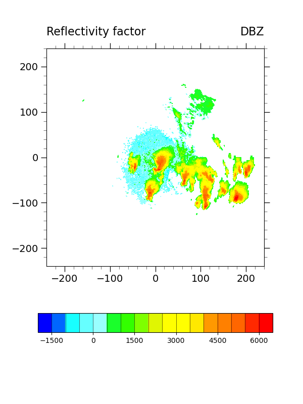
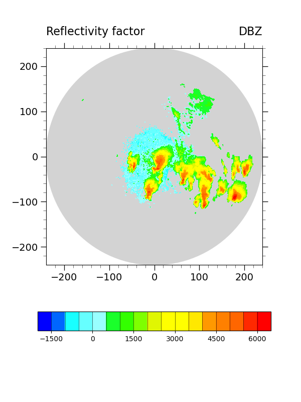
- See following URLs to see the reproduced NCL plot & script:
Import packages:
import numpy as np
import xarray as xr
import matplotlib.pyplot as plt

import geocat.datafiles as gdf
from geocat.viz import cmaps as gvcmaps
from geocat.viz import util as gvutil
Read in data:
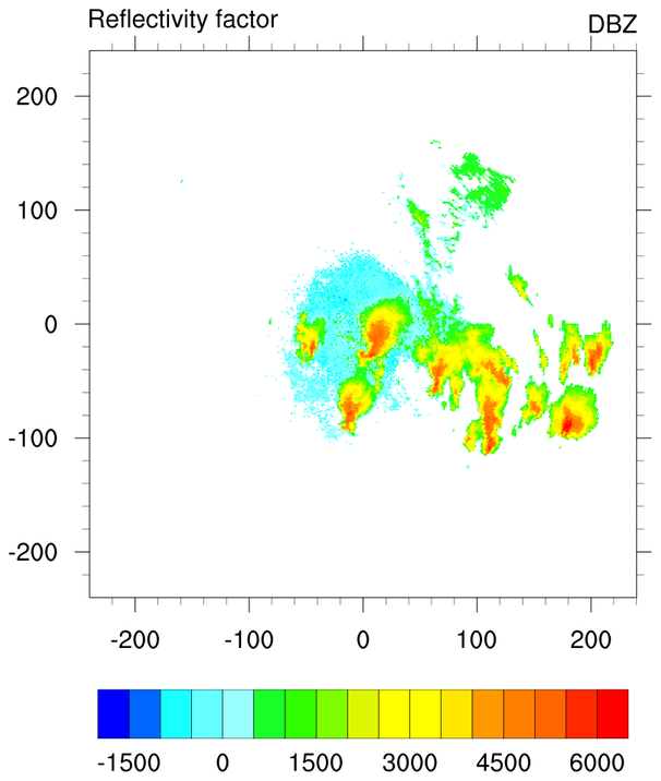
ds = xr.open_dataset(gdf.get("netcdf_files/dz.nc"), decode_times=False)
Convert data to radial form:
# Designate center of radial data
xcenter = 0.0
ycenter = 0.0

# construct radial array from netcdf metadata
km_between_cells = 0.25
radius = ds.DZ.data.shape[1] * km_between_cells
r = np.arange(0, radius, 0.25)

# Convert reflectivity factor
values = ds.DZ.data
values = values * 100

# Make angles monotonic
theta = ds.Azimuth.data
theta[0:63] = theta[0:63] - 360

# Make a cartesian mesh grid
radius_matrix, theta_matrix = np.meshgrid(r, theta)
X = radius_matrix * np.cos(np.deg2rad(theta_matrix))
Y = radius_matrix * np.sin(np.deg2rad(theta_matrix))
Plotting helper function
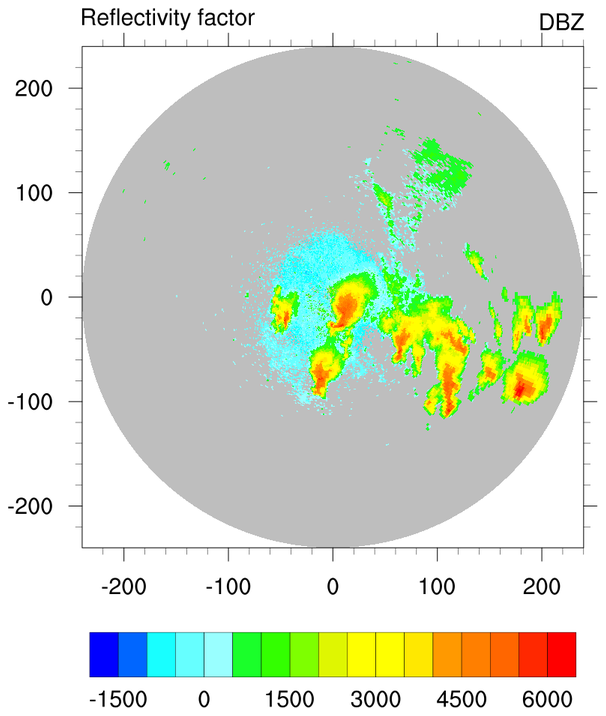
def radar_plot(X, Y, values, bg_color=None):
    # Create a figure and axes using subplots
    fig, ax = plt.subplots(figsize=(6, 8))

    # Choose default colormap
    cmap = gvcmaps.gui_default

    # Plot using contourf
    p = plt.contourf(X,
                     Y,
                     values,
                     cmap=cmap,
                     levels=np.arange(-20, 70, 5) * 100,
                     zorder=3)

    # Change orientation and tick marks of colorbar
    plt.colorbar(p,
                 orientation="horizontal",
                 ticks=np.arange(-15, 65, 15) * 100,
                 drawedges=True,
                 aspect=12)

    # Use geocat.viz.util convenience function to add minor and major tick lines
    gvutil.add_major_minor_ticks(ax, labelsize=12)

    # Use geocat.viz.util convenience function to add titles to left and right of the plot axis.
    gvutil.set_titles_and_labels(ax,
                                 lefttitle=ds.DZ.long_name,
                                 lefttitlefontsize=16,
                                 righttitle=ds.DZ.units,
                                 righttitlefontsize=16,
                                 xlabel="",
                                 ylabel="")

    # Use geocat.viz.util convenience function to set axes limits & tick values
    gvutil.set_axes_limits_and_ticks(ax,
                                     xlim=(-240, 240),
                                     ylim=(-240, 240),
                                     xticks=np.arange(-200, 201, 100),
                                     yticks=np.arange(-200, 201, 100))

    # Use geocat.viz.util convenience function to set tick placements
    gvutil.add_major_minor_ticks(ax,
                                 x_minor_per_major=5,
                                 y_minor_per_major=5,
                                 labelsize=14)

    # Set aspect ratio
    ax.set_aspect('equal')

    # Allow optional background circle to be set
    if (bg_color is not None):
        circle_bg = plt.Circle((0, 0), 240, color=bg_color, zorder=1)
        ax.add_artist(circle_bg)

    # Show plot
    plt.show()
Plot:
# Generate first plot without a background using the helper function
radar_plot(X, Y, values)
Alternative plot:
# Generate alternative plot with a background
radar_plot(X, Y, values, bg_color="lightgrey")
Total running time of the script: ( 0 minutes 0.895 seconds)