Note
Click here to download the full example code
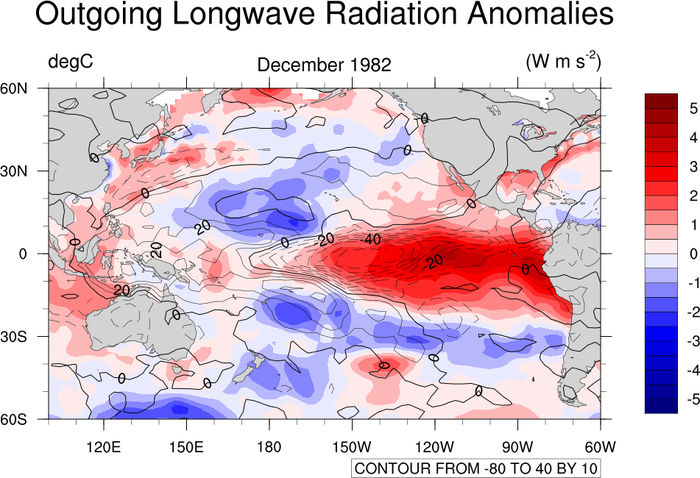
NCL_conOncon_2.py
- This script illustrates the following concepts:
Overlaying two sets of contours on a map
Drawing the zero contour line thicker
Changing the center longitude for a cylindrical equidistant projection
Using a blue-white-red color map
- See following URLs to see the reproduced NCL plot & script:
Original NCL script: https://www.ncl.ucar.edu/Applications/Scripts/conOncon_2.ncl
Original NCL plot: https://www.ncl.ucar.edu/Applications/Images/conOncon_2_lg.png
Import packages:
import numpy as np
import xarray as xr
import matplotlib.pyplot as plt
import cartopy.crs as ccrs
import cartopy.feature as cfeature
from cartopy.mpl.gridliner import LongitudeFormatter, LatitudeFormatter

import geocat.datafiles as gdf
from geocat.viz import util as gvutil
from geocat.viz import cmaps as gvcmaps
Read in data:
# Open a netCDF data file using xarray default engine and load the data into xarrays
sst = xr.open_dataset(gdf.get("netcdf_files/sst8292a.nc"))
olr = xr.open_dataset(gdf.get("netcdf_files/olr7991a.nc"))

# Extract data for December 1982
sst = sst.isel(time=11, drop=True).SSTA
olr = olr.isel(time=47, drop=True).OLRA

# Fix the artifact of not-shown-data around 0 and 360-degree longitudes
sst = gvutil.xr_add_cyclic_longitudes(sst, 'lon')
olr = gvutil.xr_add_cyclic_longitudes(olr, 'lon')
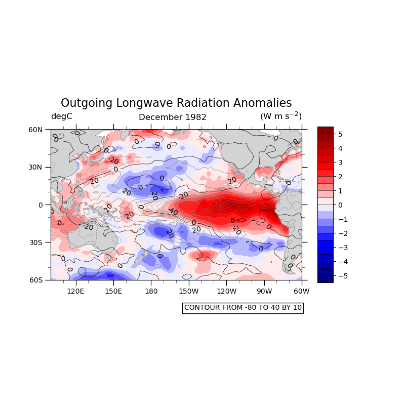
Plot:
# Generate figure and axes
plt.figure(figsize=(8, 8))

# Set axes projection
ax = plt.axes(projection=ccrs.PlateCarree(central_longitude=-160))
ax.set_extent([100, 300, -60, 60], crs=ccrs.PlateCarree())

# Load in color map and specify contour levels
cmap = gvcmaps.BlWhRe
sst_levels = np.arange(-5.5, 6, 0.5)
# Draw SST contour
temp = sst.plot.contourf(ax=ax,
                         transform=ccrs.PlateCarree(),
                         cmap=cmap,
                         levels=sst_levels,
                         extend='neither',
                         add_colorbar=False,
                         add_labels=False,
                         zorder=0)
plt.colorbar(temp,
             ax=ax,
             orientation='vertical',
             ticks=np.arange(-5, 6, 1),
             drawedges=True,
             shrink=0.5,
             aspect=10)

# Draw map features on top of filled contour
ax.add_feature(cfeature.LAND, facecolor='lightgray', zorder=1)
ax.add_feature(cfeature.COASTLINE, edgecolor='gray', linewidth=0.5, zorder=1)

# Draw OLR contour
# Specify contour levels excluding 0
olr_levels = np.arange(-80, 0, 10)
olr_levels = np.append(olr_levels, np.arange(10, 50, 10))

rad = olr.plot.contour(ax=ax,
                       transform=ccrs.PlateCarree(),
                       levels=olr_levels,
                       colors='gray',
                       linewidths=0.5,
                       add_labels=False)
ax.clabel(rad, [-40, -20, 20], fmt='%d', inline=True, colors='black')

# Plot the zero contour with a black color
rad = olr.plot.contour(ax=ax,
                       transform=ccrs.PlateCarree(),
                       levels=[0],
                       colors='black',
                       linewidths=0.5,
                       add_labels=False)
ax.clabel(rad, [0], fmt='%d', inline=True, colors='black')

# Use geocat.viz.util convenience function to set axes tick values
gvutil.set_axes_limits_and_ticks(ax,
                                 ylim=(-60, 60),
                                 yticks=np.arange(-60, 90, 30),
                                 xticks=np.arange(-80, 120, 30))

# Use geocat.viz.util convenience function to make plots look like NCL plots by
# using latitude, longitude tick labels
gvutil.add_lat_lon_ticklabels(ax)

# Remove the degree symbol from tick labels
ax.yaxis.set_major_formatter(LatitudeFormatter(degree_symbol=''))
ax.xaxis.set_major_formatter(LongitudeFormatter(degree_symbol=''))

# Use geocat.viz.util convenience function to add minor and major tick lines
gvutil.add_major_minor_ticks(ax,
                             x_minor_per_major=3,
                             y_minor_per_major=3,
                             labelsize=10)

gvutil.set_titles_and_labels(ax,
                             maintitle=olr.long_name,
                             maintitlefontsize=14,
                             lefttitle='degC',
                             lefttitlefontsize=12,
                             righttitle='(W m s$^{-2}$)',
                             righttitlefontsize=12)
# Add center title
ax.text(0.35, 1.06, 'December 1982', fontsize=12, transform=ax.transAxes)

# Add lower text box
ax.text(1,
        -0.2,
        "CONTOUR FROM -80 TO 40 BY 10",
        horizontalalignment='right',
        transform=ax.transAxes,
        bbox=dict(boxstyle='square, pad=0.25',
                  facecolor='white',
                  edgecolor='black'))

plt.show()
Total running time of the script: ( 0 minutes 2.640 seconds)