Note
Click here to download the full example code
NCL_conLev_4.py
- This script illustrates the following concepts:
Explicitly setting contour levels
Explicitly setting the fill colors for contours
Reordering an array
Removing the mean
Drawing color-filled contours over a cylindrical equidistant map
Turning off contour line labels
Turning off contour lines
Turning off map fill
Turning on map outlines
- See following URLs to see the reproduced NCL plot & script:
Original NCL script: https://www.ncl.ucar.edu/Applications/Scripts/conLev_4.ncl
Original NCL plot: https://www.ncl.ucar.edu/Applications/Images/conLev_4_lg.png
Import packages:
import numpy as np
import xarray as xr
import matplotlib.pyplot as plt

import cartopy.crs as ccrs
import geocat.datafiles as gdf
from geocat.viz import cmaps as gvcmaps
from geocat.viz import util as gvutil
Read in data:
# Open a netCDF data file using xarray default engine and load the data into xarrays
ds = xr.open_dataset(gdf.get("netcdf_files/b003_TS_200-299.nc"),
                     decode_times=False)
x = ds.TS

# Apply mean reduction from coordinates as performed in NCL's dim_rmvmean_n_Wrap(x,0)
# Apply this only to x.isel(time=0) because NCL plot plots only for time=0
newx = x.mean('time')
newx = x.isel(time=0) - newx

# Fix the artifact of not-shown-data around 0 and 360-degree longitudes
newx = gvutil.xr_add_cyclic_longitudes(newx, "lon")
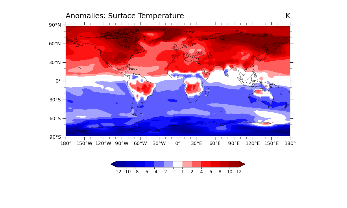
Plot:
# Generate figure (set its size (width, height) in inches)
plt.figure(figsize=(12, 7.2))

# Generate axes using Cartopy projection
projection = ccrs.PlateCarree()
ax = plt.axes(projection=projection)

# Use global map and draw coastlines
ax.set_global()
ax.coastlines(linewidth=0.5, resolution="110m")

# Import an NCL colormap
newcmp = gvcmaps.BlRe
newcmp.colors[len(newcmp.colors) //
              2] = [1, 1, 1]  # Set middle value to white to match NCL

# Contourf-plot data (for filled contours)
p = newx.plot.contourf(
    ax=ax,
    vmin=-1,
    vmax=10,
    levels=[-12, -10, -8, -6, -4, -2, -1, 1, 2, 4, 6, 8, 10, 12],
    cmap=newcmp,
    add_colorbar=False,
    transform=projection,
    add_labels=False)

# Add horizontal colorbar
cbar = plt.colorbar(p, orientation='horizontal', shrink=0.5)
cbar.ax.tick_params(labelsize=11)
cbar.set_ticks([-12, -10, -8, -6, -4, -2, -1, 1, 2, 4, 6, 8, 10, 12])

# Use geocat.viz.util convenience function to set axes tick values
gvutil.set_axes_limits_and_ticks(ax,
                                 xticks=np.linspace(-180, 180, 13),
                                 yticks=np.linspace(-90, 90, 7))

# Use geocat.viz.util convenience function to make plots look like NCL plots by using latitude, longitude tick labels
gvutil.add_lat_lon_ticklabels(ax)

# Use geocat.viz.util convenience function to add minor and major tick lines
gvutil.add_major_minor_ticks(ax, labelsize=12)

# Use geocat.viz.util convenience function to add titles to left and right of the plot axis.
gvutil.set_titles_and_labels(ax,
                             lefttitle='Anomalies: Surface Temperature',
                             righttitle='K')

# Show the plot
plt.show()
Total running time of the script: ( 0 minutes 0.690 seconds)