Note
Click here to download the full example code
NCL_color_1.py
- This script illustrates the following concepts:
Drawing a horizonal color bar
Adjusting a colorbar position relative to plot axes
Recreating a default NCL colormap
- See following URLs to see the reproduced NCL plot & script:
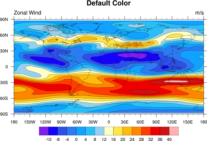
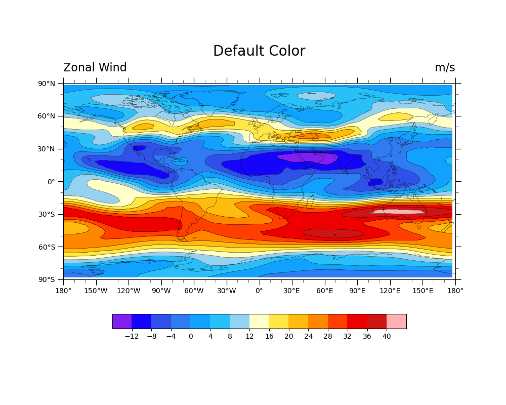
Original NCL script: https://www.ncl.ucar.edu/Applications/Scripts/color_1.ncl
Original NCL plot: https://www.ncl.ucar.edu/Applications/Images/color_1_lg.png
- Note:
This may not be the best colormap to interpret the information, but was included here in order to demonstrate how to recreate the original NCL colormap. For more information on colormap choices, see the Colors examples in the GeoCAT-examples documentation.
Import packages:
import cartopy.crs as ccrs
import matplotlib.pyplot as plt
import numpy as np
import xarray as xr

import geocat.viz.util as gvutil
import geocat.datafiles as gdf
from geocat.viz import cmaps as gvcmaps
Read in data:
# Open a netCDF data file using xarray default engine and load the data into xarray
ds = xr.open_dataset(gdf.get("netcdf_files/uv300.nc")).isel(time=1)
Plot:
# Generate figure and set its size in (width, height)
fig = plt.figure(figsize=(10, 8))

# Generate axes using Cartopy to draw coastlines
ax = plt.axes(projection=ccrs.PlateCarree())
ax.coastlines(linewidth=0.5, alpha=0.6)

# Use geocat.viz.util convenience function to set axes limits & tick values
gvutil.set_axes_limits_and_ticks(ax,
                                 xlim=(-180, 180),
                                 ylim=(-90, 90),
                                 xticks=np.linspace(-180, 180, 13),
                                 yticks=np.linspace(-90, 90, 7))

# Use geocat.viz.util convenience function to add minor and major tick lines
gvutil.add_major_minor_ticks(ax, labelsize=10)

# Use geocat.viz.util convenience function to make latitude, longitude tick labels
gvutil.add_lat_lon_ticklabels(ax)

# Import the default color map
newcmp = gvcmaps.ncl_default

# Define contour levels
levels = np.arange(-16, 48, 4)

# Define dictionary for kwargs
kwargs = dict(
    levels=levels,
    xticks=np.arange(-180, 181, 30),  # nice x ticks
    yticks=np.arange(-90, 91, 30),  # nice y ticks
    add_colorbar=False,  # allow for colorbar specification later
    transform=ccrs.PlateCarree(),  # ds projection
)

# Contouf-plot U data (for filled contours)
fillplot = ds.U.plot.contourf(ax=ax, cmap=newcmp, **kwargs)

# Create horizonal color bar
# By changing the kwarg `pad`, the colorbar can be moved closer to or farther away from
# the axis parallel to it.
# `pad` defaults to 0.15 for horizontal colorbars
fig.colorbar(fillplot,
             orientation="horizontal",
             ticks=np.arange(-12, 44, 4),
             label='',
             shrink=0.75,
             pad=0.11)

# Plot line contours
ds.U.plot.contour(ax=ax,
                  colors='black',
                  alpha=0.8,
                  linewidths=0.4,
                  linestyles='solid',
                  add_labels=False,
                  levels=levels,
                  transform=ccrs.PlateCarree())

# Use geocat.viz.util convenience function to add titles to left and right of the plot axis.
gvutil.set_titles_and_labels(ax,
                             maintitle="Default Color",
                             lefttitle=ds.U.long_name,
                             lefttitlefontsize=16,
                             righttitle=ds.U.units,
                             righttitlefontsize=16,
                             xlabel="",
                             ylabel="")

# Show the plot
plt.show()
Total running time of the script: ( 0 minutes 0.396 seconds)