Note
Click here to download the full example code
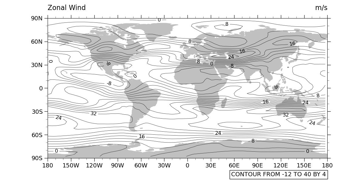
NCL_ce_1.py
- This script illustrates the following concepts:
Drawing black-and-white contours over a cylindrical equi-distant map
Specifying contour labels
- See following URLs to see the reproduced NCL plot & script:
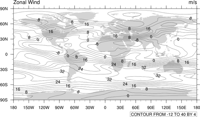
Original NCL script: https://www.ncl.ucar.edu/Applications/Scripts/ce_1.ncl
Original NCL plot: https://www.ncl.ucar.edu/Applications/Images/ce_1_lg.png
Import packages:
import numpy as np
import xarray as xr
import cartopy.crs as ccrs
import matplotlib.pyplot as plt
import cartopy.feature as cfeature
from cartopy.mpl.gridliner import LongitudeFormatter, LatitudeFormatter

import geocat.datafiles as gdf
from geocat.viz import util as gvutil
Read in data:
# Open a netCDF data file using xarray default engine and load the data into xarrays, choosing the 2nd timestamp
ds = xr.open_dataset(gdf.get("netcdf_files/uv300.nc")).isel(time=1)
Plot:
# Generate figure (set its size (width, height) in inches)
fig = plt.figure(figsize=(12, 6))

# Generate axes using Cartopy projection
projection = ccrs.PlateCarree()
ax = plt.axes(projection=projection)

# Draw land
ax.add_feature(cfeature.LAND, color='silver')

# Define the contour levels
levels = np.arange(-12, 41, 4)

# Draw contour lines
contour = ds.U.plot.contour(
    ax=ax,
    levels=levels,
    xticks=np.arange(-180, 181, 30),  # nice x ticks
    yticks=np.arange(-90, 91, 30),  # nice y ticks
    transform=projection,  # ds projection
    add_labels=False,  # turn off xarray's automatic Lat, lon labels
    colors="black",  # note plurals in this and following kwargs
    linestyles="-",
    linewidths=0.5)

# Label the contours and set axes title
ax.clabel(contour, [-8, 0, 8, 16, 24, 32], fontsize=12, fmt="%.0f")

# Add lower text box
ax.text(0.995,
        -0.13,
        "CONTOUR FROM -12 TO 40 BY 4",
        horizontalalignment='right',
        transform=ax.transAxes,
        fontsize=14,
        bbox=dict(boxstyle='square, pad=0.25',
                  facecolor='white',
                  edgecolor='black'))

# Use geocat.viz.util convenience function to add minor and major tick lines
gvutil.add_major_minor_ticks(ax)

# Use geocat.viz.util convenience function to make plots look like NCL plots by using latitude, longitude tick labels
gvutil.add_lat_lon_ticklabels(ax)

# Removing degree symbol from tick labels to resemble NCL example
ax.yaxis.set_major_formatter(LatitudeFormatter(degree_symbol=''))
ax.xaxis.set_major_formatter(LongitudeFormatter(degree_symbol=''))

# Use geocat.viz.util convenience function to add left and right title to the plot axes.
gvutil.set_titles_and_labels(ax,
                             lefttitle="Zonal Wind",
                             lefttitlefontsize=16,
                             righttitle=ds.U.units,
                             righttitlefontsize=16)

# Set ticklabel fontsize
plt.xticks(fontsize=14)
plt.yticks(fontsize=14)

# Show plot
plt.tight_layout()
plt.show()
Total running time of the script: ( 0 minutes 0.691 seconds)