Note
Click here to download the full example code
NCL_box_2.py
- This script illustrates the following concepts:
Drawing box plots
Manipulating boxplot visualizations
Manipulating plot axes
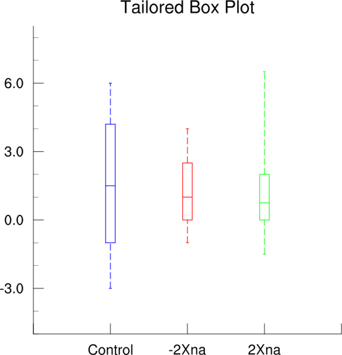
- See following URLs to see the reproduced NCL plot & script:
Original NCL script: https://www.ncl.ucar.edu/Applications/Scripts/box_2.ncl
Original NCL plot: https://www.ncl.ucar.edu/Applications/Images/box_2_lg.png
Import packages:
import matplotlib.pyplot as plt
from matplotlib.ticker import FormatStrFormatter
import numpy as np

from geocat.viz import util as gvutil
Generate fake data:
seed = 200
np.random.seed(seed)

data = np.random.lognormal(size=(40, 3), mean=1, sigma=.7)
for a in range(len(data)):
    data[a] = [x - 4 for x in data[a]]
Helper function to set edge color of boxes
def setBoxColor(boxplot, colors):

    # Set edge color of the outside and median lines of the boxes
    for element in ['boxes', 'medians']:
        for box, color in zip(boxplot[element], colors):
            plt.setp(box, color=color)

    # Set the color of the whiskers and caps of the boxes
    for element in ['whiskers', 'caps']:
        for box, color in zip(
                zip(boxplot[element][::2], boxplot[element][1::2]), colors):
            plt.setp(box, color=color)
Plot:
# Create figure and axis
w = 0.1
fig, ax = plt.subplots(figsize=(6, 6))
boxplots = ax.boxplot(data,
                      labels=['Control', '-2Xna', '2Xna'],
                      widths=[w, w, w],
                      showfliers=False)

# Set whiskers style to dashed
plt.setp(boxplots['whiskers'], linestyle='--')

# Set boxplot edge colors
setBoxColor(boxplots, ['blue', 'red', '#66FF00'])

# Remove axis lines on top and right sides
ax.spines['right'].set_visible(False)
ax.spines['top'].set_visible(False)

# Use geocat.viz.util convenience function to set axes tick values
gvutil.set_axes_limits_and_ticks(ax,
                                 ylim=(-6.0, 8.5),
                                 yticks=[-3.0, 0.0, 3.0, 6.0])

# Set y_axis format
ax.yaxis.set_major_formatter(FormatStrFormatter('%.1f'))

# Use geocat.viz.util convenience function to add minor and major tick lines
gvutil.add_major_minor_ticks(ax,
                             y_minor_per_major=3,
                             x_minor_per_major=1,
                             labelsize=16)

# Use geocat.viz.util convenience function to add title to the plot axis.
gvutil.set_titles_and_labels(ax,
                             maintitle='Tailored Box Plot',
                             maintitlefontsize=22)

# Make both major and minor ticks point inwards towards the plot
ax.tick_params(direction="in", which='both', pad=9)

# Set ticks only at left and bottom sides of plot
ax.yaxis.set_ticks_position('left')
ax.xaxis.set_ticks_position('bottom')

# Display Plot
plt.tight_layout()
plt.show()
Total running time of the script: ( 0 minutes 0.151 seconds)