Note
Click here to download the full example code
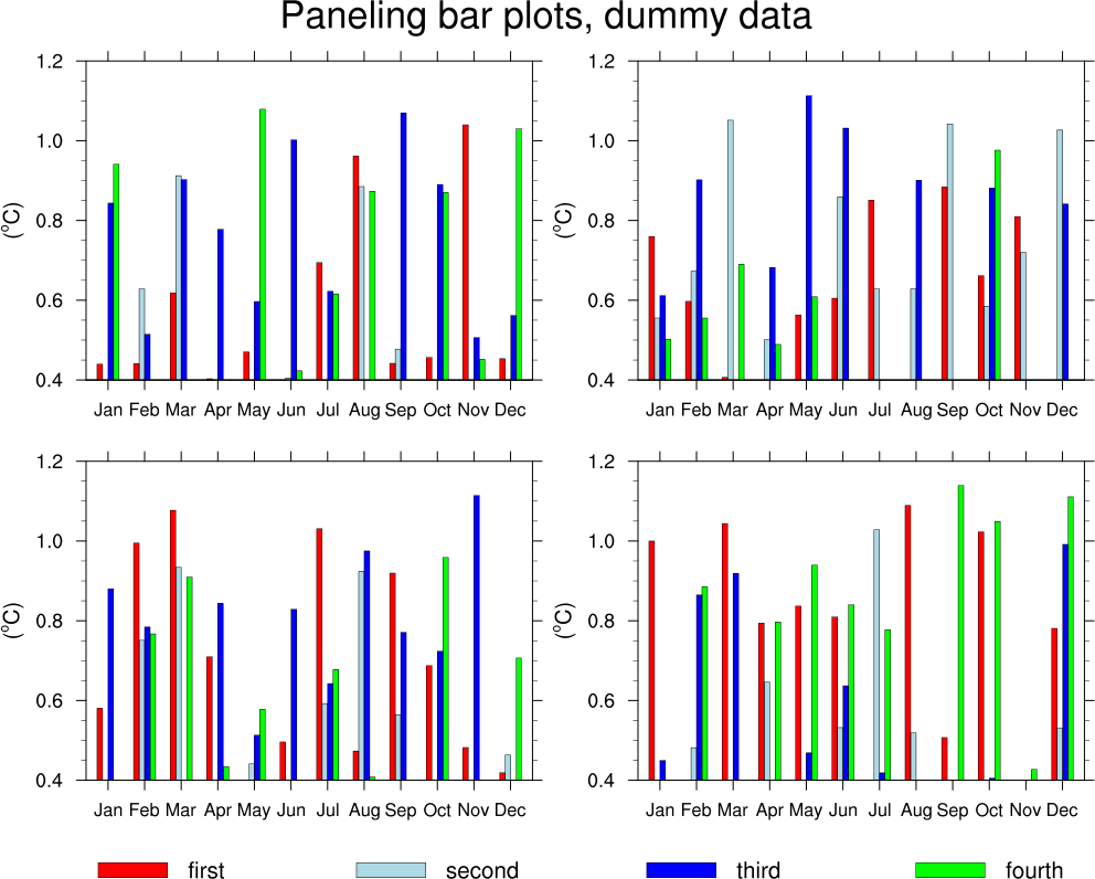
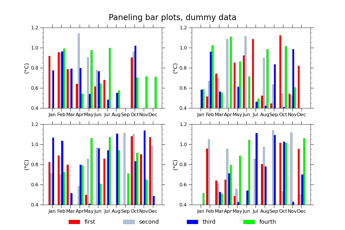
NCL_bar_11.py
- This script illustrates the following concepts:
Drawing filled bars using solid colors
Setting the minimum/maximum value of the X and Y axis in a bar plot
Paneling bar plots
Drawing a custom legend
Generating random data using numpy
- See following URLs to see the reproduced NCL plot & script:
Original NCL script: https://www.ncl.ucar.edu/Applications/Scripts/bar_11.ncl
Original NCL plot: https://www.ncl.ucar.edu/Applications/Images/bar_11_lg.png
Import packages:
import matplotlib.pyplot as plt
import numpy as np

import geocat.viz.util as gvutil
Generate dummy data:
num_months = 12
bars_per_panel = 4
panels = 4
data = np.random.uniform(0.1, 1.15, (panels, bars_per_panel, num_months))

months = [
    'Jan', 'Feb', 'Mar', 'Apr', 'May', 'Jun', 'Jul', 'Aug', 'Sep', 'Oct', 'Nov',
    'Dec'
]
Plot:
fig, axs = plt.subplots(2, 2, figsize=(12, 8), gridspec_kw=dict(wspace=0.25))
x = np.arange(len(months))  # where to draw x ticks
width = 0.2  # width of each bar within the groups

# Create the subplots using a loop
panel = 0
for row in range(0, 2):
    for col in range(0, 2):
        # Use geocat.viz.util convenience function to set axes parameters
        gvutil.set_axes_limits_and_ticks(axs[row][col],
                                         ylim=(0.4, 1.2),
                                         xticks=x,
                                         yticks=np.arange(0.4, 1.4, 0.2),
                                         xticklabels=months)
        # Use geocat.viz.util convenience function to add minor and major tick lines
        gvutil.add_major_minor_ticks(axs[row][col],
                                     x_minor_per_major=1,
                                     y_minor_per_major=4,
                                     labelsize=12)
        # Use geocat.viz.util convenience function to set titles and labels
        gvutil.set_titles_and_labels(axs[row][col],
                                     ylabel='(\u00B0C)',
                                     labelfontsize=14)

        # Add overall figure title
        fig.suptitle('Paneling bar plots, dummy data', size=20, y=0.94)

        # Add data to subplot
        axs[row][col].bar(x - width * 3 / 2,
                          data[panel][0][:],
                          width,
                          edgecolor='black',
                          linewidth=0.25,
                          color='red',
                          label='first')
        axs[row][col].bar(x - width / 2,
                          data[panel][1][:],
                          width,
                          edgecolor='black',
                          linewidth=0.25,
                          color='lightsteelblue',
                          label='second')
        axs[row][col].bar(x + width / 2,
                          data[panel][2][:],
                          width,
                          edgecolor='black',
                          linewidth=0.25,
                          color='blue',
                          label='third')
        axs[row][col].bar(x + width * 3 / 2,
                          data[panel][3][:],
                          width,
                          edgecolor='black',
                          linewidth=0.25,
                          color='lime',
                          label='fourth')
        panel += 1

# Add legend with `figlegend()` to position it relative to figure instead of subplots
handles, labels = axs[0][0].get_legend_handles_labels()
fig.legend(handles,
           labels,
           ncol=4,
           loc='lower center',
           fontsize=14,
           columnspacing=5,
           frameon=False)

plt.show()
Total running time of the script: ( 0 minutes 0.497 seconds)